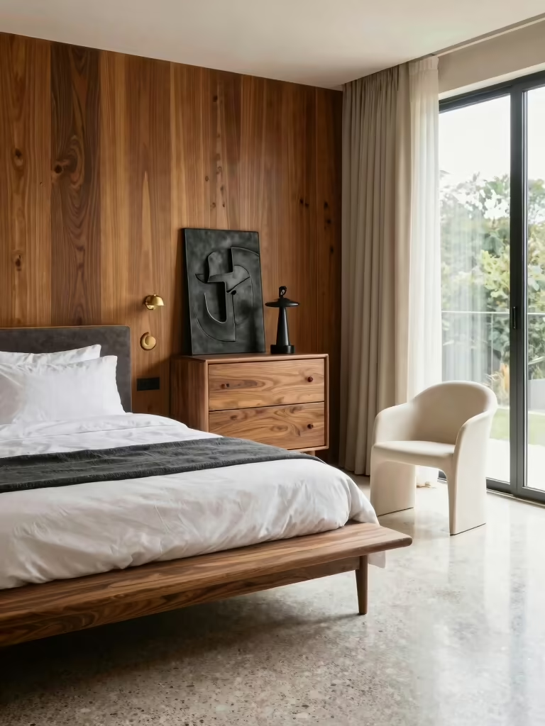

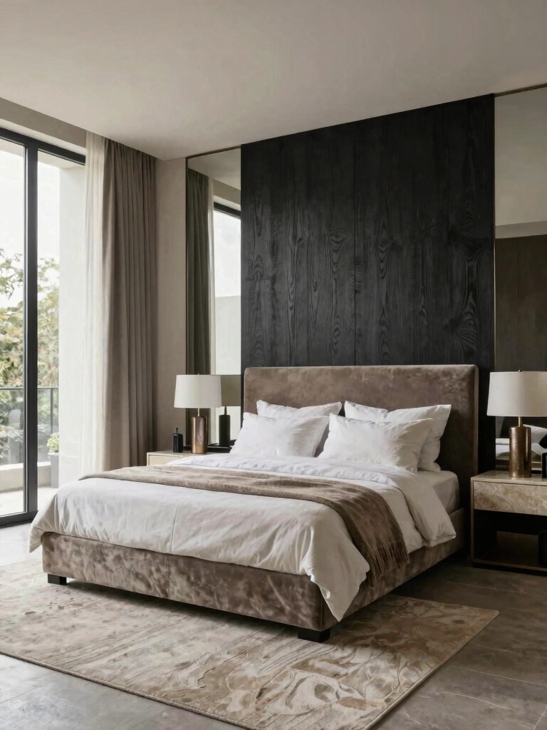
The gap between a nice bedroom and one that feels designed comes down to a handful of fundamentals pros get right almost without thinking. None of them is expensive. Most people just skip them and reach for decor instead, then wonder why the room still feels a little off.
These are the bedroom ideas interior design pros swear by, the quiet basics that do the heavy lifting: proportion, a calm palette, layered light, hidden storage, and a bed placed for flow. Get these few things right first and almost anything you add on top will look intentional. Skip them and no amount of pretty pillows will save the room.
Key Takeaways
- Start with proportion and scale before decor; the right-sized pieces are what make a room feel designed.
- Keep the palette calm and let texture add the interest, since a quiet color scheme feels more restful.
- Layer the light at three heights and put it on dimmers so the room shifts from task-bright to wind-down.
- Hide the clutter and place the bed for clear flow; a clean floor and a clear path do more than any accessory.
Curate Serenity: Where Pros Start for Relaxation
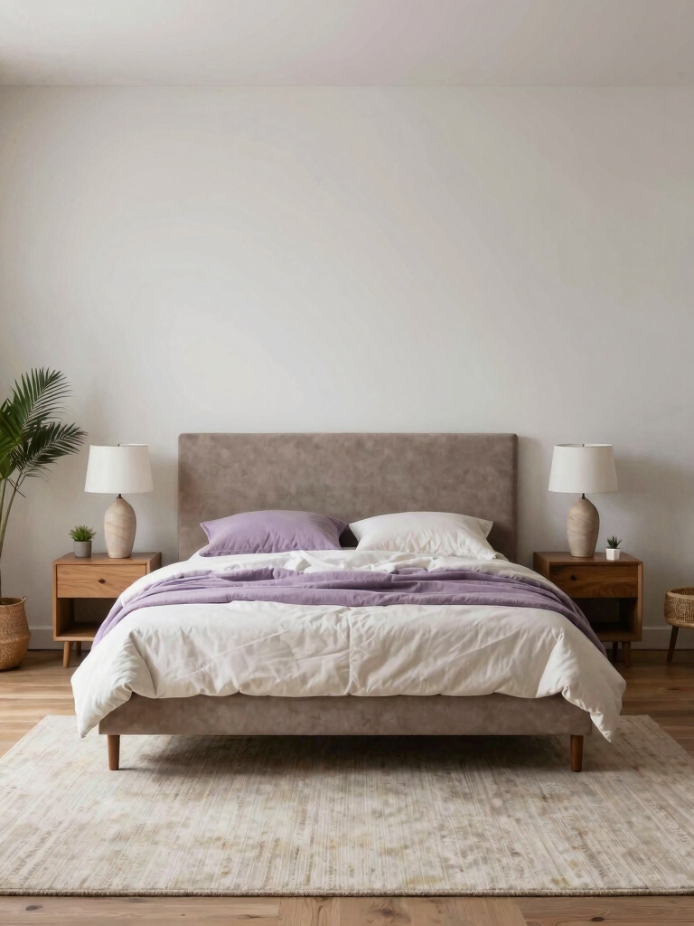
Calm isn’t a vibe you stumble into; it’s a set of decisions you can actually make on purpose. When I walk into a bedroom that doesn’t feel restful, the cause is almost always the same short list: too much stuff out, harsh light, and a palette that’s working too hard. Pros fix the room by subtracting before they add a single thing.
Subtract before you add
The first thing I check is the surfaces. Clear nightstands, a made bed, and one or two considered objects feel calm instantly, while crowded tops come across as noise no matter how nice each item is. Then I look at the light and the color, because those two set the mood before you’ve consciously noticed either one.
Think of serenity as the goal every other choice serves. If a piece doesn’t help the room feel restful, it’s probably working against it. That single test, does this add calm or take it away, will steer most of your decisions better than any trend will.
Start With Proportion and Scale
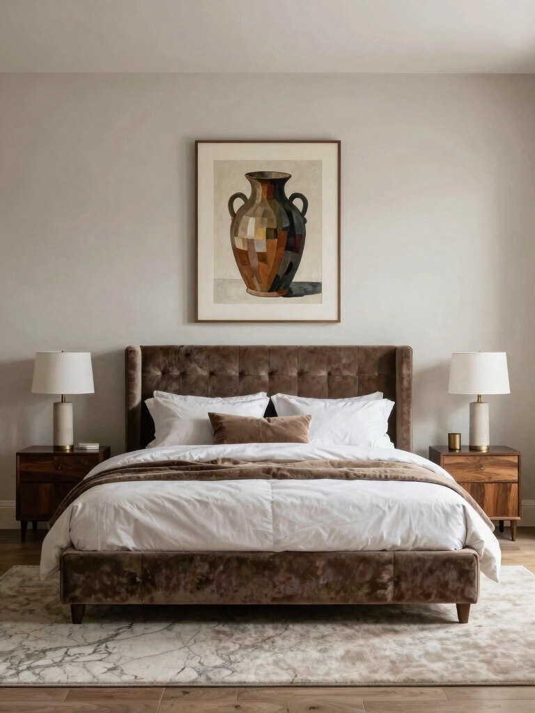
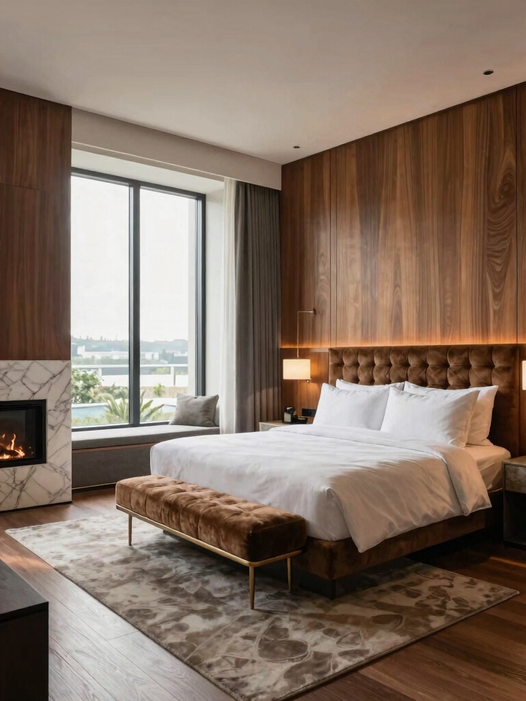
Proportion is the thing pros obsess over and everyone else forgets, and it’s the single biggest reason a room either clicks or feels slightly wrong. It’s about the relationship between sizes: a bed that fits the wall, a nightstand that matches the bed height, a rug big enough to sit under the furniture. Get those relationships right and a plain room looks composed; get them wrong and even expensive pieces feel awkward.
The most common scale mistake I see is furniture that’s too small for the room and rugs that are far too small for the bed. A rug should run at least 18 to 24 inches past the bed on the sides you step out on, and a nightstand should land within a couple of inches of the mattress top. Sketch the room to scale before you buy, the same way you would plan a bedroom layout.
- Match the nightstand height to the top of the mattress, give or take a couple of inches, so the bedside looks balanced.
- Size the rug to slide well past the bed on the step-out sides; a small rug makes the whole room look off.
- Anchor one bold piece with calmer forms around it so nothing fights for attention.
Heads-Up
Bigger isn’t always better in a bedroom. The most common pro fix is removing a piece, not adding one. If a room feels cramped, pull the smallest non-essential item before you rearrange anything, since one fewer thing on the floor often reads as more space than a clever layout does.
Calming Color Combinations Pros Reach For
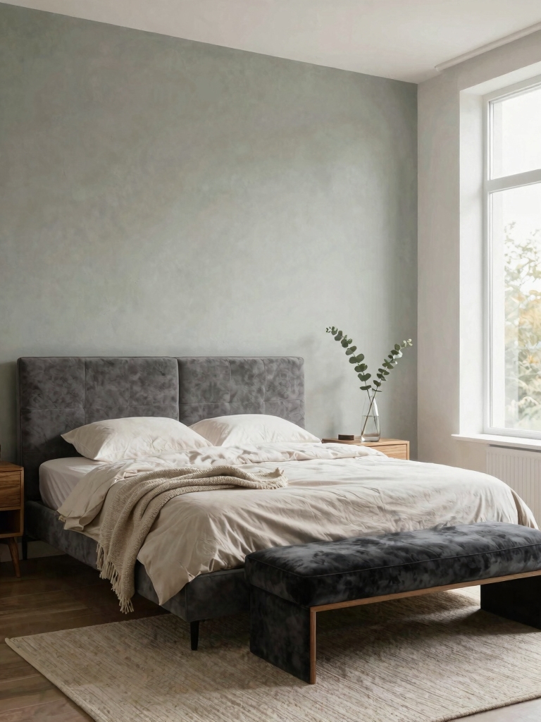
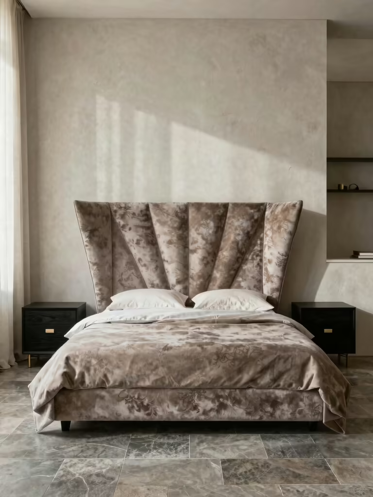
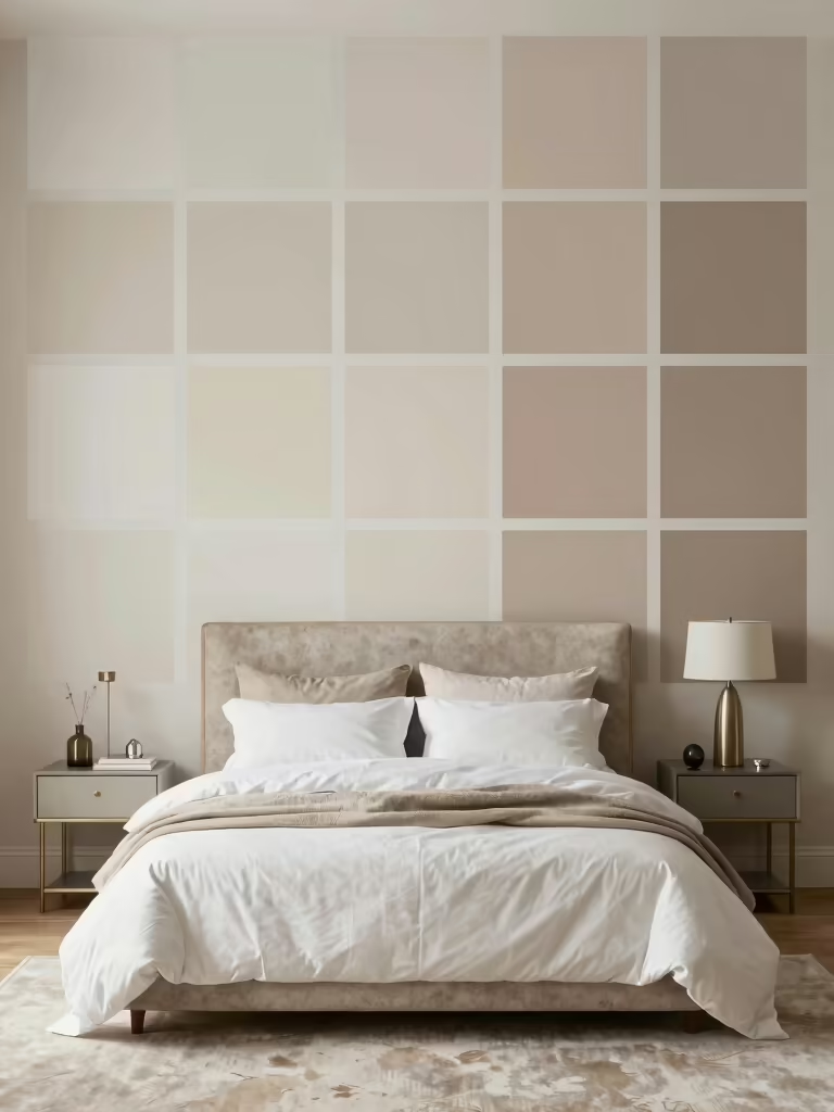
The palettes designers use in bedrooms are quieter than people expect, because the goal is rest, not a showroom. Loud rarely feels restful. I lean on soft, low-contrast combinations, a warm white with greige, sage with oatmeal, a muted blue with cream, that feel polished without shouting. The trick is to keep the contrast gentle and let texture and wood add the richness a bolder color would.
Color is also the cheapest reset you can make; a fresh wall color runs about $50 and a weekend for one room. Pull your scheme from a textile or piece of art you already love so it feels personal, and these calming color palette ideas are a good place to start narrowing it down.
- Pick one quiet base, two soft supports, and a single accent, then repeat the accent two or three times.
- Keep contrast low for rest; save the high-drama pairings for rooms you don’t sleep in.
- Test a large swatch on the wall and check it at night, since paint shifts hard under warm bulbs.
Layered Lighting for Mood and Function
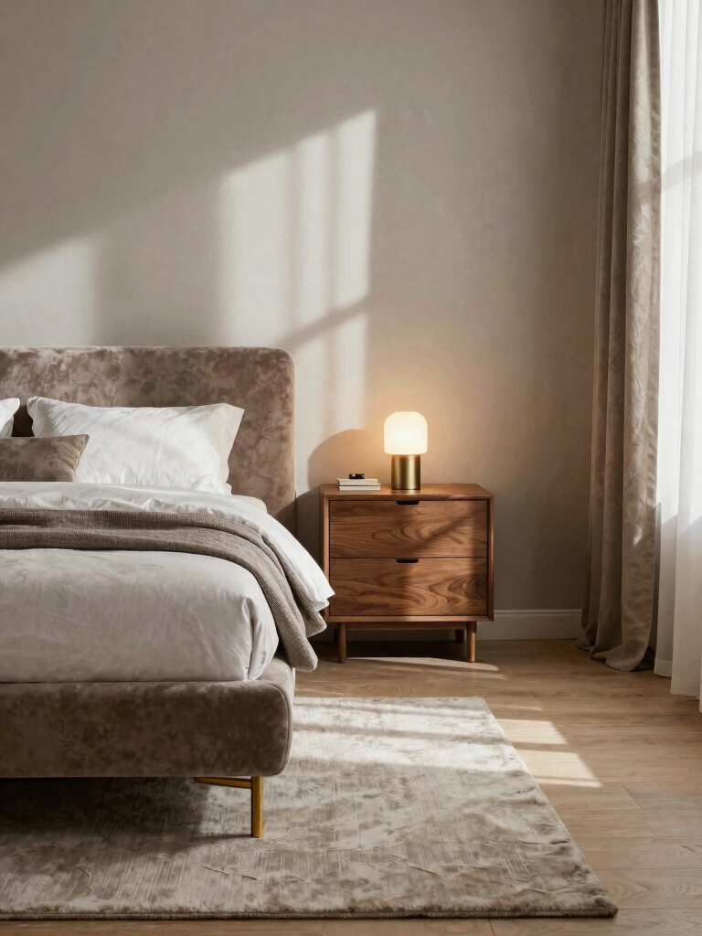
If I could change one thing in most bedrooms, it would be the lighting. A single bright overhead is the fastest way to make a room feel like an office, and layering a few softer sources at different heights is the fastest way to fix it. Pros never rely on one switch.
- Build three layers: an ambient overhead for general light, bedside lamps or sconces for task, and a low accent glow for mood.
- Put as much as you can on dimmers, about $15 to $25 each, so one room can go bright for tasks and soft for winding down.
- Choose warm 2700K bulbs throughout so the whole room stays cozy and easy on the eyes at night.
- Clear the nightstands with wall sconces where you can, and steal the layering in these bedroom lighting ideas for mood.
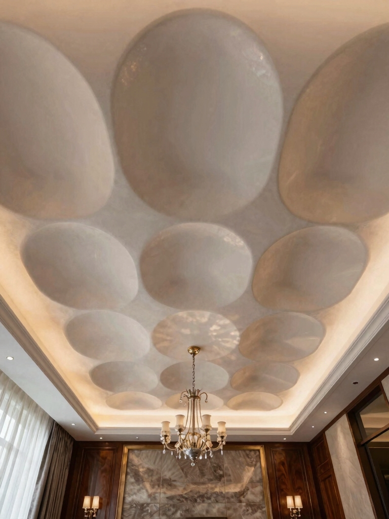
👍One statement overhead light
- +Becomes a design feature, not just a function
- +Frees nightstands if it casts enough glow
- +Anchors the ceiling in a plain room
👎Worth knowing
- –On its own it flattens the room with even light
- –Needs a dimmer to feel like anything but an office
- –Still wants bedside layers for real task light
Smart, Stylish Storage That Stays Sleek
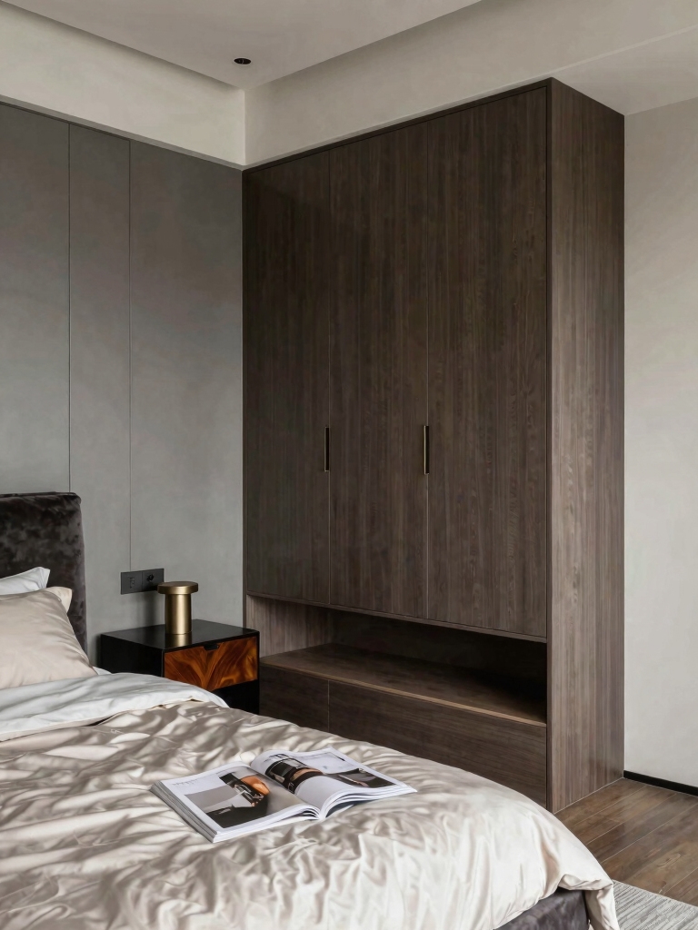
Clutter is the enemy of a calm bedroom, and pros design the storage in from the start so the surfaces can stay clear. The principle is simple: give everything a home that’s out of sight, then the room feels serene because there’s nothing visual to trip on. A made bed and clear nightstands do most of the work once the stuff has somewhere to go.
Lean on the spots people forget. The under-bed zone, the back of the door, and vertical wall space hold a surprising amount without crowding the floor. A storage bed or a few under-bed bins clear out a whole dresser’s worth of overflow, and these storage ideas for hiding clutter go deeper on keeping it invisible.
- Build storage into the big pieces: a bed with drawers, a bench that opens, a nightstand with a door.
- Use closed fronts over open shelves where you can, since open shelving shows clutter fast.
- Keep one tray or basket for the daily overflow so it has a home instead of landing on a surface.
Bed Placement for Space and Flow
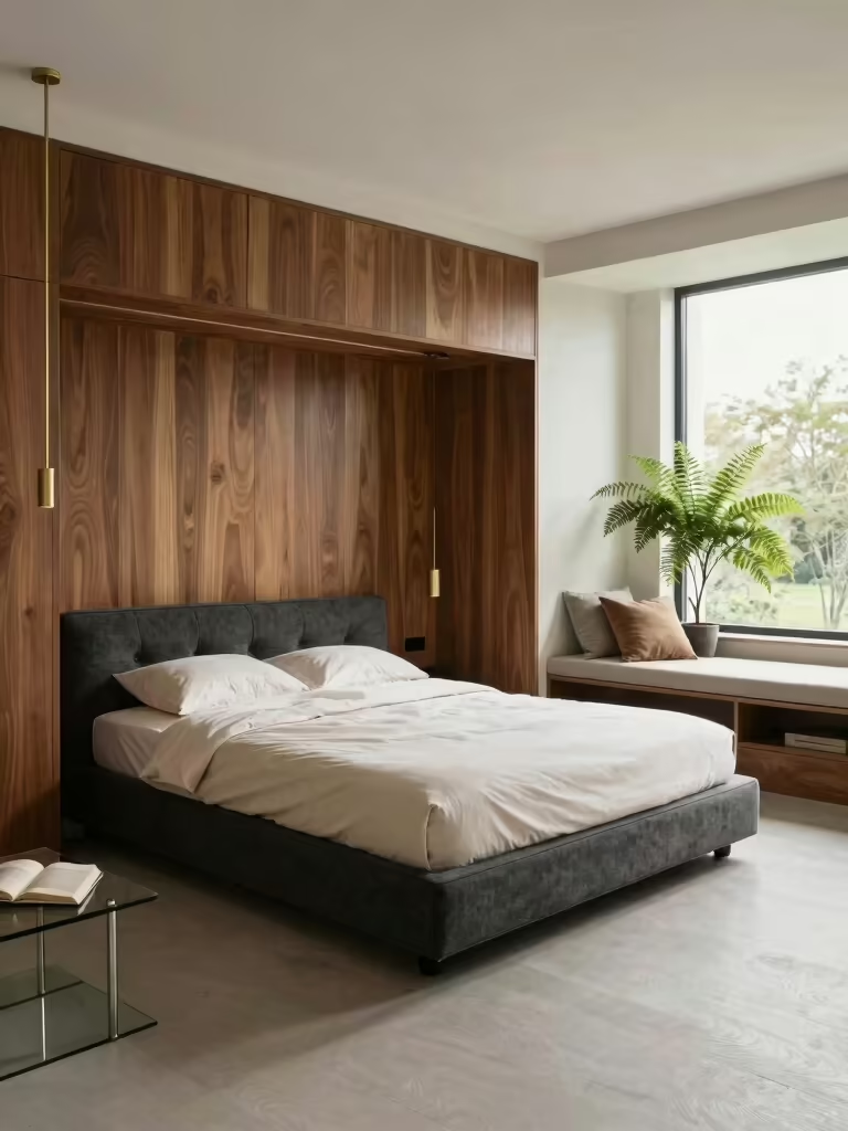
Where the bed goes decides how the whole room feels, and pros treat it as the first big decision, not an afterthought. The bed wants to be the clear focal point, usually centered on the longest unbroken wall, with a clean sightline from the door. When you walk in and the bed lands as the anchor, the room feels settled before you’ve registered anything else. I tell clients to get this one decision right before anything else.
Flow matters as much as the focal point. I keep at least 24 inches of clear path on each side you use, symmetrical nightstands where the wall allows, and nothing bulky blocking the route from door to bed. A bed jammed into a corner saves a few inches and costs you a usable side, which makes the whole room feel tighter than it is.
If the room is awkward, work with the quirks instead of fighting them. Angle the bed off a problem wall, float it a few inches to clear a radiator, or use the headboard wall to hide an off-center window. The goal is always the same: the bed leads, the path stays clear, and your eye lands somewhere restful from the doorway.
Common Mistakes Pros Quietly Fix First
Most bedroom mistakes come from the same short list, and pros catch them on instinct. The biggest is the floating rug, a small one stranded in the middle of the room with the bed legs sitting off it, which makes the whole layout look unmoored.
I size up almost every rug a client owns. Right behind it is furniture lined flat against the walls like a waiting room, which drains any sense of intention; pulling a piece or two in a few inches instantly reads more designed.
The other two are everywhere. One harsh overhead doing all the lighting flattens a room no matter how nice the furniture is, and buying decor before the bones are set is how people end up with a pretty bedroom that still feels off. None of these cost money to fix. They cost attention, which is exactly why pros get them right and most rooms I walk into don’t. Sort those four and you’re already ahead of the game.
A Designer’s Cheat Sheet: What to Get Right First
When a client wants to know where to spend their energy first, I give them the same order every time, because it’s the sequence that makes everything else easier. Layout and proportion come first, then light, then the palette, then storage, and only then the decorative layer. Most rooms go wrong because people start at the end, shopping for pretty things before the bones are settled.
Work in that order and you rarely waste money. A correctly placed bed and a right-sized rug cost nothing extra to get right, a couple of dimmers and warm bulbs run under fifty dollars, and a wall color is cheap. Spend the real budget on the few pieces you touch every day, the mattress, the bed, the lighting, and let the accessories be the easy, swappable finish on top. A handful of well-chosen decor ideas worth stealing is plenty once the bones are right.
Pro Bedroom Questions, Answered
?What’s the one change that makes a bedroom look more designed?
Fix the lighting. Swap a single bright overhead for three layers, ambient, bedside task, and a low accent glow, all on warm dimmable bulbs. It does more for the feel of a room than new furniture, and it costs less than fifty dollars to start.
?How big should my bedroom rug be?
Bigger than you think. It should slide at least 18 to 24 inches past the bed on the sides you step out on, ideally with the front two-thirds of the bed sitting on it. A too-small rug is the most common scale mistake pros see, and sizing up instantly makes the room look pulled together.
?Where should the bed go in a bedroom?
Center it on the longest unbroken wall with a clear sightline from the door, and keep at least 24 inches of clear path on each side you use. The bed should read as the focal point the moment you walk in, with symmetrical nightstands where the wall allows.
?What do designers spend money on versus save on?
Spend on what you touch daily, the mattress, the bed frame, and good lighting, since those carry the room and last for years. Save on the decorative layer, pillows, art, accessories, which you’ll swap anyway. Getting the layout and proportion right costs nothing but attention.
Master the Basics, Then Have Fun
The reason these ideas are the ones pros swear by is that they work in any room and cost almost nothing to get right. Nail the proportion, layer the light, calm the palette, hide the clutter, and place the bed for flow, and the room will feel designed before you’ve hung a single thing on the wall.
Start with whichever basic your room is missing most, usually the lighting or the rug size, and build from there. Once the bones are right, the fun, personal layer is the easy part, and it’s a lot more rewarding when it’s sitting on a room that already works.