I’ve gathered 17 bedroom color ideas that calm, elevate, and transform your space with thoughtful neutrals, airy blues and greens, warm terracotta tones, bold accents, and practical tips for testing and applying color. From calming neutrals and soft base palettes to moody murals and two-tone walls, there’s something for every mood. I’ll also share quick, budget-friendly swaps and a room-by-room color map to keep things cohesive. Want more insights? there’s plenty more to explore.
Explore 17 Bedroom Color Ideas That Calm a Space
Choosing calming colors for a bedroom isn’t about chasing a trend; it’s about creating a sanctuary you’ll actually want to retreat to every night.
I’m sharing 17 ideas that melt visual noise, balance contrast, and invite rest. Think soft greens, muted blues, gentle lavenders, and airy whites.
I’ll explain how each hue supports calm, focus, and personal retreat without overwhelm.
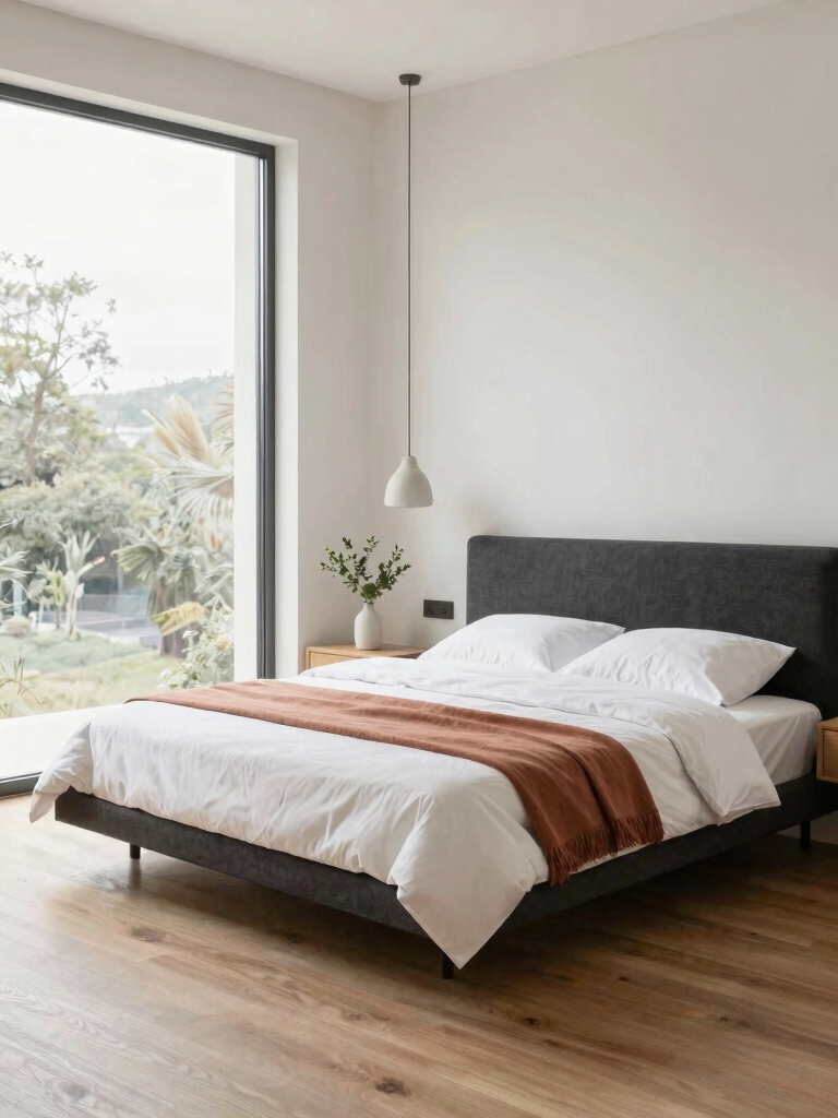
One great option to consider is a serene light grey, which offers a perfect balance for relaxing retreats and pairs beautifully with many color palettes.
Calming Neutrals: Soft Base Palettes for Sleep-Ready Rooms
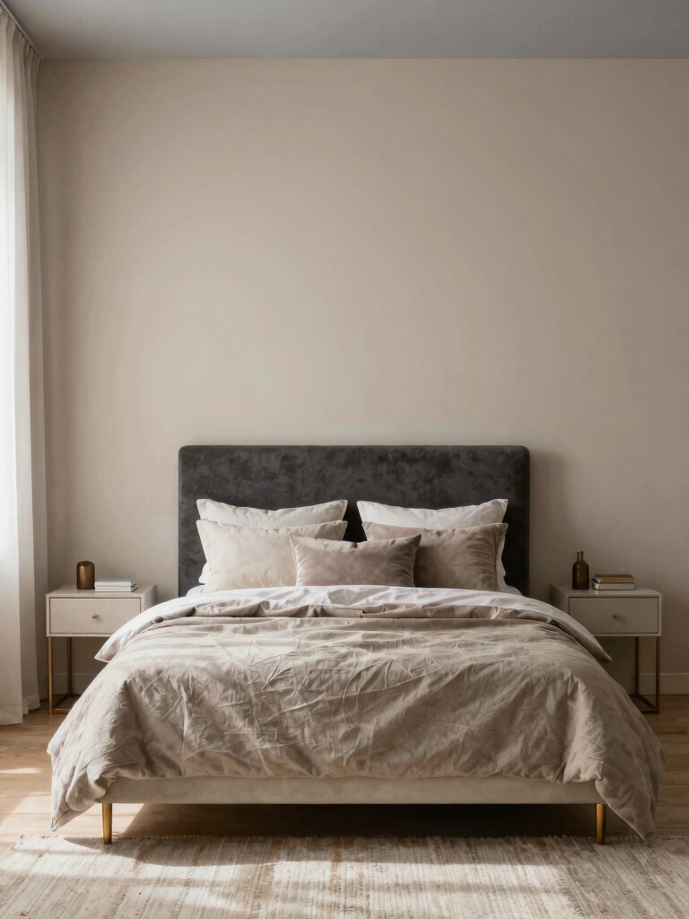
Soft Linen Neutrals set a calm, breathable foundation, while Sleep-Boosting Hue Balance helps keep the room feeling serene yet subtly alive.
I’ll show you how to pair warm whites with cool greys and soft beiges for a cohesive, sleep-friendly base.
Let’s explore practical combos that read as tranquil and polish the moment you walk in.
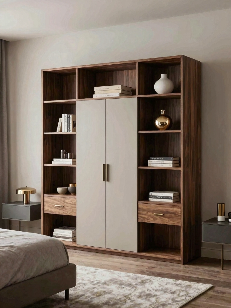
Small bedrooms can be completely transformed with inspiring paint ideas that maximize the sense of space and tranquility.
Soft Linen Neutrals
I share how these tones blend warmth with restraint, offering a versatile base for furniture and textiles.
I favor low-sheen whites, warm beiges, and subtle taupes that reflect natural light without shouting.
Together, we’ll curate layers—soft textures, minimal contrast, and purposeful accents—for a tranquil, sleep-friendly retreat.
Sleep-Boosting Hue Balance
Soft linen neutrals laid a calm groundwork, and now we’ll add a sleep-boosting balance with calming neutrals as the base.
I guide you to choose gentle contrasts that soothe the mind, layering texture and light for depth without overstimulation.
- Pair warm taupe with cool dove accents
- Embrace soft sage highlights for serenity
- Add muted blues in textiles for restful focus
Airy Blues and Greens for Light-Filled Retreats
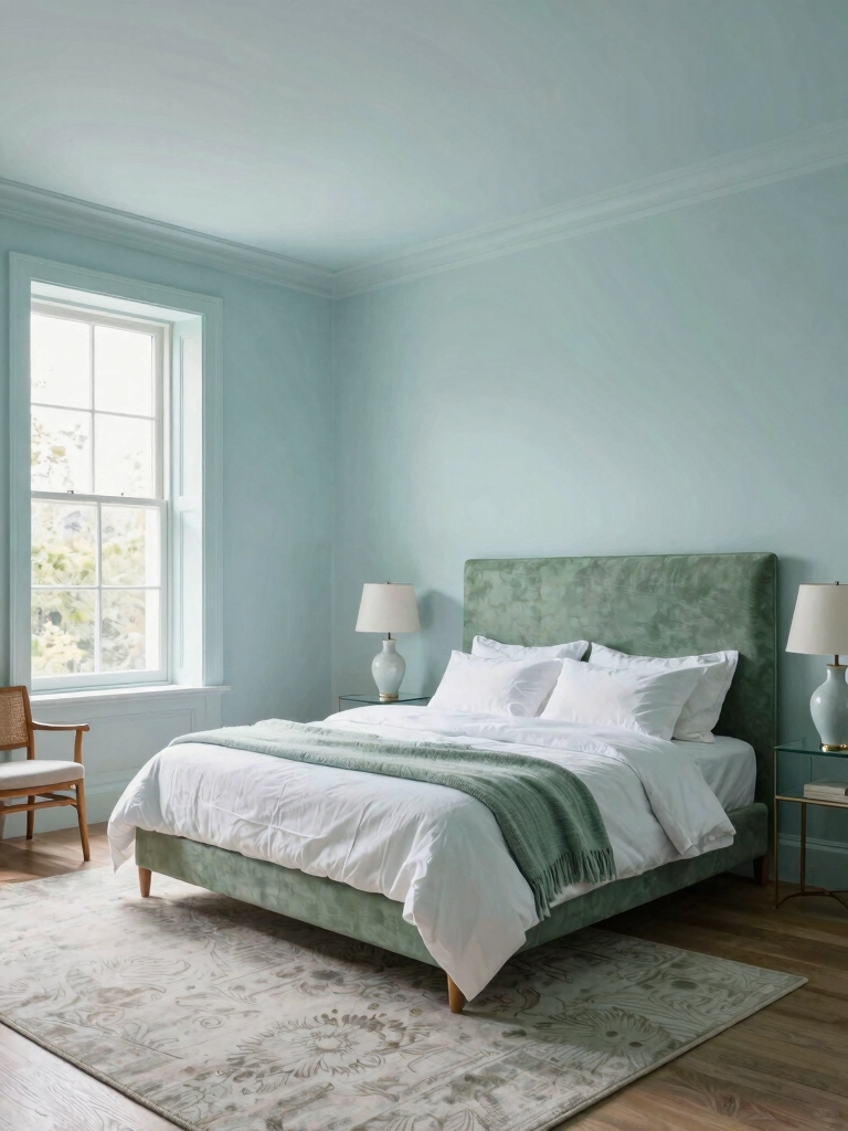
If you crave a calm, sunlit retreat, airy blues and greens are a natural choice, because they reflect light and feel spacious.
I’d pair pale cerulean walls with soft sage accents to keep rooms airy, not clinical.
Use white trim, breathable fabrics, and natural wood furniture for contrast.
These shades enhance space, ease, and everyday serenity without overpowering the senses.
Incorporating these colors can create charming bedroom inspirations that cozy souls will love.
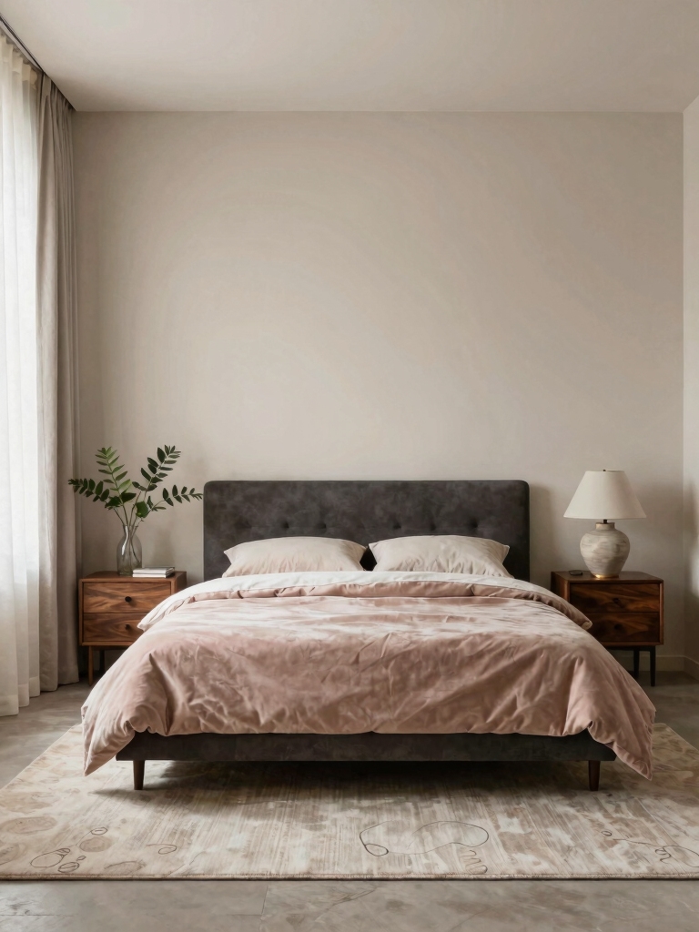
Warm Terracotta and Sand Tones for Cozy Bedrooms
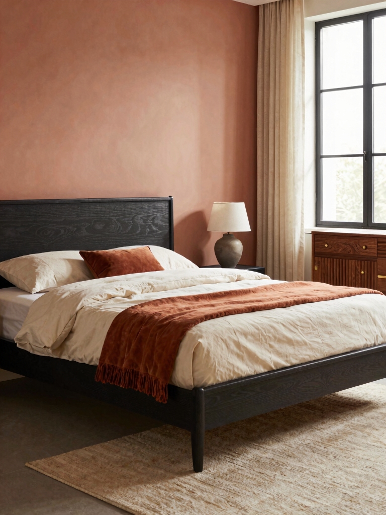
Warm terracotta and sand tones envelop a bedroom in cozy warmth, making evenings feel intimate and welcoming.
I pair these hues with natural textures to keep the room grounded and calm.
- Include terracotta accents through textiles and ceramic pieces
- Balance warmth with pale neutrals on walls
- Add soft lighting to enhance the cozy mood
When to Use Moody Murals and Dark Accent Walls
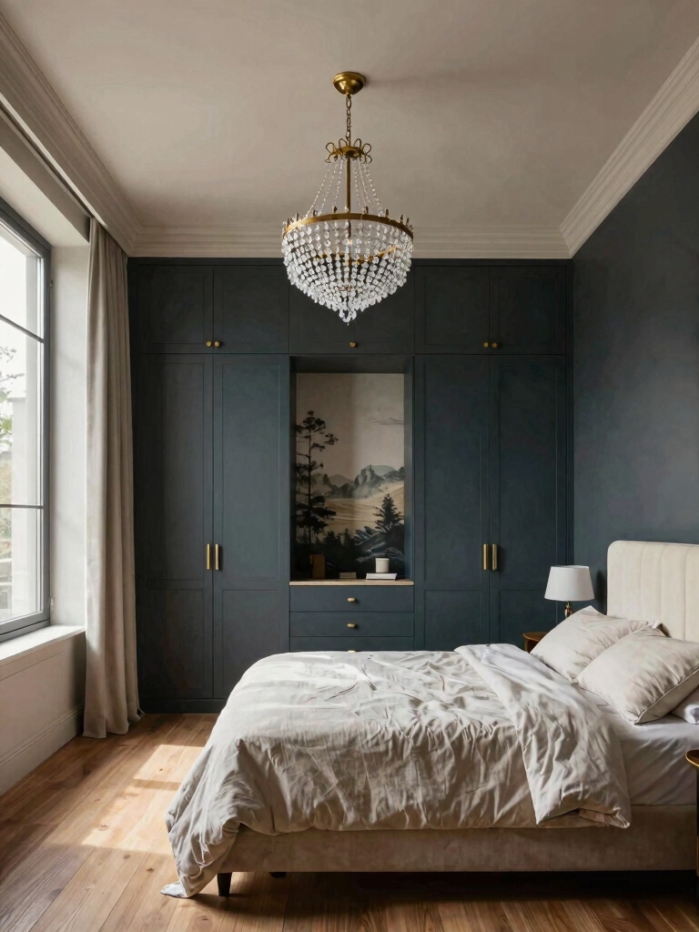
Moody murals and dark accent walls can anchor a bedroom’s mood when you want drama with sleep-friendly depth.
I’d use them sparingly, in rooms with ample natural light or where a single feature wall can ground a furniture-heavy layout.
Keep other walls light, textures soft, and silhouettes clean so contrast enhances calm rather than overwhelm.
Purposeful, timeless, and balanced.
Dark tones create cozy, dreamy vibes that can transform your bedroom into a restful retreat with moody atmosphere.
Subtle Contrasts: Light Walls With Rich Trim
Light walls create a calm backdrop, while rich trim adds instant architectural interest without overpowering the room.
I pair airy neutrals with satin or semi-gloss woodwork to keep contrast refined, not loud. The result feels timeless, intentional, and inviting.
- Balance soft wall color with slightly glossy trim
- Choose trim in a complementary undertone
- Keep furniture simple to preserve harmony
In small bedrooms, incorporating charming small bedroom ideas can enhance the cozy feel while maintaining style.
White With Black or Navy Accents: Classic Bedroom Combos
White walls with bold black or navy accents create a crisp, timeless look that helps a room feel both grounded and fresh.
I’ll show you practical ways to mix these tones—think graphic art, hardware, and textiles—so the contrast stays elegant, not punishing.
If you share your space and preferred vibe, I’ll tailor easy, stylish combos you can use right away.
White With Black Accents
Black accents in a white bedroom create a timeless, high-contrast look that’s both sophisticated and easy to live with.
I mix crisp sheets, bold art, and matte hardware to keep the space refined, not stark.
- crisp textiles
- focused lighting
- simple geometry
This approach stays practical, polished, and welcoming for daily life.
Navy Accent Details
Navy accents bring a confident depth to a white room while keeping the look crisp and versatile.
I’ll use navy details sparingly—think a headboard, trim, or textiles—to anchor the space without overwhelming it.
Pair these with bright whites and natural textures, like wood or linen.
The result stays timeless, sophisticated, and easy to refresh with new accessories.
Gelato-Inspired Palettes for Playful Calm
Gelato-inspired palettes mix soft, creamy tones with gentle pops of color to create a room that feels playful yet calm.
I pair blush, mint, and vanilla with small accents that energize without shouting, keeping balance intact.
- Balance bold accents with soft neutrals
- Layer textures for subtle depth
- Use light-to-medium contrast for harmony
Incorporating charming bedroom decor ideas can further enhance the inviting atmosphere of your space.
Earthy Textures: Wood, Stone, and Fabrics With Color
I’m curious how wood grain warmth and stone texture layering can transform a bedroom’s atmosphere.
I’ll show you simple ways to pair these earthy elements with color, so the room feels cohesive and inviting.
Let’s start by balancing warm wood tones with cool stone textures to create depth and comfort.
Incorporating grey tones alongside natural wood can embrace natural warmth while maintaining a modern bedroom feel.
Wood Grain Warmth
- Use matte finishes to preserve subtle grain
- Mix warm tones with cool neutrals for contrast
- Highlight with light, airy textiles and accessories
Stone Texture Layering
Stone textures add depth and warmth to a bedroom without overwhelming the space.
I blend rough, tactile stone with soft textiles and restrained color to keep balance. Layering helps achieve a calm, earthy vibe: a slate mattress throw, limestone accents, and woven fabrics.
I prefer clean lines, subtle contrast, and purposeful texture to maintain polish and comfort.
Pastel Tricks That Make Soft Hues Read Rich
Pastels feel delicate, but with a few tricks they can read as rich rather than wishy-washy.
I’ll show practical tweaks you can try to keep soft hues sophisticated and inviting.
- Layer contrasting textures to deepen the color without overpowering the room
- Pair with warm neutrals for balance and warmth
- Use a slightly saturated accent to give depth while retaining calm vibes
Incorporating cozy bedroom decor tips can enhance the inviting atmosphere of your pastel-themed space.
Color Lighting to Match Your Palette and Mood
Color lighting isn’t just about bulbs; it’s a practical tool that can amplify the palette and mood you’ve already set.
I choose warm tones for coziness and switch to cooler accents for clarity, using dimmers to pace the room’s energy.
I balance hues with task lighting, ensuring shadows feel intentional, not harsh, and never overpower the color scheme you crafted.
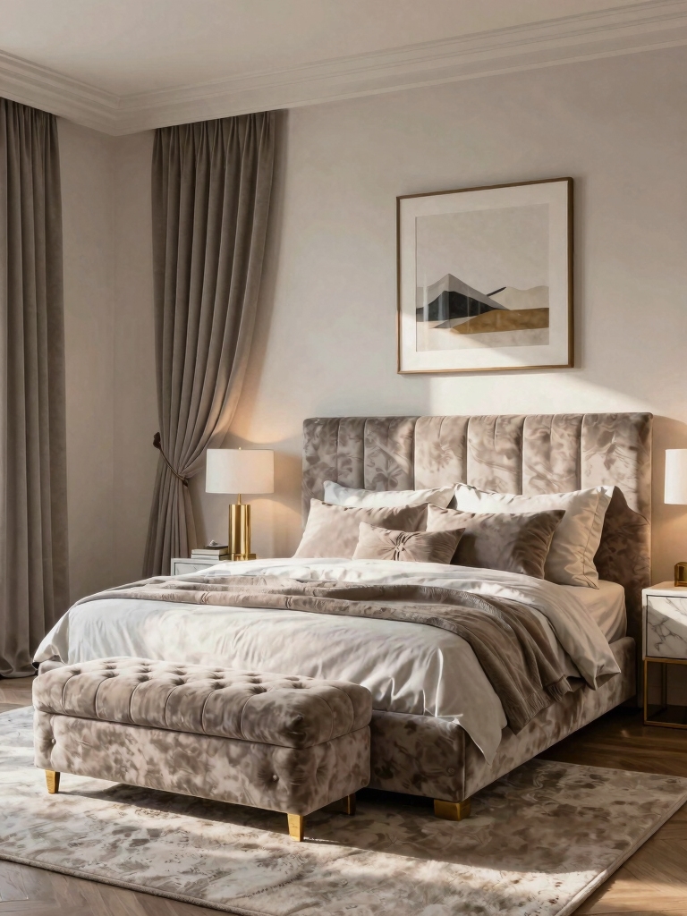
Incorporating comfy cozy bedroom ideas can instantly transform your space into a relaxing retreat.
Two-Tone Walls: How to Pull Off Bicolor Bedrooms
I’m sharing how to balance color proportions, so your two-tone look feels cohesive rather than choppy.
I’ll show how ceiling, trim, and wall colors can play distinct roles without competing for attention.
We’ll explore smart accent wall choices that tie everything together for a polished, inviting space.
Incorporating these ideas can also help create a cozy bedroom that maximizes both space and style.
Balanced Color Proportions
When balanced color proportions work, two-tone walls feel intentional rather than gimmicky, and the room instantly reads as calm and cohesive.
I choose a dominant shade for 60% of surfaces, an accent on 30%, and a small trim in 10%. This proportion guides mood, contrast, and depth without shouting.
- select a quiet main color
- pair a coordinating accent hue
- reserve contrast for focal areas
Ceiling and Trim Roles
Ceiling and trim aren’t afterthoughts; they’re the framework that pulls a two-tone bedroom together.
I treat them as deliberate design anchors: the ceiling can lift or soften the room’s mood, while trim defines lines and contrast.
When choosing colors, I align ceiling and trim with the dominant shade, ensuring balance, cohesion, and a crisp, polished finish throughout the space.
Accent Wall Strategies
Accent walls are a practical way to anchor a two-tone bedroom without overwhelming the space.
I love choosing one bold hue on a focal wall and balancing with a softer shade on the others, creating depth without chaos.
Key strategies:
- pick complementary tones
- keep patterns minimal
- test in daylight before committing
Gallery-Style Walls: Match Artwork to Wall Shades
Gallery-style walls can elevate a bedroom’s vibe by turning art into a cohesive narrative with your wall color.
I match frames and canvases to nearby hues, selecting grayscale or soft pastels for balance, or echoing a dominant shade for unity.
You’ll notice calmer spaces when artwork breathes with walls, not competes, guiding focal points without shouting.
Practical, polished results.
Quick, Budget-Friendly Paint Swaps That Transform
Quick, budget-friendly paint swaps can dramatically refresh a bedroom without a full redo.
I’ll show practical ideas you can tackle this weekend, without breaking the bank, that make a real difference.
- Swap white for soft gray or warm taupe on walls
- Accent a focal wall with a bold, cohesive color
- Refresh trim and doors in crisp, matching tones
Room-By-Room Color Map for Cohesive Design
A room-by-room color map helps you build a cohesive look without guessing.
I map tones that flow from entry to retreat, pairing neutrals with subtle accents so each space feels connected.
You’ll see how to repeat favorite colors in furniture, textiles, and trim, while allowing rooms to breathe.
This practical guide keeps shifts smooth and budget-friendly.
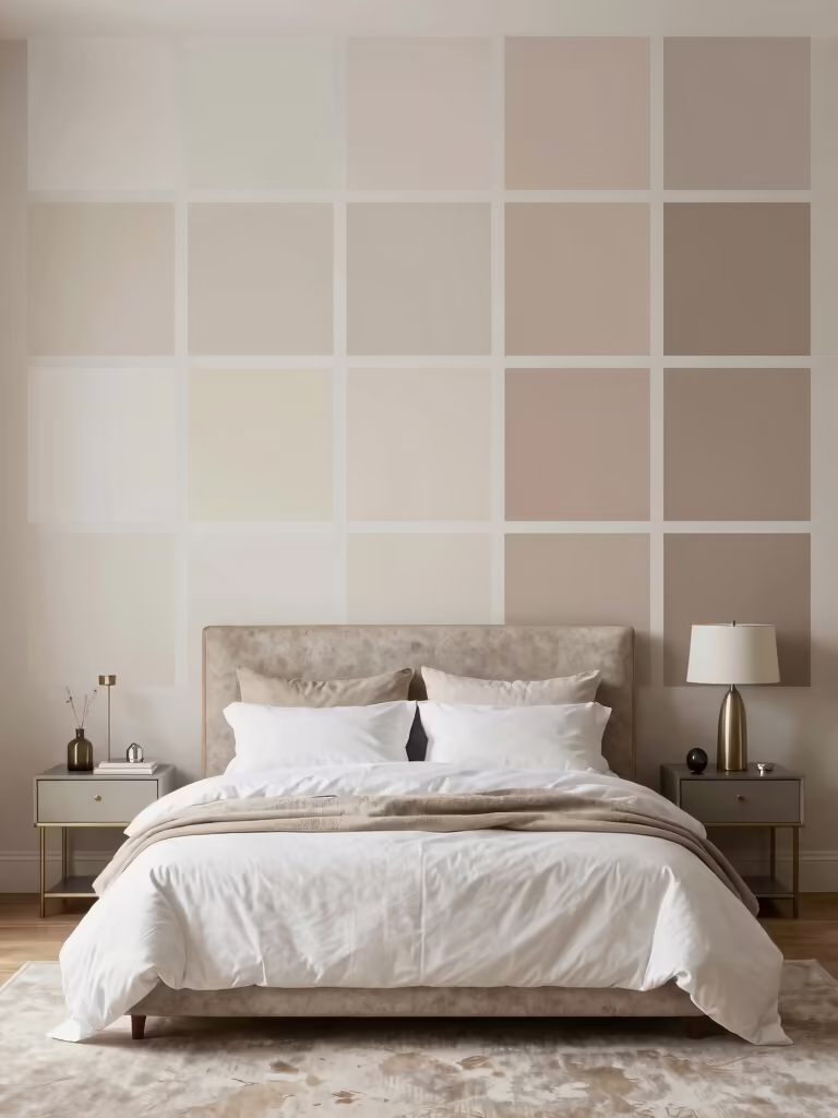
How to Test Paint Colors in a Real Bedroom
Testing paint in a real bedroom makes color feel tangible, not just swatches on a wall.
I recommend small patches, sample boards on different walls, and observing at various times of day to see undertones shift.
- test on large swatches
- observe under natural and artificial light
- compare next to furniture and bedding
Maintenance, Longevity, and Refresh Timelines for Paint
Maintaining a fresh, long-lasting paint job is about smart planning and simple habits. I’ll share practical timelines and tips you can trust.
Clean walls before touchups, use quality brushes, and match sheen to room use. Plan refreshes every 5–7 years, or sooner if wear shows.
Address mold, heat, and humidity promptly. A proactive schedule saves money and preserves color integrity.
Conclusion
I know color can feel like a leap, yet it’s really a doorway. You’re balancing calm and personality, like lullabies against a playlist. A soft neutral grounds the room; a misty blue breathes it awake; a warm terracotta invites conversation. Juxtapose quiet walls with an inky accent, then swap a swatch and see how light changes what you chose. Start small, dream big, and let your space tell your true rhythm.