Blue is the color people seem to sleep best in, and you can feel why the moment you step into a well-done blue bedroom: it is as if the air drops a few degrees and your shoulders come down. From a pale sky that brightens a small room to a deep navy that cocoons it, blue does calm better than any other color. That is why blue lovers swear by these bedroom ideas.
Below are 20 ways to get blue right, from choosing your shade to balancing navy so it never feels heavy. The whole trick is pairing blue with warmth, texture, light wood, and warm bulbs, so the room feels serene and warm.
Getting Blue Right, in Short
Blue is the most calming color you can put in a bedroom, but it tips cold fast without warmth to balance it. Pair your blue, sky or navy, with warm wood, soft texture, and warm bulbs, and the room feels restful rather than chilly.
Match the shade to the room: light, airy blues open up a small or dark space, while deep navy cocoons a bigger, brighter one. Lean on one or two blues plus a neutral, and let texture carry the rest.
The Calm, Serene Case for Blue
Blue earns its reputation as the bedroom color because of what it does to your nervous system. The research on rest keeps pointing to cool, calm tones, and blue feels restful to almost everyone. It lowers the visual noise of a room, which is exactly what you want where you sleep.
Calm, and never boring
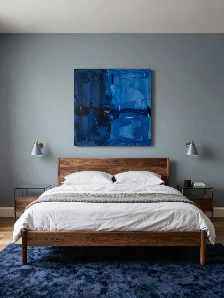
It is also endlessly flexible. Blue spans from breezy coastal sky to deep, moody navy, so it suits a beach cottage and a city apartment equally. Whatever your style, there is a blue that fits it, which is rare for a color with this much personality.
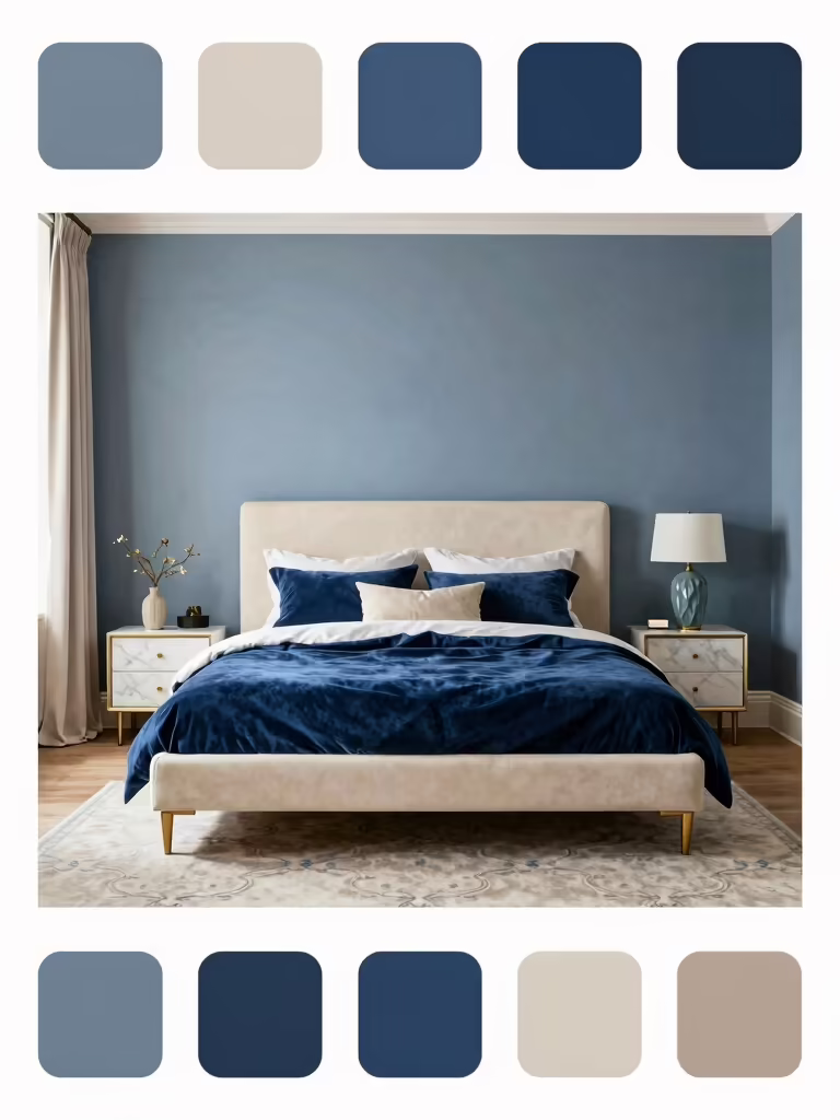
The reason I turn to blue in a restless bedroom is that it calms a room down without going beige-boring. I have painted a too-busy room a soft slate blue and watched it settle on the spot. For a fuller palette plan, our a bedroom color scheme helps you build around it.
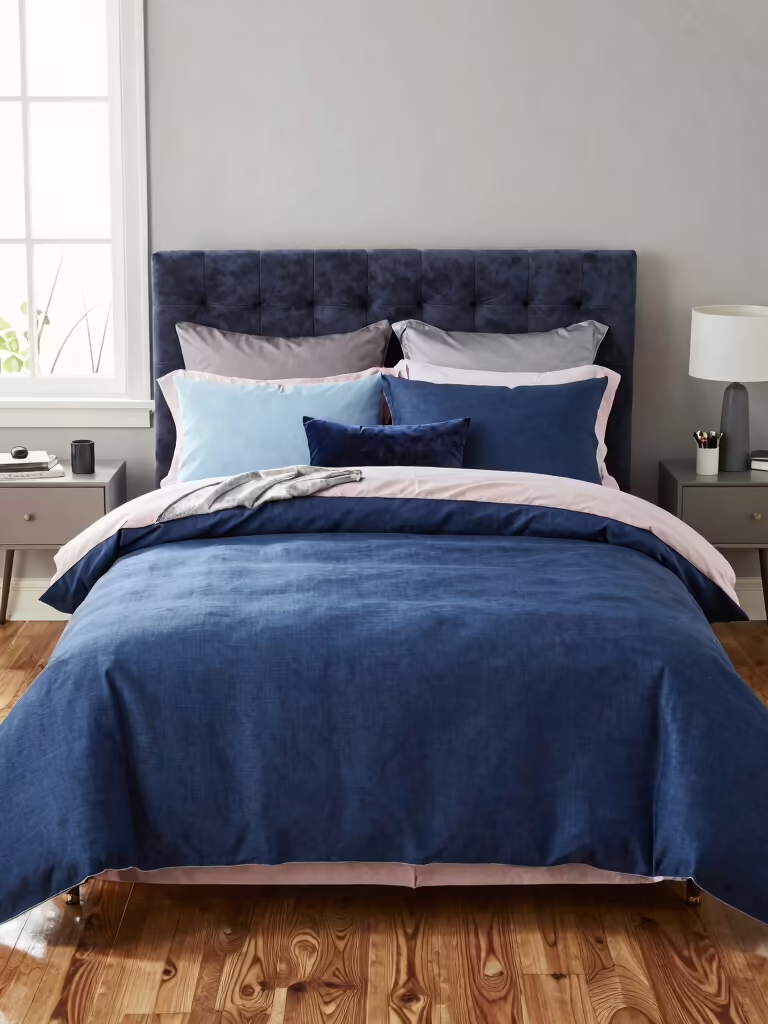
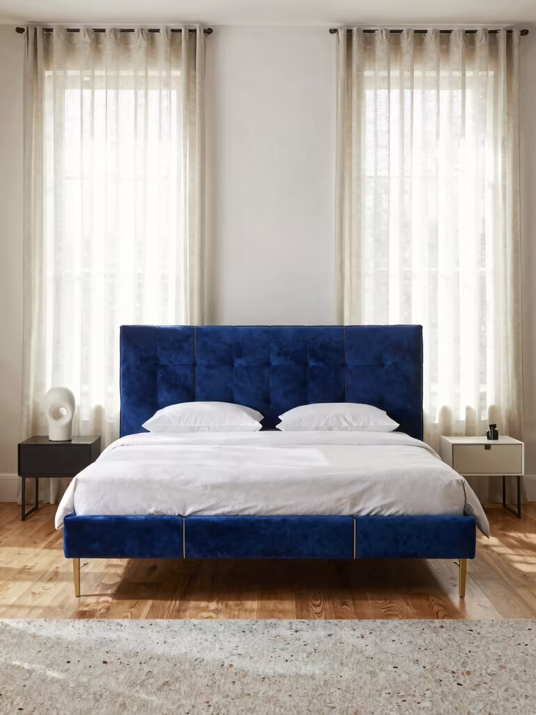
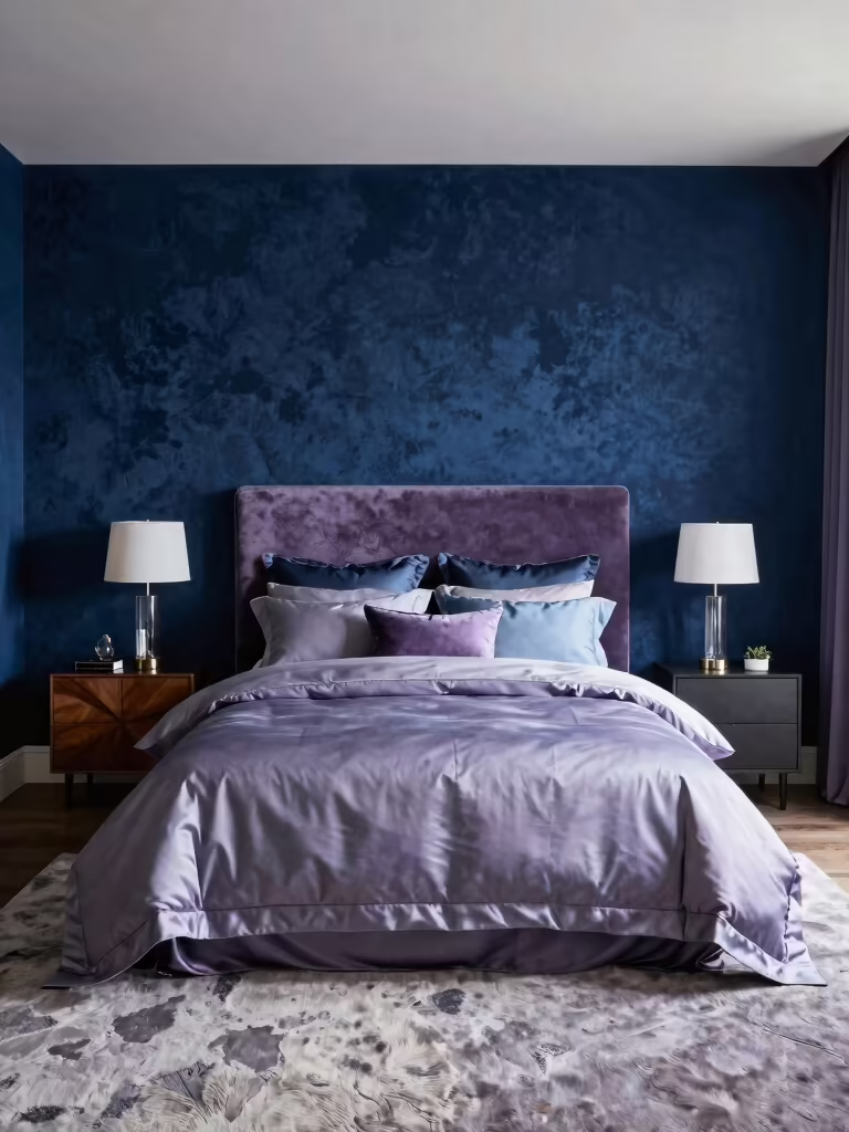
Balance Navy Without Feeling Heavy
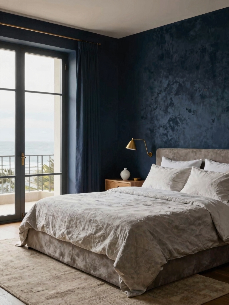
Navy is the most beloved bedroom blue and the easiest to overdo. The depth that makes it luxe can also make a room feel heavy when you pile it on. Less is more with navy. Keep it balanced in this order:
- Use navy on one surface, a wall, the bed, or the curtains, not all three
- Break it up with plenty of white or warm neutral
- Add warm wood and brass so the navy looks rich and deep
- Keep the bulbs warm, since navy under cool light goes flat and cold
- Leave breathing room so the depth feels intentional
👍Where blue shines
- +Calms a room better than almost any color
- +Spans sky to navy, so it suits any style
- +Pairs beautifully with white, wood, and brass
👎Where it needs help
- –Tips cold without warm light and texture
- –Heavy navy can shrink a small or dark room
- –Too many blues at once read busy, not calm
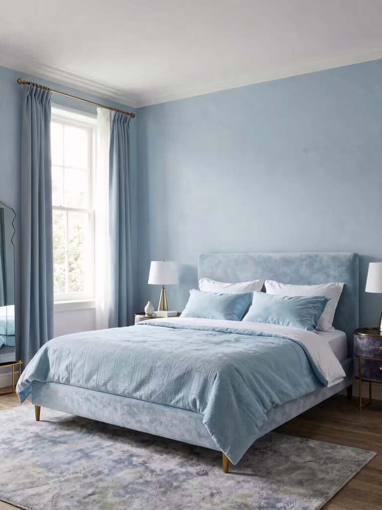
Open Up a Room With Airy Light Blue
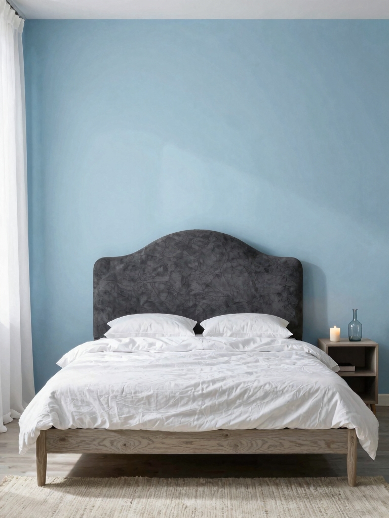
If your bedroom is small or short on light, a pale sky blue is your friend. Light blues bounce daylight back into the room, so the walls feel like they step back and the room looks bigger and brighter. It is the calm of blue with none of the weight. Lead with sky. The shade I default to in a dark room is exactly this kind of soft sky.
Keep the trim bright and the furniture light to push the airy feeling further. A few navy or teal accents add depth so the room keeps some weight. For more ways to stretch a small space, our make a small room feel bigger pairs well with a light-blue palette.
Layer Blues in a Balanced Way
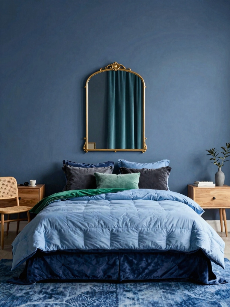
Blue is one of the few colors you can layer with itself, as long as you keep it balanced. Mix navy, powder, and denim over a neutral base, vary the scale of any patterns, and the room stays collected and calm. Repeat a shade two or three times so the layering looks deliberate.
Leave negative space between the blues so the eye can rest. If a print starts to overwhelm, dial it back to one patterned piece and let the rest stay solid. The goal is a cohesive range of blues, all part of one calm story.
- Start with a neutral or white base, then build the blues on top
- Mix one or two patterns, repeating the motif, and keep the rest solid
- Vary the depth, a pale wall, a navy throw, a denim cushion
- Leave plenty of plain space so the layers breathe
Build a calm blue palette in four steps:
1Pick your lead blue
Sky blue to open a small room, navy to cocoon a bigger one; commit to one as the star.
2Set a neutral base
Warm white or cream on the walls or big pieces so the blue has room to breathe.
3Layer the texture
Linen, velvet, and wicker in your blue range add the warmth a cool color needs.
4Warm the light
Swap to 2700K bulbs on a dimmer so the blue glows cozy after dark.
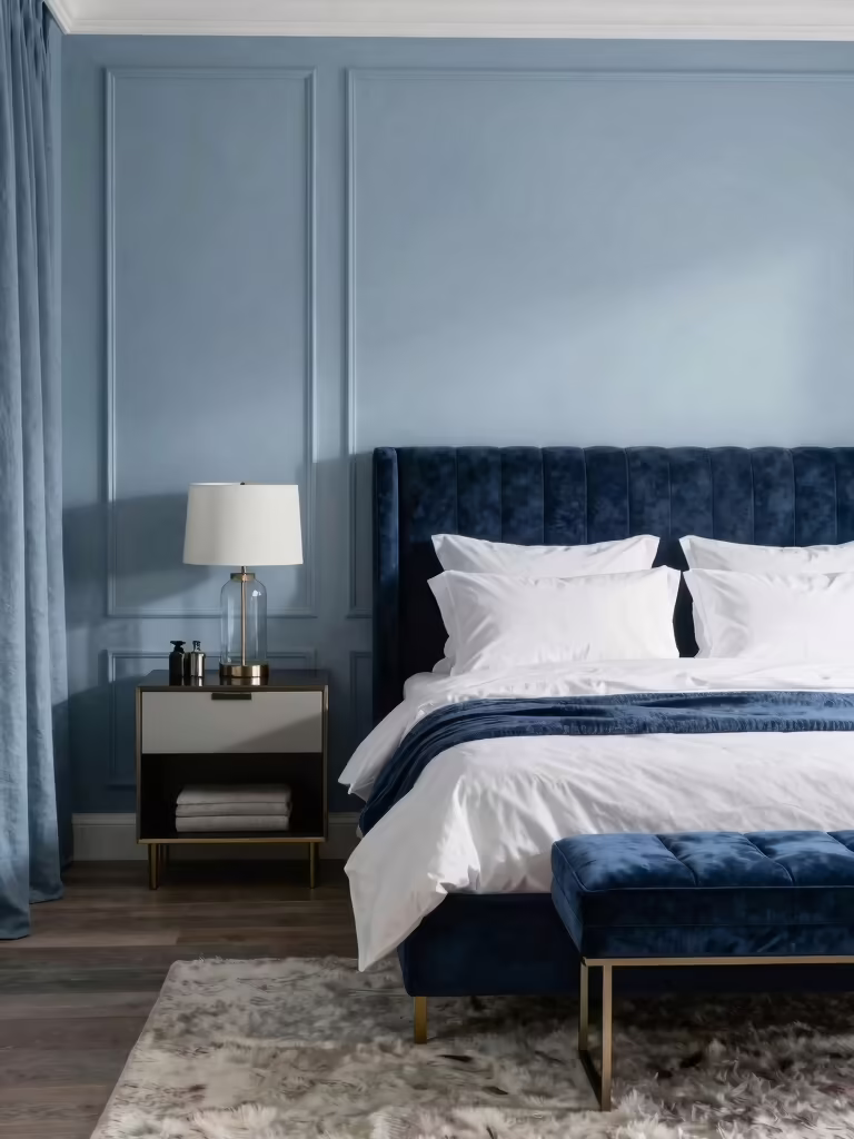
Bring Blue Alive With Texture
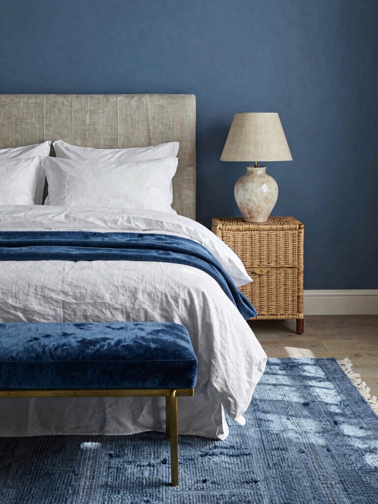
Texture is what stops a blue room from feeling flat or chilly. The same navy in velvet, linen, and wicker looks completely different, and mixing them adds the warmth blue needs. Texture warms it. Build the texture in this order:
- Start with crisp linen on the bed for an airy, breathable base
- Add velvet in a deeper blue for warmth and a soft glow
- Bring in wicker or rattan to ground the cool tones
- Layer a wool or jute rug so the floor feels warm underfoot
- Keep the textures in your blue range so they read as one story
Common Blue Mistakes to Avoid
The mistake I see most in blue rooms is letting them go cold. Blue plus cool white bulbs plus zero warm materials feels clinical, like an office. The fix is always warmth. Warm it up. Warm 2700K bulbs, wood tones, and soft texture pull a blue room back to cozy.
The other big one is too much navy in a small, dark room, which can feel like a cave. If your space is tight or low on light, lead with sky blue and save navy for accents. Match the depth of the blue to the light you actually have, and the color works with the room.
Light a Blue Room Warm
Lighting makes or breaks a blue bedroom, since blue is the color most likely to go cold under the wrong bulbs. Warm 2700K bulbs counter the coolness and keep the room inviting, while cool, bright bulbs make even a soft blue feel clinical. This is the cheapest fix in the room.
Layer a few warm sources, bedside lamps, a floor lamp, a low accent, and set the overhead on a dimmer you turn down once the sun is gone. For where each light belongs, our layered lighting guide helps, and a five-minute bulb swap is the difference between cozy blue and cold blue.
Pair Blue With the Right Neutrals and Metals
Blue gets most of its warmth from what you pair it with, so the neutrals and metals matter as much as the blue itself. Warm whites, soft tans, and natural wood keep it cozy, while the right metal adds a finishing glint. Skip the cool grays that pull blue further toward cold.
- Warm white or cream over a stark, cool white
- Natural wood and rattan to ground the cool tones
- Brass or gold for warmth, or matte black for a crisp edge
- A soft tan or camel leather accent for contrast
Add Greenery and Natural Touches
Blue and green are next-door neighbors in nature, so plants belong in a blue bedroom. A leafy plant or two pops fresh against navy and softens the cool palette with something living. Green loves blue. The pairing feels coastal, organic, and calm all at once.
Choose forgiving greenery so it survives, and lean on natural materials, wood, stone, woven baskets, to warm the scheme further. One larger plant by the window does more than a row of small pots, and it brings the outdoors into a palette already inspired by sky and water.
Refresh the Blue by Season
Blue takes seasonal swaps beautifully, since the same base reads breezy in summer and cozy in winter depending on what you layer. Lighter linens and crisp white in summer, deeper navy throws and warm texture in winter, keep the room feeling current without a repaint.
Keep the walls and big pieces in your core blue and rotate the cheap accents every few months. A new throw, a fresh stem, a swapped cushion costs little and resets the mood. For an even softer take on a pale palette, our baby blue done right is worth a look.
Bring Blue In Without Painting
You do not have to paint a wall to get a blue bedroom. Renters and the commitment-shy can bring the color in through textiles and decor alone, and it reads just as intentional. Start with the bed, since that is the biggest surface, and build out from there with a few blue accents.
- A navy or chambray duvet as the anchor, around $70-140
- Two or three blue cushions in mixed shades and textures
- A blue-and-white patterned rug to ground the room
- Blue art or a framed print for a no-commitment wall moment
Match the Blue to the Room’s Light
The same blue can look completely different from one room to the next, so test it before you commit. North-facing rooms run cool, which can push a blue toward gray and gloomy, while south-facing rooms stay warm enough to carry a deeper navy. A sample pot for a few dollars saves an expensive mistake.
Paint a big swatch and live with it for a day. Look at it in morning light, in the afternoon, and under your warm bulbs at night, since blue shifts more than almost any other color across the day. The shade that looks perfect at noon can turn chilly by evening, and only the wall test will tell you.
Blue, Done Calm and Warm
Blue lovers swear by it for good reason: no color calms a bedroom faster. Balance the cool. The only rule that really matters is to answer the cool with warmth, the right shade for your light, warm bulbs, wood, and texture, so the room feels calm and warm.
So pick your blue, the airy sky or the deep navy, and start with one surface and warm light before you go further. Build the rest slowly, and you will end up with the kind of calm blue room people never want to leave.