Color works on you before you’ve thought about it. You feel it first. A soft sage slows your breathing; a deep indigo makes a room feel like a cocoon; a crisp pastel lifts a groggy morning. The smartest way to pick a bedroom color is to start from what you need the room to do for your mood, then choose the shade that delivers it.
These bedroom color ideas are matched to function: the colors that help you sleep, the ones that wake you up gently, the ones that wrap you in calm at night. We’ll work through grounding neutrals, soft pastels, bold accents, and dramatic darks, with how each affects mood and the room it suits. Match the color to the job and the room finally works the way you want.
Color, Matched to Your Mood
Different colors do different jobs: grounding neutrals settle a busy mind, soft pastels lift and soothe, deep tones cocoon for sleep, and one bold accent adds energy while the rest stays calm.
Match the color to how you actually use the room and how its light falls, then test it before committing. The right shade for your mood depends as much on your daylight and your routine as on the trend of the moment.
Define Your Bedroom Mood and Goals
Before any swatch, get clear on what you need the room to do, since color is a tool for a job, not just decoration. A bedroom can be built to help you sleep deeply, wake gently, or feel calm after a hard day, and different colors serve different goals. Name the goal first. The right family of shades gets obvious fast once you do.
- For deep, restful sleep, lean toward soft, muted, low-stimulation tones.
- For gentle, brighter mornings, choose airy pastels and warm whites that lift the light.
- For a cocooning, wind-down feel, go deeper and moodier, with warm accents to keep it cozy.
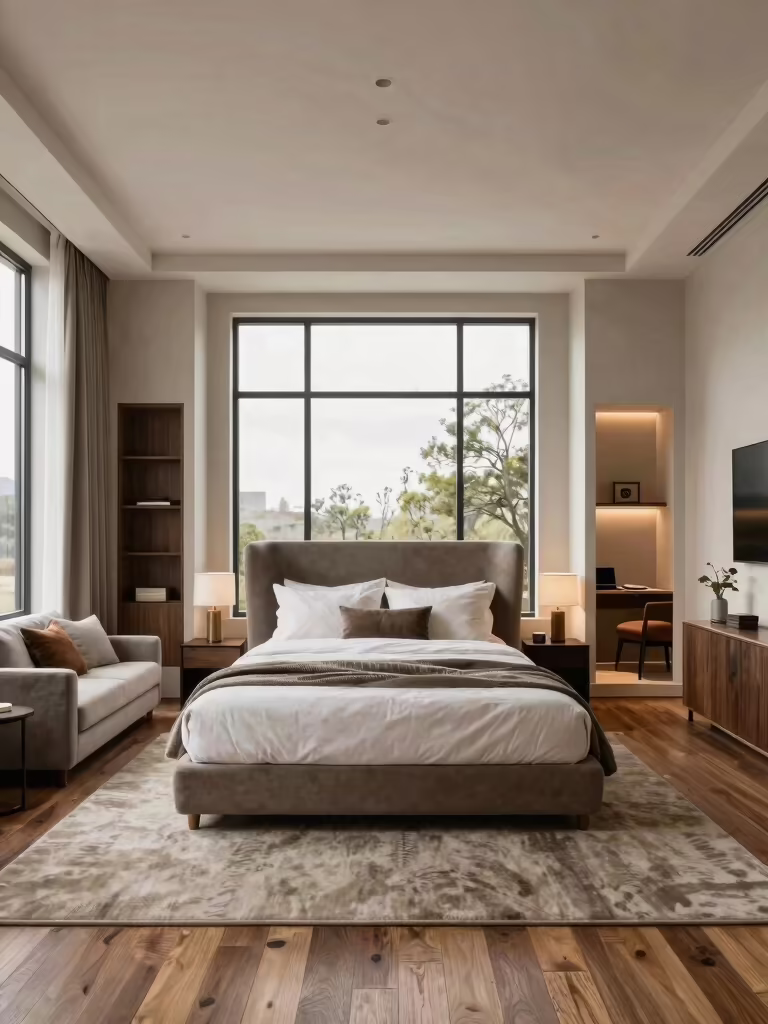
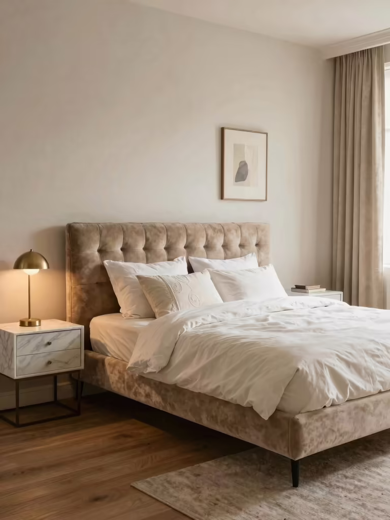
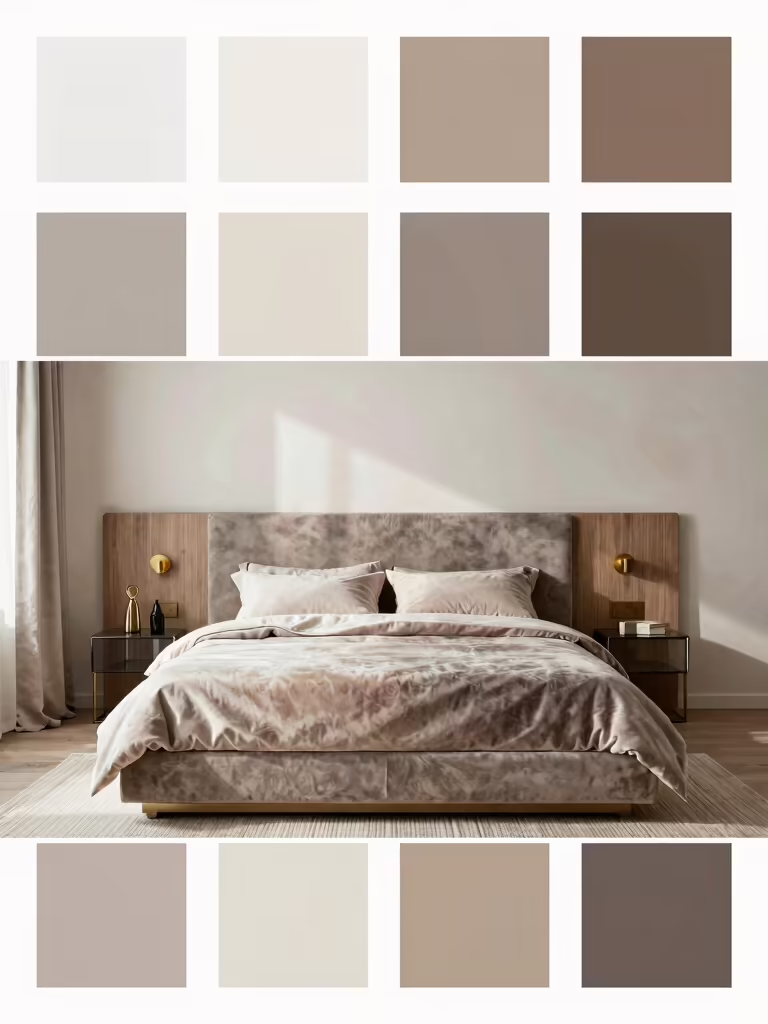
Grounded, Cozy Neutral Tones
When the mood you need is steady and settled, grounded neutrals do it. A warm greige, a soft taupe, or a stone with a little depth anchors a busy mind and gives the rest of the room a calm stage to sit on. These are the colors that lower the volume in a space, which is what an overstimulated brain wants at bedtime.
Keep grounded neutrals from going flat by leaning warm and layering texture. A neutral with a hint of clay or caramel feels cozy where a cold gray turns bare, and linen, wool, and pale wood add the depth that makes a quiet palette interesting. This is the most forgiving mood-color of all, which is why it suits nearly any bedroom and sleeper. My [cozy bedroom color palette guide](cozy-bedroom-color-palette-ideas-changing) covers warm neutral pairings.
- Choose a warm-toned neutral (greige, taupe, warm stone) to settle the room and the mind.
- Layer linen, wool, and wood so the calm palette gains depth, not boredom.
- Add one slightly deeper accent so the neutral has a point of focus.
“Before picking a single shade, write down the one thing you most want the room to do for you: sleep deeper, wake gentler, or feel calm after work. That goal narrows a paralyzing wall of paint chips to a handful of shades worth testing, and it keeps you from chasing a trend that fights your actual mood.”
Soft Pastel Bedroom Decor
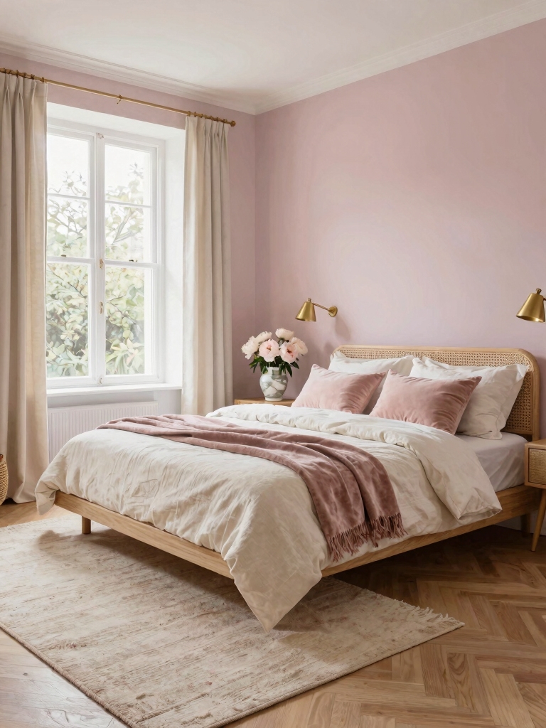
For a mood that’s gentle, light, and quietly uplifting, soft pastels are the move. Blush, mint, powder blue, and the palest lavender bring a fresh, airy feeling that suits a room you want to wake up happy in. The trick is restraint. Keep them muted and grown-up so they soothe instead of reading nursery. Build a pastel mood like this.
- Pick chalky, muted pastels over candy-bright ones so they feel calm and mature.
- Pair them with warm white and light wood to keep the room warm and grown-up.
- Use matte finishes and soft textures so the pastels stay soft and matte.
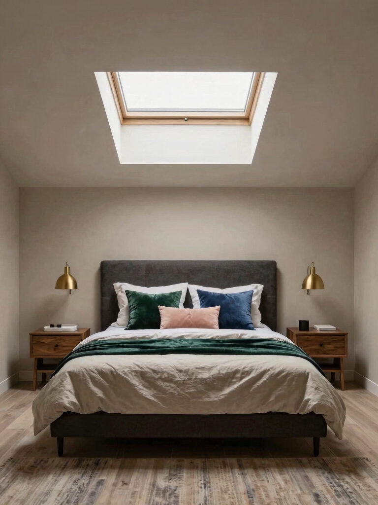
Bold Accent Wall Transformation
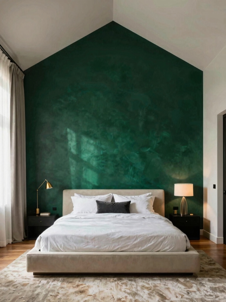
When the mood you want is a jolt of energy or personality without committing the whole room, a bold accent wall delivers. A single saturated wall (behind the bed is the classic spot) adds drama and a focal point while the other walls stay calm. It’s the lowest-risk way to bring a strong color’s mood into a bedroom, and one afternoon undoes it if you change your mind, which makes a daring shade feel safe to try.
Choose the accent color for the feeling you’re after and pull it from your palette. A deep terracotta or mustard warms and energizes, a forest green grounds and calms, a navy adds quiet drama. Keep the rest of the room neutral so the accent leads, then echo its color once or twice in textiles so the wall reads intentional. For more on balancing bold color, see my [aesthetic room color ideas for any bedroom](aesthetic-room-color-ideas-bedroom).
- Put the bold color on one wall, usually behind the bed, and keep the others calm.
- Match the accent to the mood: warm tones energize, deep greens and blues ground.
- Echo the accent in a pillow or piece of art so it ties into the room.
💡Color Tip
Test every shade against your bedding and your light, not just the wall. Tape a big swatch beside the duvet and look at it in morning and lamplight. The mood comes from the whole grouping, so a color that works with your sheets and your bulbs is the one that will actually deliver the feeling you want.
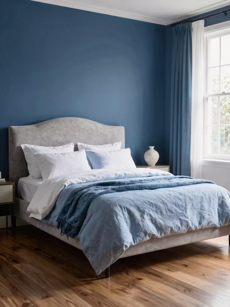
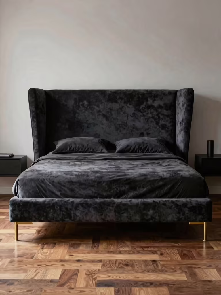
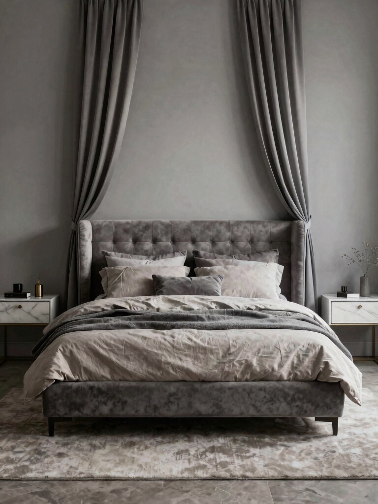
Dramatic Charcoal and Indigo
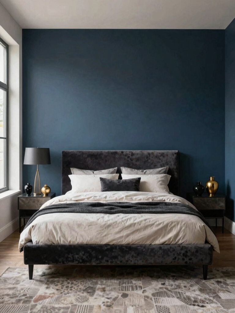
For the deepest, most cocooning mood, dramatic darks like charcoal and indigo wrap a bedroom in restful intensity. A dark room reads enveloping and quiet. Many people find it easier to sleep in, and it gives a bedroom a grown-up, hotel-suite drama. The key is warmth. Warm the dark and it cocoons instead of looming.
Warm the Dark So It Cocoons
Balance the depth with warmth and a little light. Pair charcoal or indigo with warm brass, natural wood, and soft textures, and keep the lighting low and warm so the dark color glows rather than flattens. A few well-placed lamps make a dark room feel intimate; one harsh overhead makes it feel like a cave, so layer the light carefully.
Decide between a full dark room and a partial commitment based on your light and nerve. A bright room can carry charcoal on every wall; a dim one might do better with a dark accent wall or a dark ceiling over lighter walls. Either way, the deep tone is what delivers that wrap-around, lights-out-and-sink-in mood. My [bedroom lighting ideas for mood](bedroom-lighting-ideas-mood) cover lighting a dark room well.
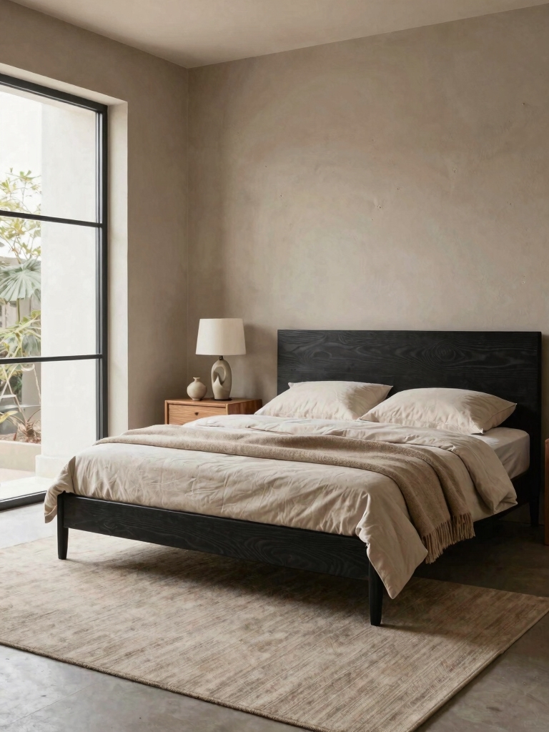
How Light Changes a Color’s Mood
The same color can deliver two completely different moods depending on the light, which is why testing matters so much. A north-facing room gets cool light that pushes colors gray and chilly, so warm tones hold their mood best there; a south-facing room gets warm light that lets cool blues and greens stay fresh. Read which way your windows face before you fall for a shade.
Artificial light shifts the mood again after dark. Warm 2700K bulbs deepen a cozy or moody color and keep a neutral inviting, while cool white bulbs drain warmth and flatten the feeling you were going for. Match your bulb temperature to the mood you want, and put the main light on a dimmer so the room can change character from morning to night.
Always test a color in your own room, at your own hours, before you commit. Brush a big swatch on a couple of walls and look at it at breakfast, midafternoon, and lamplit night. A color that nails the mood at noon can betray it by evening, and a few dollars of sample paint is far cheaper than a whole-room repaint and a mood that never lands.
Pairing Color With Texture and Light
Color sets the mood, but texture and light decide whether it fully lands, so treat them as a trio. I’ve watched the same sage go spa-calm beside linen and matte paint, then turn preppy and crisp next to glossy white trim, which taught me the finishes decide the mood almost as much as the color does. Choose fabrics and finishes that push the color toward the feeling you actually want.
Layer the lighting to support the color’s job. A wind-down mood wants warm, low, dimmable light; a wake-up mood wants brighter, cooler morning light from a clear window. Letting the lighting flex through the day means one wall color can serve both a calm night and an alert morning, which is the quiet power of pairing color with adjustable light.
Repeat the color a few times so the mood reads as a plan. Echo your main shade in a wall, a textile, and a piece of art, and the room feels composed rather than accidental. Color, texture, and light working together are what turn a nice paint choice into a room that truly shifts how you feel when you walk in.
Budget Color Moves for Any Mood
Shifting a room’s mood with color barely dents a budget, which is the best part. A single gallon of paint resets the whole feeling of a bedroom for the price of takeout, and an accent wall needs even less. Before pricing furniture, a thoughtful color change is the cheapest mood upgrade a room can get.
Stretch it further with the supporting layers that cost little. Warm bulbs and a dimmer shift the mood for a few dollars, swapped pillow covers and a throw bring the color into the room without repainting, and removable wallpaper trials a bold mood with zero commitment. These small moves let one color choice carry several feelings over time.
Save the real money for the textiles you touch and the light you live under, since those carry the mood nightly. A quality throw, good bedding, and warm dimmable lighting are worth the spend, while art and accents that echo your color look just as rich thrifted. Spend where the mood lives and the room delivers far above its receipt.
Common Mistakes to Avoid
The most common color mistake is choosing for a photo instead of for your life. A shade that looks dreamy on a screen or a store chip can land cold, flat, or jarring in your actual room and routine, so always match the color to your light and your goal, then test it. The second mistake is too much contrast in a sleep space, since high-contrast schemes energize when a bedroom usually wants to calm.
The other frequent slip is stopping at the paint. Color alone, with no thought to the bulbs or the textures, often disappoints, because a beautiful shade under cold light and against flat surfaces loses the mood it promised. Pair the color with warm or cool light to match its job and layer in texture, and the mood you painted for actually shows up come evening and again the next morning.
Pick the Mood, Pick the Color
The best bedroom color is the one that does the job your mood needs, whether that’s settling a busy mind, lifting a slow morning, or cocooning you for sleep. Name the goal, choose the color family that serves it, test it in your own light, and back it with the right bulbs and fabrics. Matched to its purpose, color does more for how a room feels than anything else you can buy.
Decide what you most need from your bedroom, then let one well-chosen color get you there, day and night.