I’ve lined up 14 bedroom color palettes—from calming neutrals to moody drama—so you can pick a vibe that fits your routine, light levels, and texture desires without overthinking it. Start with brightness goals, mood, and function, then mix textures like linen and wood for warmth. Try soft pastels for airy serenity or moody hues for cozy drama, pairing warm whites or blacks against crisp textiles. Want a foolproof path? Stick with one family, varied finishes—and yes, there’s more to uncover.
Define Your Bedroom Color Goals: Brightness, Mood, and Function
Color goals aren’t just about looks—they’re about how you live in the room.
I start by asking what brightness you need for morning routine, what mood helps you wind down, and what functions the space must support, from work to lounging.
I’ll map colors to those needs, then test with samples, tweaking until it feels effortless and livable.
Choosing the right hues can transform your space to match every mood.
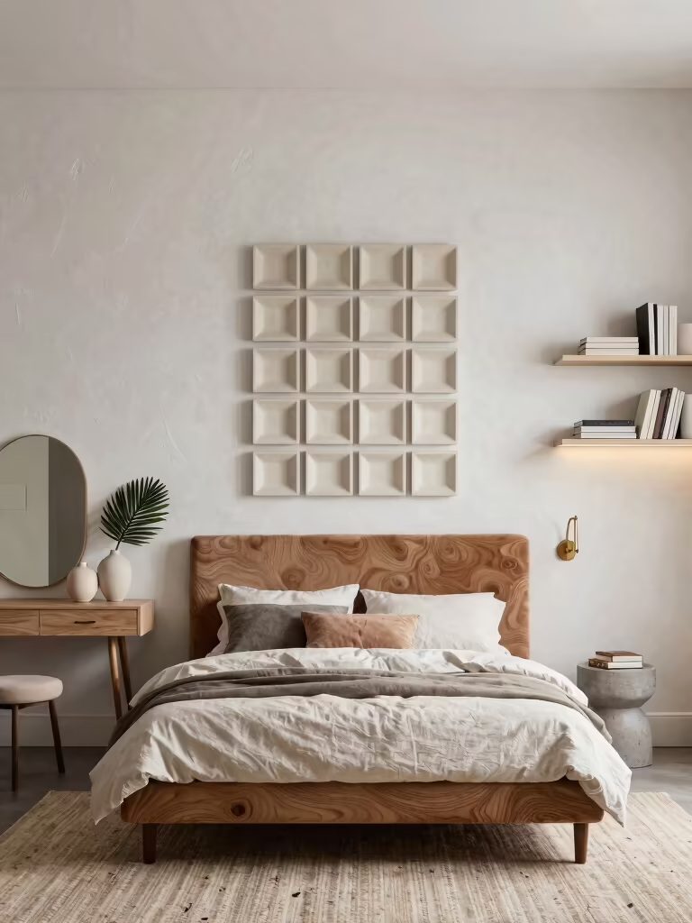
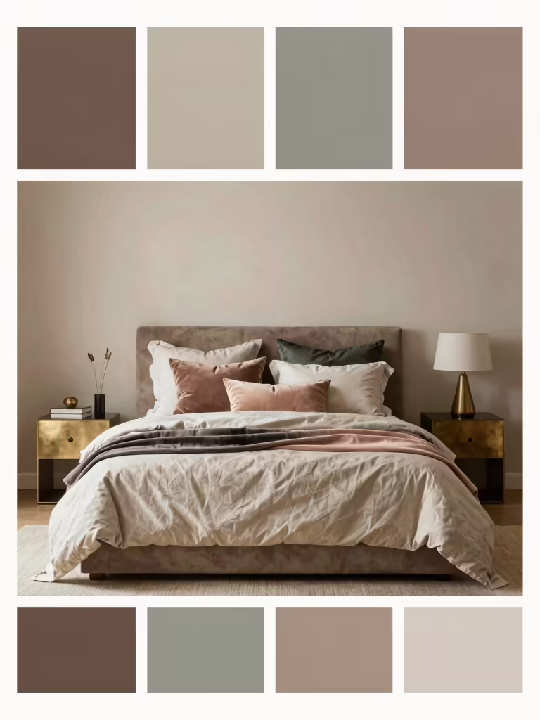
Calming Neutrals for Everyday Calm
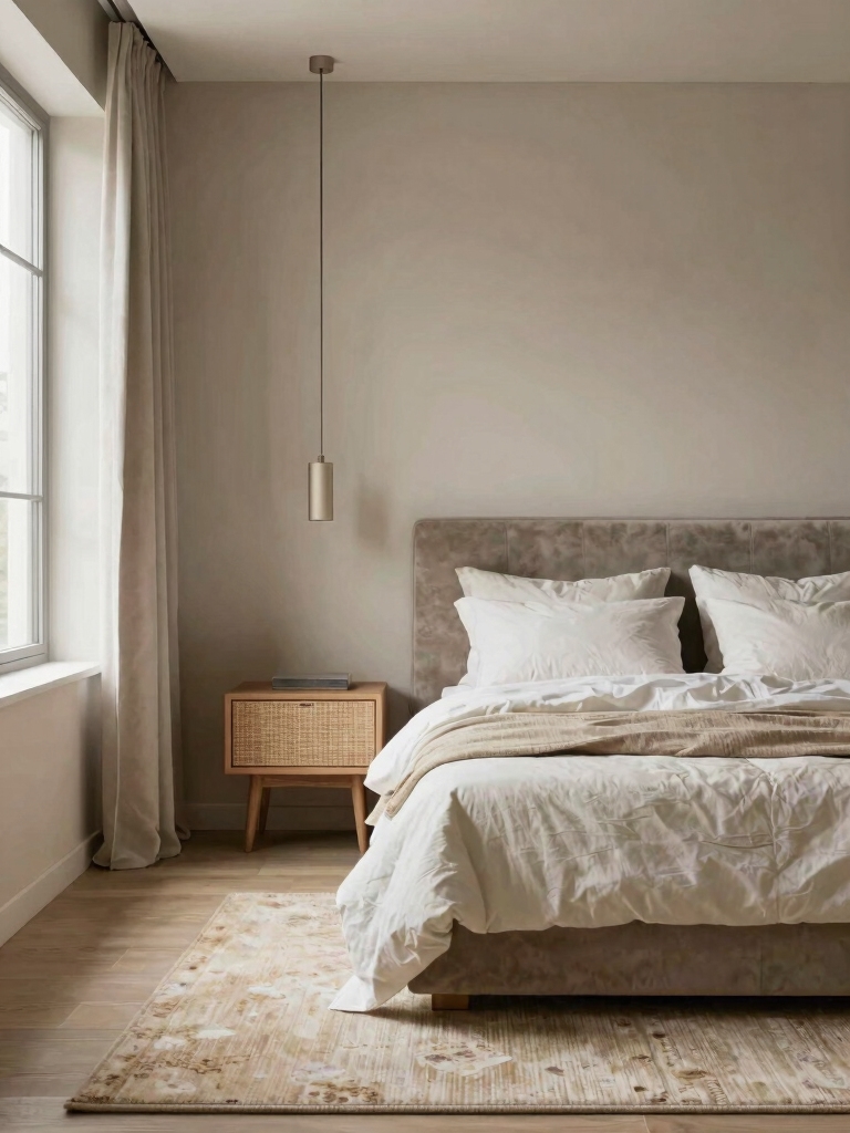
I’ll be honest: calming neutrals aren’t boring when they’re paired with everyday comfort, like a soft rug and a cozy throw.
I’m drawn to soothing neutral palettes that feel effortless yet intentional, so your space stays serene if life gets loud.
Let’s explore simple, practical combos that keep the mood calm without dulling the room.
In small bedrooms, incorporating aesthetic ideas for cozy bedrooms can enhance the calming effect without overwhelming the space.
Everyday Neutral Calm
Soft, soothing neutrals are the secret weapon for a calming bedroom, and they’re not boring—just smart.
I lean into warm beiges, dove grays, and creamy whites for everyday calm, pairing them with simple textures. You’ll feel grounded without losing personality—no loud accents needed.
Keep surfaces uncluttered, light layers, and subtle contrast; the room breathes, invites rest, and stays adaptable for life’s varied moods.
Soothing Neutral Palettes
- Cozy textiles layer depth without shouting
- Warm undertones unify wood, brass, and linen
- Whites stay creamy, not stark
- Accent colors pop softly through art, pillows, and greenery
Soft Pastels for Subtle Serenity
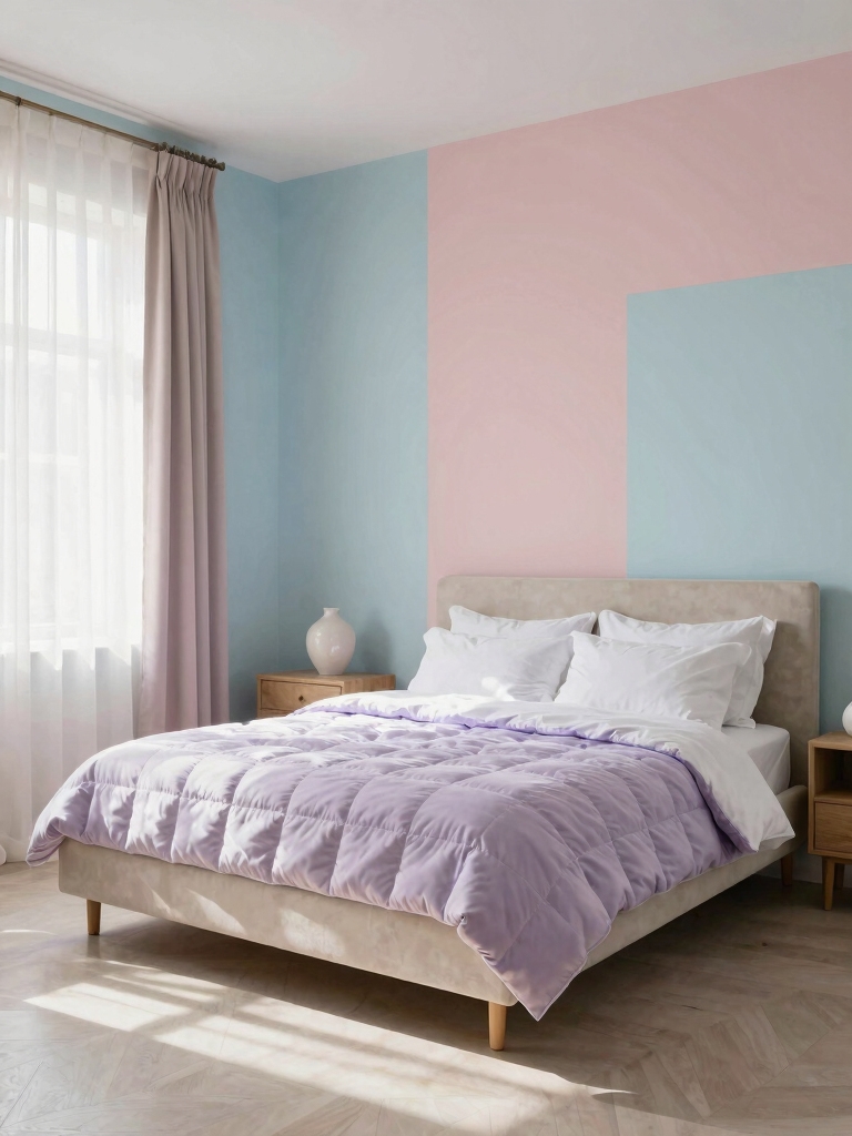
Soft pastels set a soft-goal vibe for serenity, so I’ll start with gentle hues and a calm eye on lightness.
I’ll show how soft hues pair with subtle calm, create a tranquil palette, and keep the room feeling airy rather than loud.
We’ll explore how lightness through accents—like pillows, throws, and a touch of metallic—keeps the space bright without shouting.
Sage green, in particular, is an emerging favorite for bedroom palettes due to its ability to embrace tranquility and enhance a restful atmosphere with its calming qualities.
Soft Hues, Subtle Calm
Soft pastels create a calm bedroom mood, and I’m a fan of using them as the backbone of a serene space.
I’ll keep things simple, playful, and practical.
- Whisper-soft wall tones that read as breathable air
- Subtle contrast with crisp white trim
- Textures that catch light without shouting
- Thoughtful accents that don’t overpower serenity
Tranquil Palette Pairings
If you want serenity without staring at the same shade all week, pair soft pastels with grounded neutrals to keep the look fresh and breathable.
I mix whisper pinks with taupe and sage accents, then balance them with clean white bedding.
The result is calm, cohesive spaces that feel intentional, not pastel-pattered chaos.
Practical, approachable, and quietly chic.
Lightness Through Accents
Lightness in a bedroom doesn’t come from a single shade but from the way soft pastels play with the room’s light.
I’m all about practical tweaks that feel effortless, not fussy. Let gentle pinks, blues, and greens do the talking, then keep accents minimal but meaningful.
- Pair pastel walls with bright white linens
- Add metallic accents for sparkle
- Use woven textures for warmth
- Layer sheer curtains to diffuse daylight
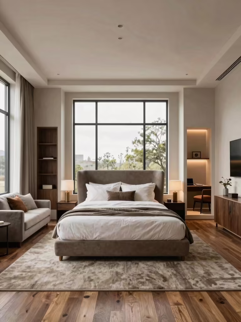
Moody Hues for Cozy Drama
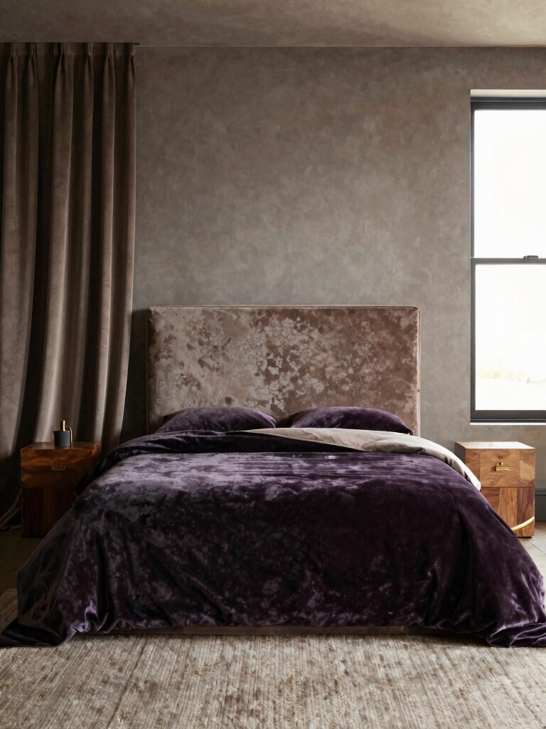
Dark, moody hues can transform a bedroom from a sleepy retreat into a retreat that feels almost cinematic, and they’re easier to pull off than you might think.
I mix charcoal, deep sapphire, or moss with warm wood and soft lighting, keeping textures inviting.
I avoid stark contrasts, lean into calming undertones, and let statement silhouettes—art, bedding, rug—do the mood lifting.
In particular, a dark green room can create a rich, immersive atmosphere that elevates the overall design with moody bedroom inspiration.
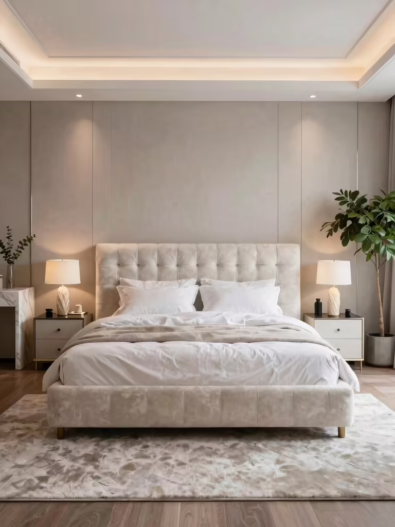
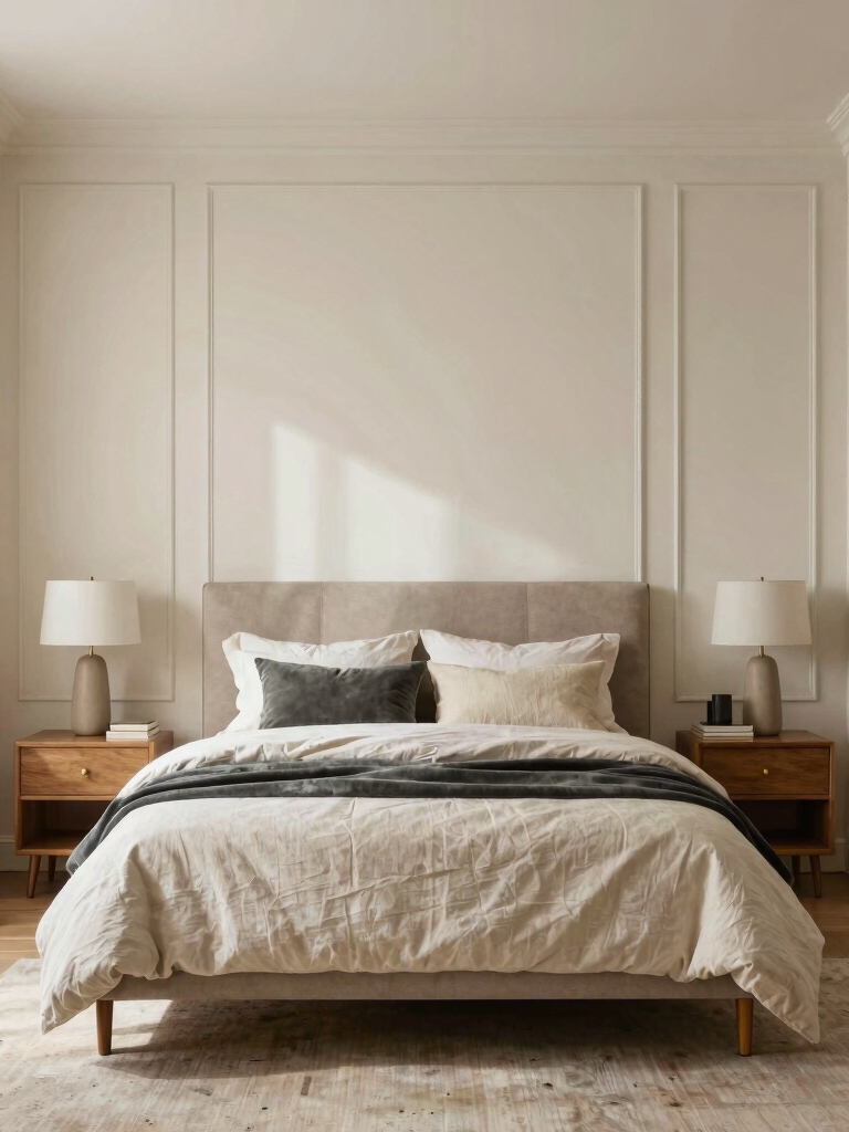
Fresh Whites With Warm Undertones
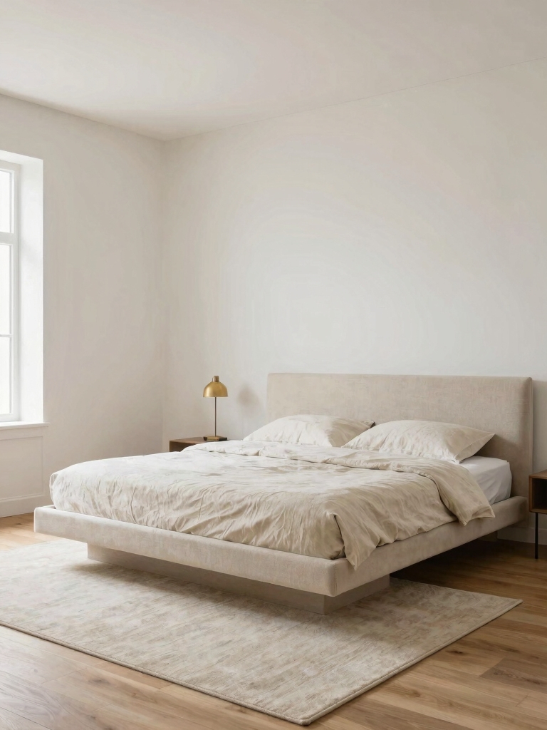
I’m all about fresh whites with warm undertones that keep a room feeling airy without sounding sterile.
Think warm-toned whites for subtle brightness balance, so the space reads open but cozy, not clinical.
It’s the easy base for cozy neutral vibes that still feels deliberate, not bland.
Incorporating colors like black, white, beige, and grey can enhance cozy warmth and create an elegant neutral bedroom atmosphere.
Warm-Toned Whites
- Reflective, not flat, sheen helps rooms feel bigger.
- Warm undertones read as inviting, not clinical.
- Pair with cream or oatmeal accents for depth.
- Test samples at different times of day to confirm warmth.
Subtle Brightness Balance
But the trick with fresh whites and warm undertones is balancing brightness with coziness, so the room feels open without reading sterile.
I pair bright walls with creamy accents, keep lighting layered, and choose furnishings with soft edges.
Too much glare steals warmth, so I introduce texture—linen, wood, plush textiles—to ground the space and invite restful, practical charm.
Cozy Neutral Vibes
Fresh whites with warm undertones read as calm, inviting, and endlessly versatile. I’m guiding you through Cozy Neutral Vibes, where clean walls meet soft textiles and subtle textures.
You’ll feel relaxed yet polished, with practical tips you can actually implement tonight. Let’s build warmth without clutter, using layered neutrals, cozy fabrics, and thoughtful contrast.
- Use warm white base with cream accents
- Introduce texture via linen, wool, and wood
- Add gentle color pops in small doses
- Keep surfaces uncluttered for serene vibes
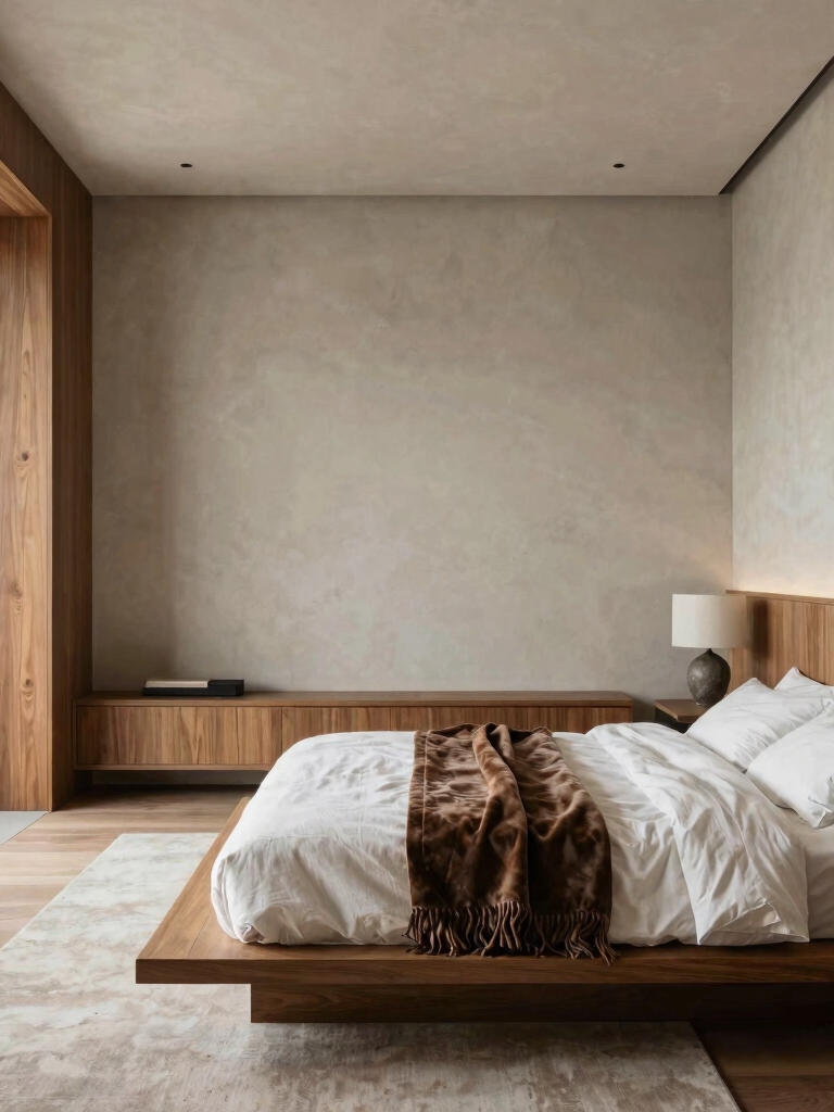
Earthy Tones Inspired by Nature
I’m a fan of layered textures—think linen, cork, and wood—that soften angles and add warmth without shouting.
Use sage, warm taupe, or terracotta as a base, then highlight with subdued greens for a serene, practical retreat.
Bringing elements of the outdoors inside helps create a peaceful atmosphere, making green bedroom ideas a perfect choice for embracing nature indoors.
Bold Accents That You Can Live With
– Incorporate timeless combinations such as grey and white to create a classic bedroom foundation.
Cool Blues and Greens for Tranquility
Cool blues and greens bring a calm that’s perfect for a bedroom retreat.
I pull this palette into the room with soft walls, crisp linens, and a few ocean-inspired accents.
I keep prints simple, balance cool tones with warm wood, and use dimmable lights for mood.
Practical tip: test color under evening light before committing, trend-free serenity guaranteed.
Incorporating green room inspiration can revitalize your space and enhance the soothing atmosphere.
Warm Terracotta and Sand Palettes
- Embrace earthy base tones with a soft terracotta wall
- Pair with sand and cream for breathable balance
- Add texture via woven textiles and clay pottery
- Use warm lighting to enhance cozy ambiance
High-Contrast Black and Charcoal Schemes
After soaking up the warm glow of terracotta and sand, we’re flipping the switch to something bolder: high-contrast black and charcoal schemes.
I’ll show you how to balance drama with calm: use matte blacks for walls, charcoal accents, and warm wood to soften.
Pair white textiles for crisp contrast, add texture with metal, and keep clutter minimal for a serene, stylish sleep zone.
Embracing bold black bedroom ideas can transform your space into a striking and sophisticated retreat.
Monochrome Palettes: One Family, Many Finishes
I love a monochrome plan because one family can wear many finishes without losing its vibe.
Think of cohesive hues tied together by varied textures and distinct surfaces that keep the room lively, not flat.
With a consistent palette and just the right mix of surfaces, your space reads polished, practical, and totally you.
Incorporating black and white bedroom decor ideas can elevate the monochrome palette with elegant contrasts and timeless style.
One Family, Diverse Finishes
With monochrome palettes, you can pull off a single family of colors while still delivering a range of finishes that feel fresh and intentional.
I crave practical mix-ins that keep rooms lively without shouting. You’ll see how sheen, texture, and depth transform a space, instantly elevating comfort and cohesion.
- Satin walls add subtle glow without glare
- Matte ceilings soften brightness
- Linen textiles warm the monochrome
- Gloss accents punch up personality
Cohesive Hues, Varied Textures
Monochrome palettes keep the vibe cohesive, but we still want rooms that feel alive.
I mix shades within one family, then layer textures for depth. Matte walls, satin trim, tactile textiles—each finish catches light differently, adding dimension without shouting.
You’ll get calm, not monochrome dullness; contrast comes from texture, not color. Practical, punchy, and elegantly simple.
Consistent Palette, Distinct Surfaces
A consistent palette doesn’t mean boring surfaces—far from it.
I explore monochrome rooms where one family unifies everything, while finishes tell the story. You’ll notice texture, sheen, and weight shift without breaking the mood.
Ready for tips that keep depth crisp, not dull?
- Mix matte, satin, gloss for contrast
- Vary textures: wood, fabric, metal
- Use subtle undertones across surfaces
- Spotlight reflections with strategic lighting
Texture and Material Pairings to Elevate Your Palette
Texture and material pairings can dramatically elevate your palette, especially when you mix tactile interest with color tone.
I mix linen, wood, and ceramic with bold accents to keep rooms lively yet calm.
Try a soft velvet throw on a matte dresser, or a ribbed plaster wall beside a glossy surface.
Subtle contrasts make space feel curated, never fussy.
Lighting and Its Transformative Effect on Color
Light alters color like a dimmer knob—small tweaks can shift the mood of a room faster than a new throw pillow.
I’m sharing practical tips you can use tonight to harness lighting’s power, from bulbs to shadows. You’ll see color shift with warmth, intensity, and placement.
Here’s a quick guide to unleash color’s full potential.
- Choose bulbs by warmth and CRI for true hues
- Layer light: ambient, task, accent
- Dim smart switches for dynamic mood
- Use lampshades to soften or reveal tones
Weekend Palette Implementation: Practical Steps to Action
If you’re ready to turn weekend plans into color reality, here’s the playbook: pick one or two palettes you love, test swatches in the room at different times of day, and map them to your lighting and furniture so nothing fights for attention.
I’d simplify by grouping tones—soft neutrals with a bold accent—and commit to one main mood per wall.
Practical, fun, done.
Conclusion
I’ll treat your bedroom like a small, loyal harbor. You’re the captain, color the compass. The hues you pick aren’t just paint; they’re currents that steer mood, warmth, and flow. I’ve laid out calm neutrals, soft pastels, moody drama, whites with warmth, and monochrome harmonies, plus textures and light as wind and tide. So chart your course with a weekend plan, test a few swatches, and trust the harbor you’ve chosen. Your room will greet you like a well-loved lighthouse.