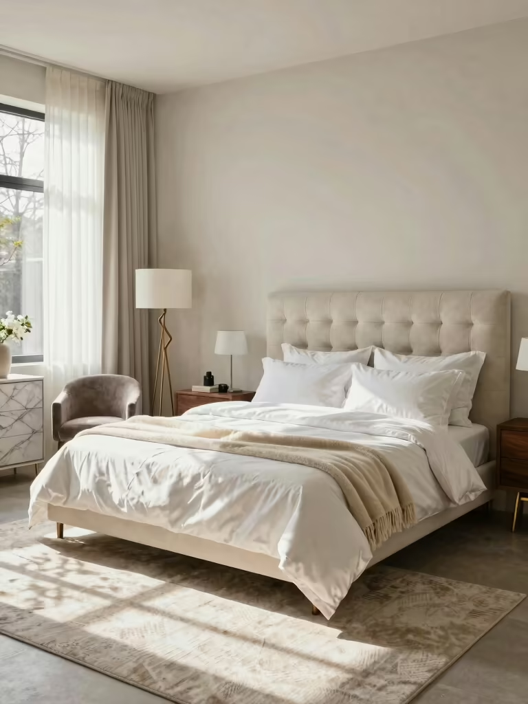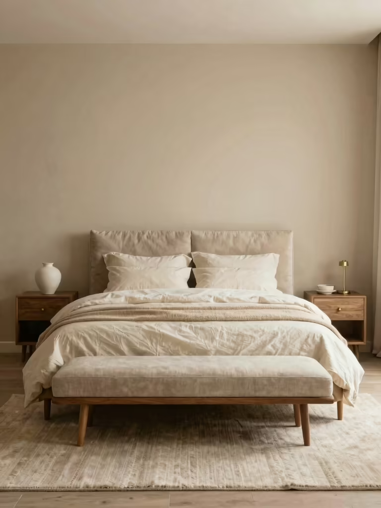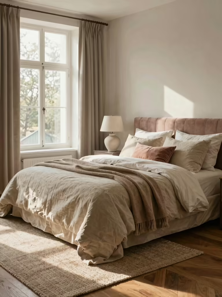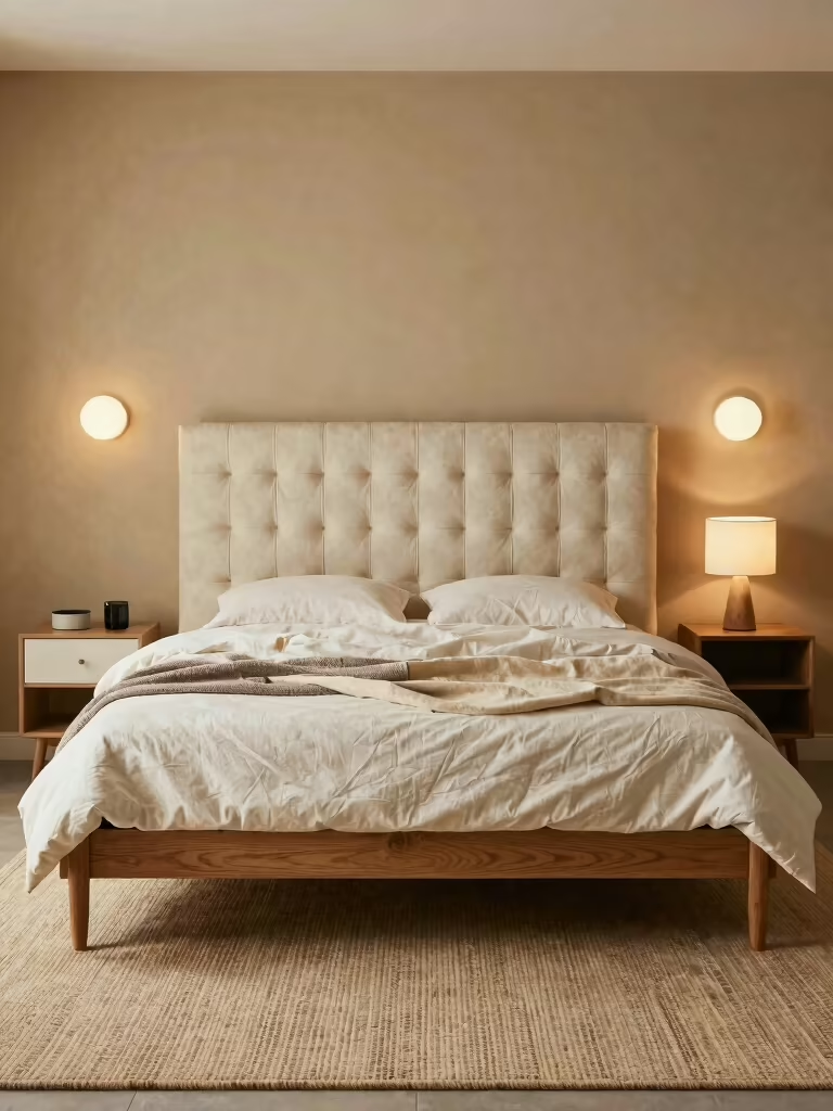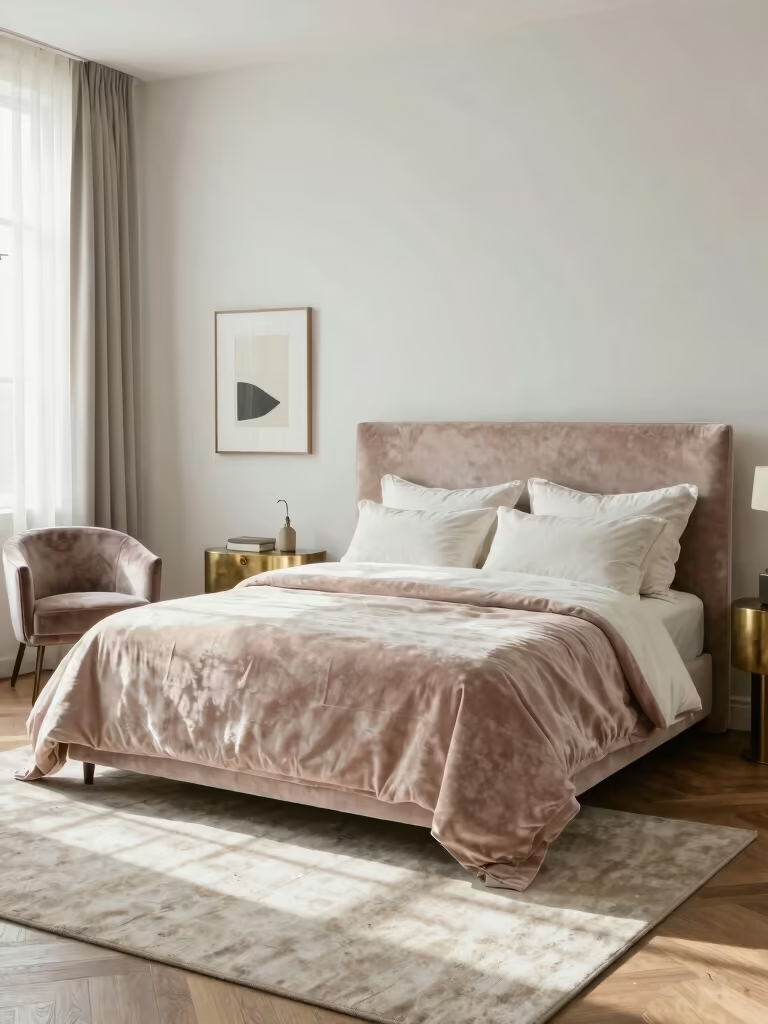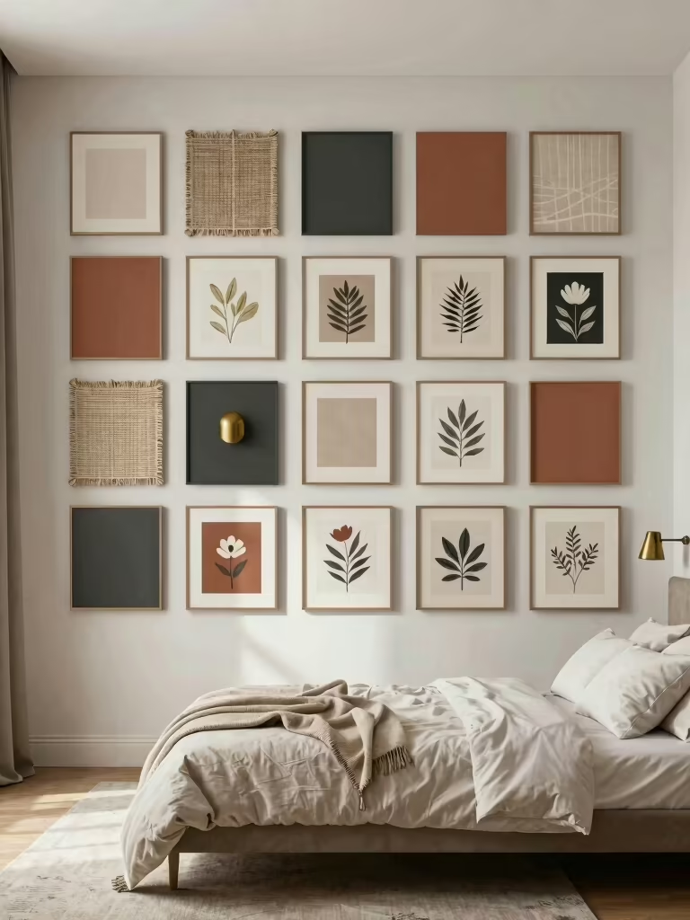

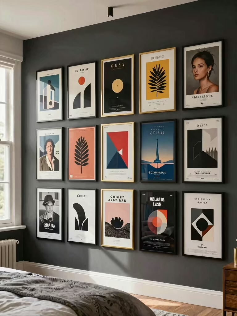
The first poster wall I ever helped with was a mess of tape and good intentions: a band poster here, a sun-faded print there, all at different heights and none of it talking to each other. We pulled it all down, picked one mood, and rehung half as many. The wall went from chaotic to the kind of corner you photograph, and almost nothing new got bought.
That’s the whole secret to a poster wall that aesthetic fans obsess over: the win is in choosing a theme and hanging it with intention. The sheer count of posters barely matters. These ideas walk through finding your aesthetic, mixing typography with imagery, leaning on nature, retro, or abstract prints, and arranging it all so a blank wall turns into a focal point that actually looks curated instead of cluttered.
Poster Wall Questions, Quick Answers
How do I make a poster wall look intentional? Pick one theme or color story and hang the posters as a tight grid or balanced cluster with even gaps, instead of taping them up at random heights.
Do I need frames? No, but they raise the look fast. Even cheap frames or wood poster hangers make prints read curated; raw posters work if you keep the edges clean and the arrangement tight.
How do I hang posters without wrecking the wall? Use removable adhesive strips or washi tape, about $8 to $12 a pack, so you can rearrange and move out without holes or lost deposit.
Curate Your Bedroom Aesthetic First
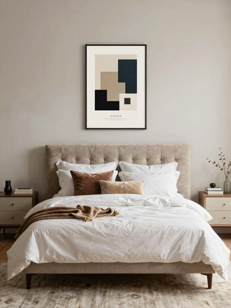
A poster wall lives or dies on having one clear idea behind it. Before you print or buy anything, name the aesthetic you’re after, moody and cinematic, soft and botanical, bright and retro, and let that filter every poster you consider. A wall where the prints share a mood looks curated. A wall of unrelated favorites just looks like stuff you happened to like.
Let a color story do the tying
The simplest way to get cohesion is a shared color story. Pick three or four colors and choose posters that mostly live in that palette, even across different subjects, and the wall hangs together no matter how varied the images are. Color is the thread that lets a film print, a photo, and a typographic poster feel like one collection. Color is the glue.
Edit harder than feels natural; I always start a poster wall by pulling the prints that fight the mood, before anything goes up. A tight set of six to nine posters that all belong beats twenty that fight each other, so be willing to leave favorites in the drawer. The restraint is exactly what makes the wall look designed, the same discipline these decor ideas worth borrowing bring to a small space.
Mix Bold Typography With Dreamy Imagery
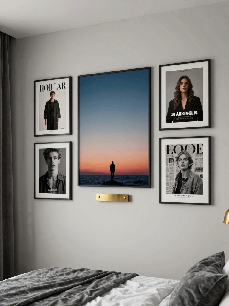
The poster walls that stop you scrolling usually mix two kinds of print: bold typography and softer imagery. A graphic word or quote poster brings energy and a point of view, while a dreamy photo or a hazy landscape gives the eye somewhere calm to rest. Alternating the two across the wall keeps it from feeling either too loud or too flat. One feeds the other. The words spark, the images soothe.
Balance is the whole game. One or two strong type posters anchor the wall, and the imagery fills in around them, so the words feel like a clear statement. Keep the type colors pulled from the same palette as the images, and the contrast of words and pictures comes across as deliberate styling.
- Anchor the wall with one or two bold type posters, then surround them with softer images.
- Keep the type colors in your palette so the words blend into the collection.
- Alternate words and imagery across the grid so neither dominates, and pull tones from these color palette ideas.
| Aesthetic | The mood | Poster types |
|---|---|---|
| Cinematic | Moody, dramatic, grown-up | Film stills, bold type, dark photography |
| Botanical | Calm, organic, restful | Plant prints, muted landscapes, soft photos |
| Retro | Warm, nostalgic, characterful | Vintage travel, concert, mid-century graphics |
| Modern | Clean, graphic, current | Abstract shapes, line art, color fields |
Soften With Nature-Inspired Calming Decor
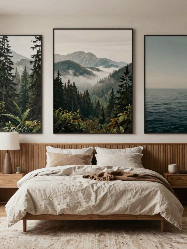
For a wall meant to calm a busy mind, lean on nature-forward posters. Quiet imagery sets a quiet room. Botanical prints, muted landscapes, pressed-flower art, and soft photography of hills or water bring a calm, grounded feeling that suits a room meant for sleep. The greens, sands, and soft blues in natural imagery double as your color story, so the wall stays cohesive almost on its own.
Pair the prints with warm, natural framing to push the calm further. Light wood frames, a few clip-hung prints on a wooden rail, or simple thin black edges keep nature posters feeling organic and warm.
A trailing plant on a nearby shelf or a small dried arrangement ties the wall to the room. Echo one of the print’s greens in a cushion or a throw, and the whole corner starts to feel intentional, so the botanical theme feels like a considered choice, not a lone poster.
Create Nostalgia With Vintage Poster Curation
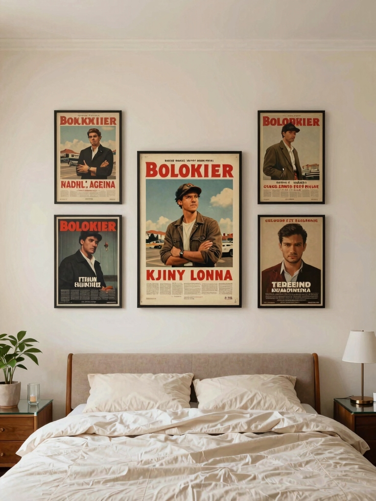
Vintage and retro posters carry a built-in mood that newer prints have to work for. Old film posters, faded travel ads, retro concert prints, and grainy mid-century graphics bring instant nostalgia and a warmth that feels personal, like a memory you can hang on the wall. The trick is to let the era do the cohering, so a set of prints from one decade or one genre looks like a real collection.
Match the color palettes as well as the era, so the retro wall doesn’t go muddy. Mid-century prints lean mustard, olive, and burnt orange; old travel posters lean teal and cream; pick one of those palettes and hold to it. A frame style from the period, thin metal or warm wood, sharpens the look and keeps it from feeling like a random thrift haul.
Lean into a little imperfection, since that’s the charm of vintage. Slightly worn edges, a soft fold line, or a real secondhand find adds character a crisp new print can’t fake, and it forgives a wall that isn’t perfectly hung. A few genuine vintage pieces among reprints give the whole wall an authenticity that’s worth the hunt, the way a single old piece lifts these refresh ideas worth saving.
💡Hanging Tip
Cut paper templates the size of each poster and tape those to the wall first. You can move paper around in seconds to test the layout, check the spacing, and stand back to judge it, all before a single strip of adhesive touches a real print. It’s the trick that gets the grid even on the first try instead of the fourth.
Transform Walls With Abstract Art
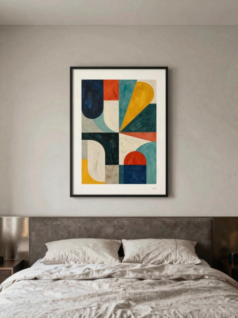
Abstract posters are the easy win when you want art that’s striking but not literal. Bold shapes, color fields, line drawings, and gestural prints add personality and a modern edge without committing to a specific subject, which makes them simple to match to any room.
Because abstract work is really about color and form, it slots into a palette-driven wall with almost no effort. It’s also the cheapest aesthetic to fake well: a few bold shapes printed at home in your colors can look like a gallery set once they’re framed and evenly hung.
- Choose abstracts in your palette so color, not subject, ties them to the rest of the wall.
- Mix scales: one large abstract as the anchor and a few smaller prints around it.
- Keep the shapes simple and calm in a bedroom, and let these layout ideas for small rooms guide the wall you choose.
How to Hang a Poster Wall Without Wrecking It
The arrangement matters as much as the posters, and there are two reliable ways to hang a wall. A tight grid, even rows and columns with matching gaps, looks clean and modern. A salon-style cluster, posters of mixed sizes packed around a center with even spacing, looks collected and gallery-like. Either way, keep the gaps consistent, around two to three inches, and center the whole grouping near eye level, about 57 to 60 inches to the middle.
Lay it out on the floor before a single thing goes up. Arrange the posters on the floor or trace paper templates and tape those to the wall first, so you can shuffle the layout in minutes and spare the wall a dozen needless holes. Hang with removable adhesive strips or washi tape, roughly $8 to $12 a pack, and you can rearrange any time and move out clean, which is what makes a poster wall the most renter-friendly art there is.
Frame It or Leave It Raw
Whether you frame posters changes the whole feel of the wall, and both directions work. Frames, even inexpensive ones, instantly make prints look like art instead of dorm decor, and a set of matching frames is the fastest way to make a mixed collection look intentional.
Adding a mat inside the frame, that border of white around the print, makes a cheap poster look gallery-worthy for a few extra dollars. The mat does the heavy lifting. It signals real art the way nothing else this cheap can, and it lets a small print hold a big frame.
Raw posters have their own appeal when you commit to it. Edge-to-edge prints hung with washi tape, binder clips on a rail, or magnetic wooden poster hangers, often $10 to $20 each, lean casual and current, which suits a younger, layered aesthetic. The key is to keep the edges crisp and the spacing tight, since the line between cool-casual and messy is mostly about whether the arrangement looks deliberate.
Keep a Poster Wall From Looking Like a Dorm
The difference between a poster wall that looks styled and one that looks like a dorm room comes down to a few choices. Quality prints on decent paper, consistent framing or hanging, and a tight, edited arrangement look grown-up; curling corners, mismatched tape, and a random scatter look temporary. None of it costs much. The upgrade is mostly about care and a little patience with the layout.
The shift I push hardest with people is from collecting to curating. Treat the wall like a real piece of the room’s design. Tie its colors to your bedding or paint, give it proper light from a nearby lamp so it isn’t lost in shadow, and resist adding one more poster every time you find one you like.
A poster wall becomes art when it’s curated and cared for, and that single shift, from collecting to curating, is what aesthetic fans are really obsessing over.
Aesthetic Poster Walls, Answered
?How do I arrange posters on a bedroom wall?
Lay them out on the floor first, then hang them as a tight grid or a balanced salon cluster with even two-to-three-inch gaps, centered around eye level. Tracing paper templates taped to the wall let you test the layout before committing. Consistent spacing is what makes any arrangement look intentional rather than random.
?How can I hang posters without damaging the wall?
Use removable adhesive strips or washi tape, about $8 to $12 a pack, or magnetic wooden poster hangers. All let you rearrange and move out without holes or lost deposit, which makes posters the most renter-friendly art around. Skip nails unless you’re framing heavier pieces and own the place.
?How do I make cheap posters look expensive?
Frame them, ideally with a mat. A simple frame and a white border instantly make a print read as gallery art instead of dorm decor for a few dollars. Matching frames across a mixed set, decent paper, and a tight, edited arrangement do the rest. The look comes from consistency and care, not from costly prints.
?How many posters should a bedroom wall have?
Fewer than you’d think. A tight, cohesive set of six to nine posters that share a theme beats a sprawl of twenty that don’t. Edit to the prints that fit your color story and leave the rest in the drawer; the restraint is exactly what makes the wall look curated rather than cluttered.
Curate It, Don’t Just Collect It
A poster wall that aesthetic fans obsess over comes down to one shift: stop collecting and start curating. Pick a theme, pull a color story through it, mix bold type with softer imagery, frame it or hang it clean, and arrange it as a tight grid or balanced cluster, and a blank wall becomes the focal point of the room for the cost of a few prints and some adhesive strips.
The wall you obsess over isn’t the one with the most posters; it’s the one where every print earns its spot. Choose the mood first, edit hard, hang it with care, and your bedroom gets a corner that looks straight off a moodboard, no big budget required.