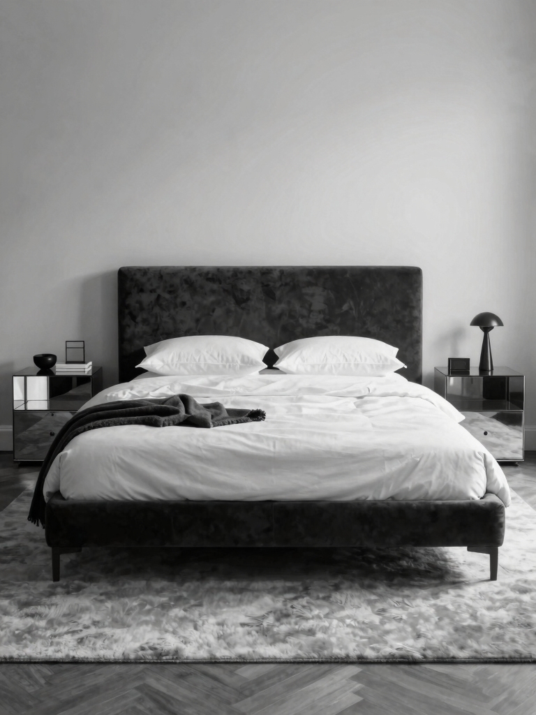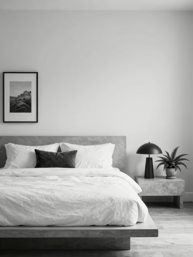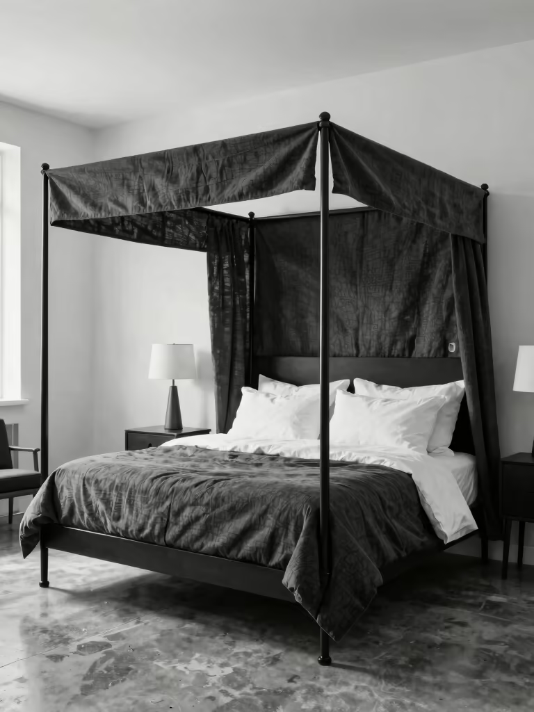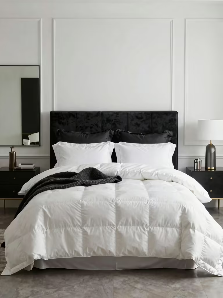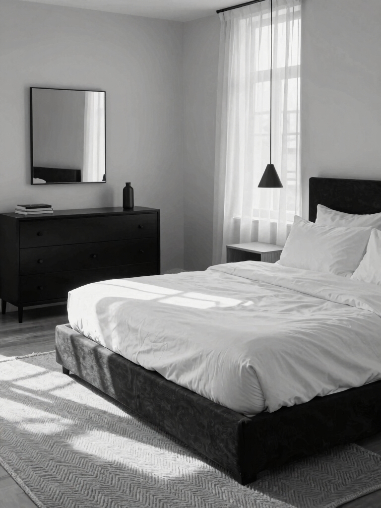

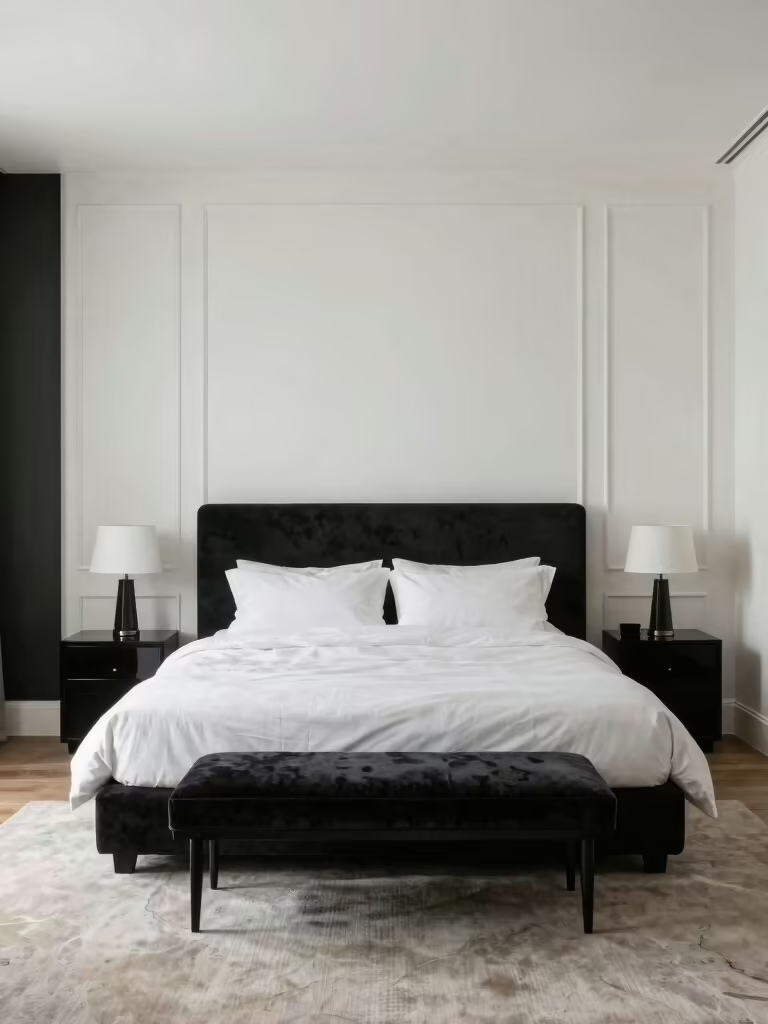
Black and white is the easiest palette to love and the easiest to get cold and clinical. The difference between a bedroom that looks chic and one that looks like a dentist’s office isn’t the colors; it’s everything you do to warm them up. Done right, monochrome is timeless and calm. Done wrong, it’s stark and a little harsh.
These black and white bedroom ideas are about doing it right: keeping the crisp contrast that makes the palette feel sharp, then softening it with wood tones, layered texture, and golden light so the room feels intimate and inviting. Let white carry most of the room, use black as the accent, and build in softness on purpose, and a monochrome bedroom becomes the most quietly sophisticated room in the house.
Black and White: Wrong vs Right
| The risk | Done wrong | Done right |
|---|---|---|
| Too cold | All black and white, no warmth | Add wood, brass, and warm 2700K light |
| Too flat | Two flat colors, no texture | Layer matte, weave, velvet, and a little sheen |
| Too stark | A hard 50/50 split | Let white dominate and use black as the accent |
Why Black and White Works When It’s Warmed Up
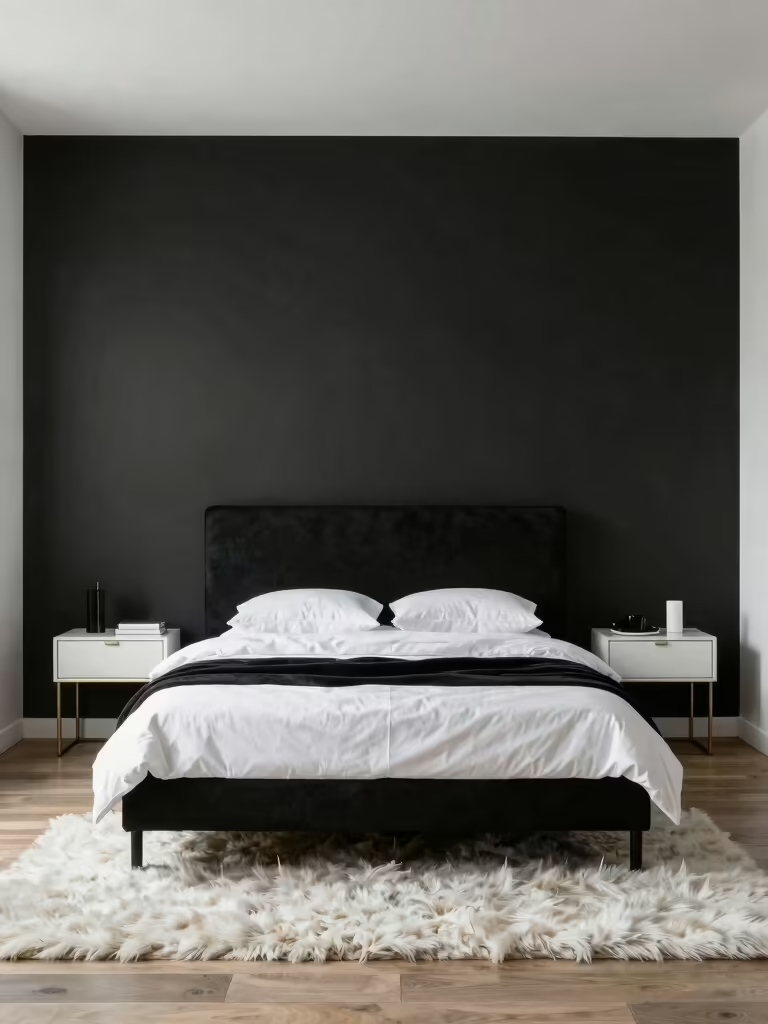
Black and white works because contrast does something no single color can: it sharpens a room and makes everything in it stand out clearly. Black anchors and grounds, white opens and breathes, and together they give a bedroom a timeless, graphic calm that a softer, single-color scheme rarely achieves. The catch is that contrast alone runs cold, so the whole game is warming it back up with material and light.
- Treat white as the base and black as the accent, since an even split tends to feel harsh.
- Ground the palette with wood, brass, and a soft glow so the contrast feels cozy, not clinical.
- Lean on texture to add depth, because two flat colors with no texture is what looks cheap.
- Keep the scheme tight and let the materials carry it, the way these color palette ideas suggest.
High-Contrast Monochrome Bedding
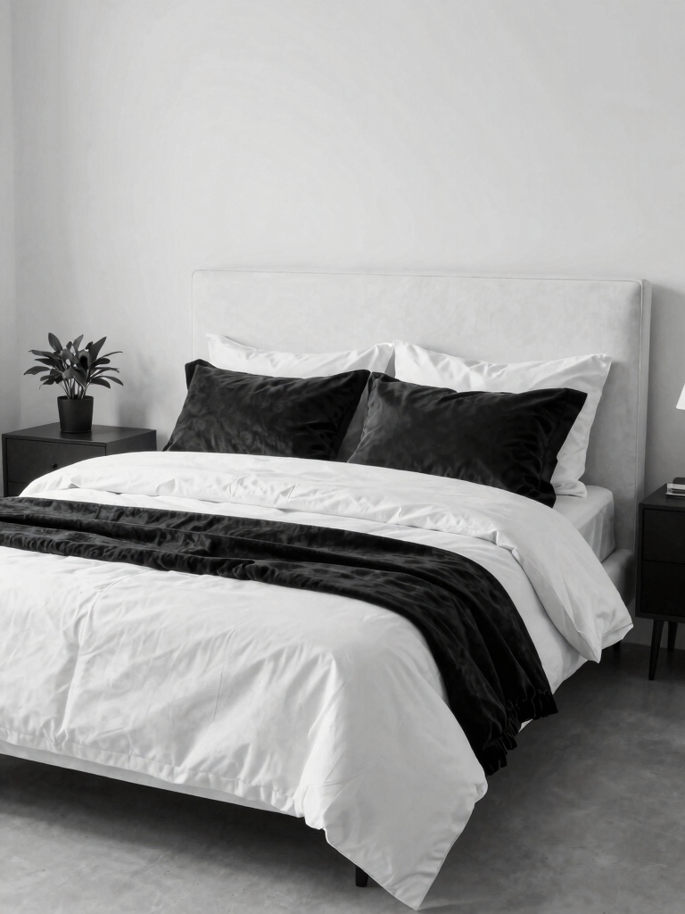
Bedding is the easiest place to get the black-and-white look without committing the walls, and the trick is contrast with texture so it looks chic instead of loud. Start here if you’re testing the look.
Crisp white sheets under a charcoal or black quilt, with a graphic pillow or two, give you the punch, while mixing weaves, a smooth percale, a chunky knit, a quilted panel, keeps it from looking flat. I always layer at least three different textures on a monochrome bed, since that’s what separates a styled bed from a stark one.
Hold the pattern in check so the contrast stays the star. One graphic element, a stripe, a geometric, a single bold print, against mostly solid black and white looks intentional; a pile of competing patterns just looks busy. Keep most of the bed white and let the black come in as the accent layer, the same balance these paint ideas to refresh a room use on walls.
- Build on crisp white sheets and add black through the quilt, shams, or a throw.
- Mix smooth and textured weaves so the monochrome bed gains real depth beyond the contrast.
- Limit the pattern to one graphic piece so the bed stays sharp instead of chaotic.
Heads-Up
Watch the finish on your black. High-gloss black shows every speck of dust and fingerprint and can look cheap, while matte and satin blacks read richer and hide wear. Keep most of the black matte, save a little sheen for one small accent, and the whole scheme instantly looks more expensive.
Soft Textures That Balance the Contrast
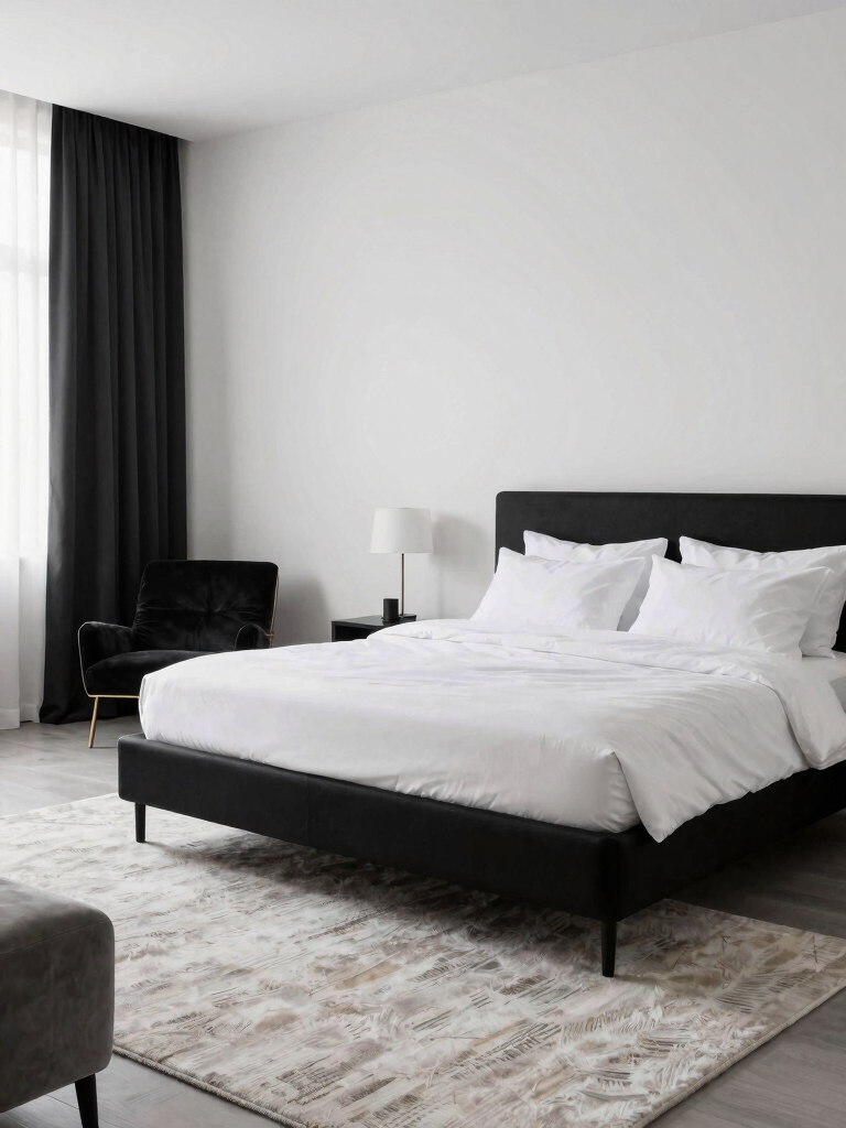
Texture is the single most important thing in a black-and-white room, because it’s what keeps the hard contrast from feeling cold. The palette is doing the graphic work, so the materials have to do the warming, which means layering plush, soft, and natural textures everywhere you can.
A velvet rug, a boucle pillow, and a chunky throw turn a stark scheme into one you want to sink into, and the more tactile variety you stack up, the warmer and more inviting the whole room becomes.
Let the materials do the warming
Reach for natural and tactile materials especially. A wood floor or headboard, a jute or wool rug, linen curtains, and a knit throw all add the natural softness that black and white alone simply lacks on its own. Each one keeps the room sophisticated while making it feel warm and inviting.
Mix the finishes too, alongside the materials. A little matte against a little sheen, a rough weave against a smooth one, gives the monochrome real depth, so it stops looking like a flat photo. The contrast carries the drama; the texture carries the comfort, and you need both for the look to land.
Layered Lighting for Drama and Coziness
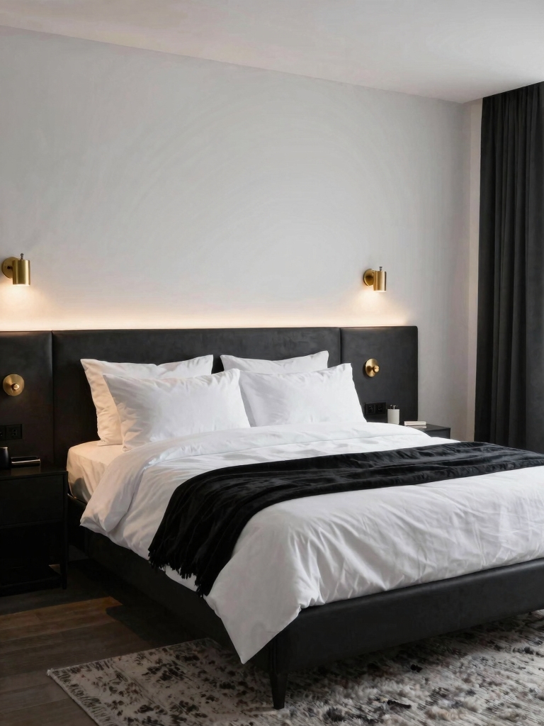
Lighting is where a black-and-white room either glows or goes cold, and the secret is soft, layered light. I tell people this is non-negotiable in a monochrome room.
A single bright overhead flattens the contrast and makes the white look gray and the black look flat, which is the opposite of the drama you want. Build up softer sources at a few heights instead, and the room gains depth and intimacy after dark, with shadows that make the contrast feel rich instead of harsh.
Keep every bulb warm, around 2700K, so the white stays soft and creamy and the black looks rich rather than dead. A warm overhead on a dimmer, a couple of bedside lamps or sconces, and a low accent glow give you control over the mood, from sharp and graphic by day to moody and cozy at night.
Use light to highlight the good stuff, too. A low wash that grazes a textured wall or a lamp that pools a soft glow on a velvet throw makes the textures you layered in actually read at night. That interplay of soft light and rich texture is what makes a monochrome room feel designed, and these lighting ideas for mood cover the layering.
ℹ️Good to Know
Whites and blacks have undertones just like any color. A warm, creamy white next to a cool, blue-black can clash subtly and look off. Pin down warm-or-cool for both before you commit, and test large swatches together on the wall, since the mismatch is much more obvious at scale.
White Walls With Black Architectural Accents
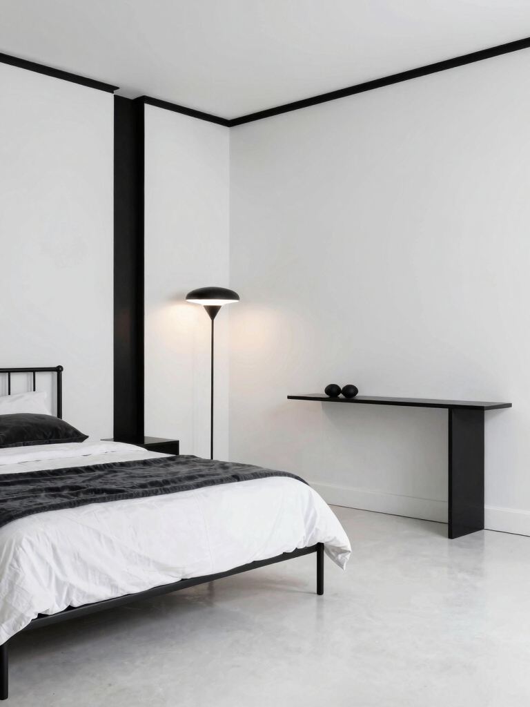
One of the sharpest ways to do black and white is to keep the walls white and bring the black in as architecture: a black door frame, a window casing, a slim shelf edge, a metal bed frame. It’s my favorite version of the look.
These graphic outlines add drama and definition without darkening the room, so the space stays open and bright while the black gives it a crisp, intentional outline. The effect feels custom and architectural, even when all you actually did was paint a few trims and swap the hardware.
- Outline the architecture, black window casings or a door frame, against white walls for graphic contrast that keeps the room light.
- Use matte black hardware and fixtures, $15 to $40 a set and about twenty minutes with a screwdriver, as the cheapest way to add the black accent.
- Add a black metal bed frame or a black light fixture so the black has one clear shape to anchor it, not just scattered bits.
- Leave plenty of white negative space so the black accents read as deliberate, the way these wall paint ideas suggest.
Common Black-and-White Mistakes to Avoid
I see the same few mistakes turn a classic palette cold, and they’re all easy to fix once you spot them. The biggest is too much black. People split the room evenly, and a hard fifty-fifty feels heavy and stark, so I always pull the black back to an accent. The second is forgetting texture, which leaves two flat colors looking like a showroom floor.
The other two are about light and undertone. Cool, bluish bulbs are the fastest way to drain the warmth out of white and make black look gray and dead, and mismatched undertones, a warm cream beside a cool blue-black, look off even when you can’t say why. Fix the ratio, the texture, the bulbs, and the undertones, and the classic look turns warm and timeless instead of clinical. I check those four on every monochrome room I plan.
Add One Accent to Bring It to Life
Black and white is a perfect backdrop, which means it loves one accent to play against. I tell people to pick a single accent and let it pop: a tan leather chair, a stem of greenery, a brass lamp, a soft blush throw. Against all that monochrome, one warm-toned note does enormous work and instantly makes the room feel personal and warm.
The classic move is greenery, a single large plant or a few stems in a vase, which adds life and a hit of color that flatters black and white without fighting it. Keep it to one accent so the scheme stays clean and graphic, and swap that one note whenever you want a new mood, which is the quiet superpower of a monochrome room. A few decor touches worth borrowing make the accent feel intentional.
What to Expect From a Black-and-White Room
Going monochrome asks for a little discipline up front, and that’s the honest part. Black and white shows everything, so a careless mix of undertones, a cool black against a warm white, can look off, and the room needs real texture and a soft glow to avoid feeling sterile. Plan for those from the start and the look comes together; skip them and it feels cold no matter how nice the pieces are.
Once it’s set, though, it’s one of the most timeless and flexible palettes you can own. It never dates, it flatters almost any wood or metal you add, and you can shift the whole mood with a single accent color, a stem of greenery, a tan leather chair, a brass lamp. Black and white done right feels calm rather than stark, a graphic backdrop that makes everything else in the room look better.
Black-and-White Bedroom Questions, Answered
?How do I keep a black and white bedroom from feeling cold?
Soften it on purpose with material and light. Add wood tones, brass or aged metal, a velvet or wool rug, and plenty of soft texture, then switch to warm 2700K bulbs. The contrast stays sharp while the warm materials and light keep the room from feeling clinical.
?What ratio of black to white works best?
Let white dominate and use black as the accent, roughly an 80/20 split rather than an even 50/50. A mostly-white room with black coming in through the frame, hardware, and a few accents stays light and graphic, while a hard half-and-half split tends to feel heavy and stark.
?Do black and white bedrooms work in a small room?
Yes, if you keep white dominant. A mostly-white small room with black accents stays bright and feels larger, while the black adds definition without darkening the space. Lean on warm light and a mirror to keep it open, and use the black sparingly on the frame and hardware.
Sharp, Warm, and Timeless
Black and white done right comes down to one idea: keep the crisp contrast, then warm it up. Let white carry the room, bring black in as the accent, layer real texture, add wood and brass, and keep the bulbs warm, and a monochrome bedroom turns calm and sophisticated instead of cold and stark. The palette is bold; the warmth is what makes it livable.
Start with the balance, more white than black, and the softening, texture and 2700K light, since those two moves fix almost everything that makes monochrome feel chilly. Nail those, then layer in the wood, the brass, and the one accent that brings it to life, and you’ll end up with a room that’s bold and graphic by day and quietly cozy by night.