
Why do some bedroom walls look designed and others just look decorated? It usually comes down to a few rules the pros follow without thinking, the kind that make a gallery wall feel intentional instead of scattered. None of them are hard, and most cost nothing once you know them.
These bedroom wall decor secrets are the ones that quietly separate a styled room from a busy one: a single statement wall to anchor everything, a gallery hung at the right height, texture layered with intention, and lighting that clears your surfaces. Get the placement and the proportion right, and even thrifted art looks like a designer hung it.
Key Takeaways
Great wall decor is mostly placement and restraint. Anchor the room with one statement wall, then hang art at eye level, around 57 to 60 inches to the center, so the whole wall feels intentional.
Layer in texture, odd-numbered groupings, and breathing space, and use wall lamps to add light without cluttering the surfaces. It all comes down to proportion and editing, not buying more.
Set a Bold Foundation With a Statement Wall
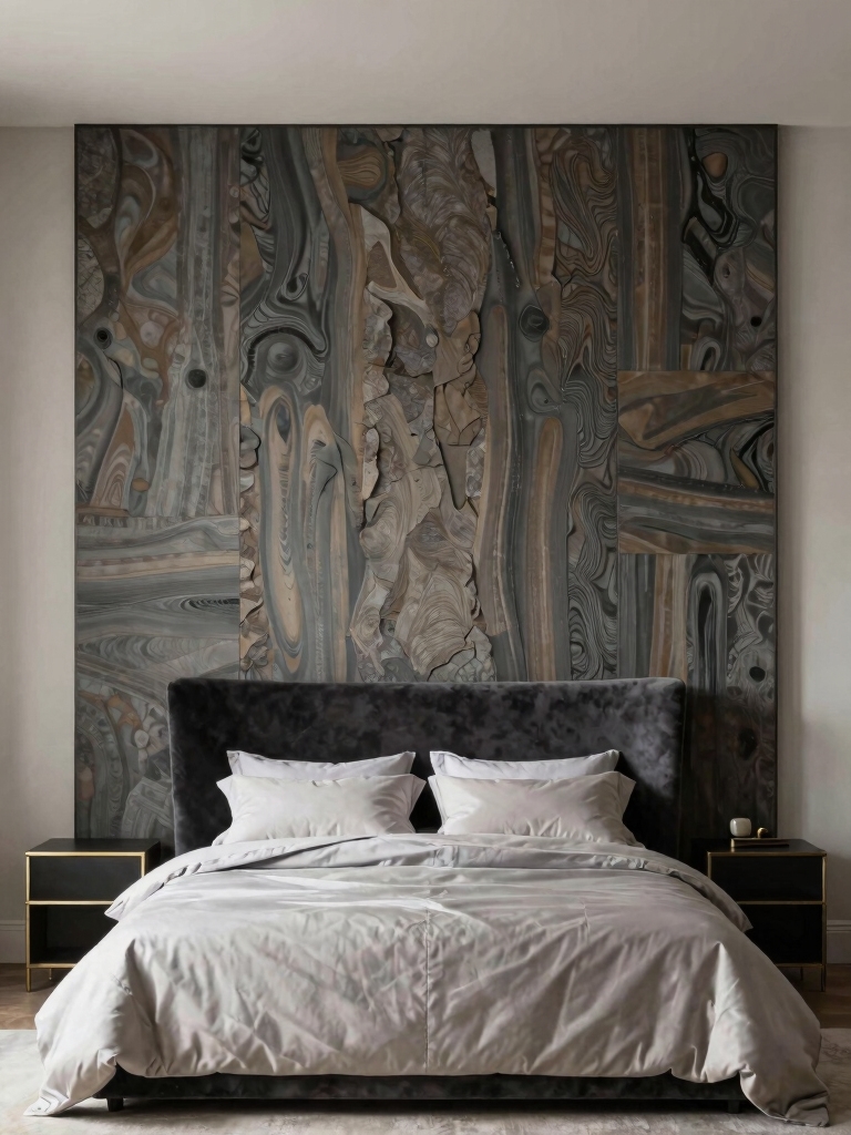
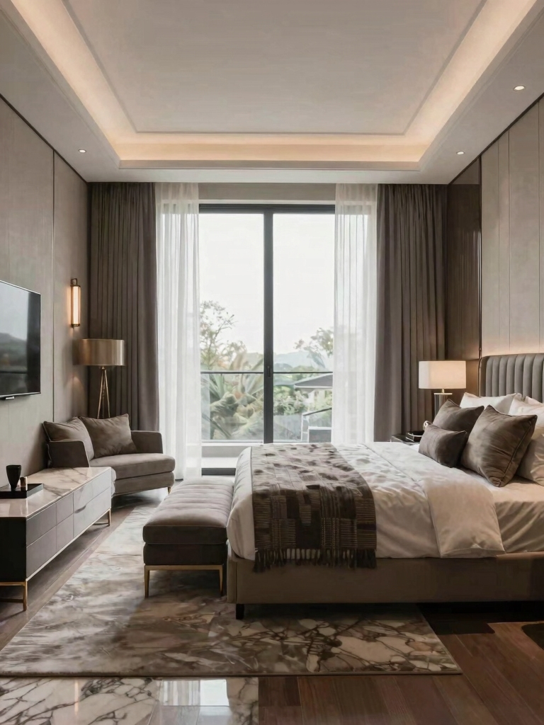
The first wall decor rule is to give the room one focal wall and let the rest stay quiet. I start almost every room here. A single statement wall, usually the one behind the bed, anchors the whole space and gives everything else something to relate to. Try to make every wall a star and the room just looks busy; commit to one and it instantly looks intentional, with a clear hierarchy the eye can follow.
- Choose the wall behind the bed as your focal point, since it’s where the eye already lands.
- Make the statement with deep paint, a textured finish, or paneling, then keep the other three walls calm.
- Carry a feature wall color or material edge to edge so it reads deliberate, not like a patch.
- Let the bold wall set the palette for the room, the way these bedroom wall paint ideas suggest.
Build a Gallery Wall That’s Truly You
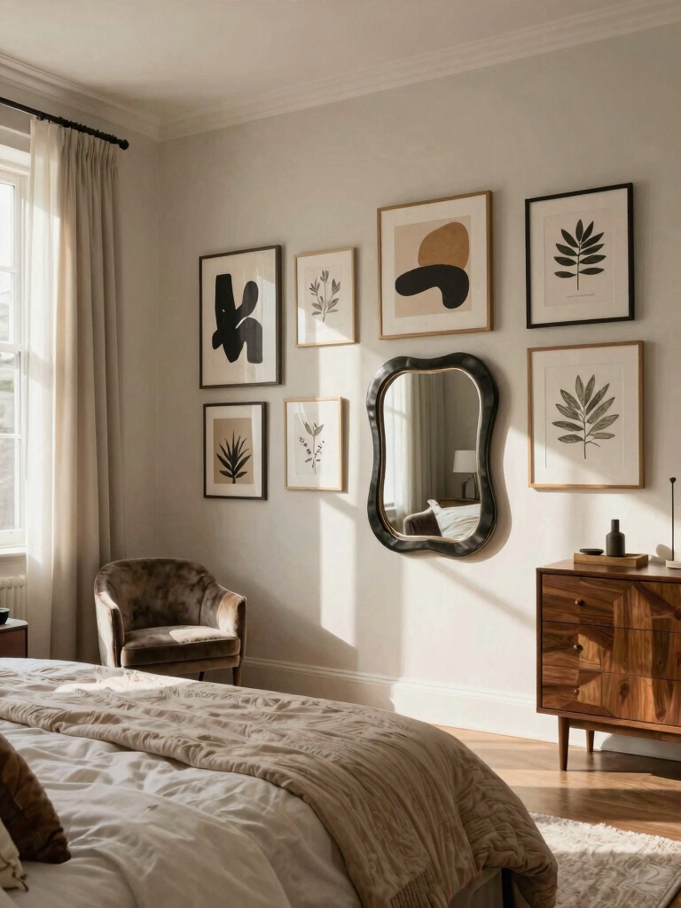
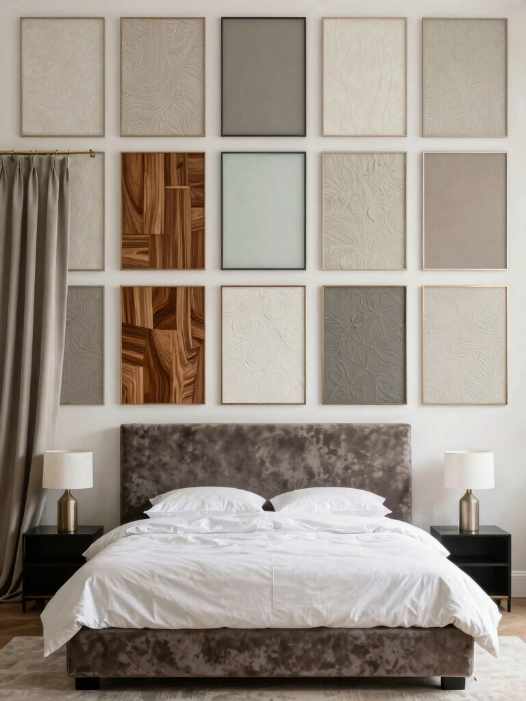
A gallery wall is where most people go wrong, because they hang as they go and skip planning the whole arrangement first. The trick is to treat it as one composition: lay every piece on the floor, shuffle until the spacing and balance feel right, then transfer that layout to the wall. Mix photos, art, and a meaningful object or two so it reads as yours.
Two rules do most of the work. Group an odd number of pieces, three or five reads more dynamic than four, and keep a consistent gap, around two to three inches, between frames so the cluster holds together. Painting a set of mismatched flea-market frames a single uniform color is how a fifteen-dollar collection ends up looking like a curated install.
Trace each frame on paper and tape the templates up first if you want to nail the spacing before you commit a single hole, and these decor ideas worth borrowing help you compose it.
- Mock up the whole arrangement on the floor, then transfer it to the wall once it feels balanced.
- Group in odd numbers with even gaps so the wall reads composed, not random.
- Unify mismatched frames with one paint color or one mat color to tie the collection together.
Heads-Up
The most common wall decor mistake is hanging everything too high. The center of a piece, or the center of a gallery grouping, should land around eye level, 57 to 60 inches from the floor, not up near the ceiling. Art floating high looks disconnected from the bed and the room below it.
Frame Bedside Moments With Floating Shelves
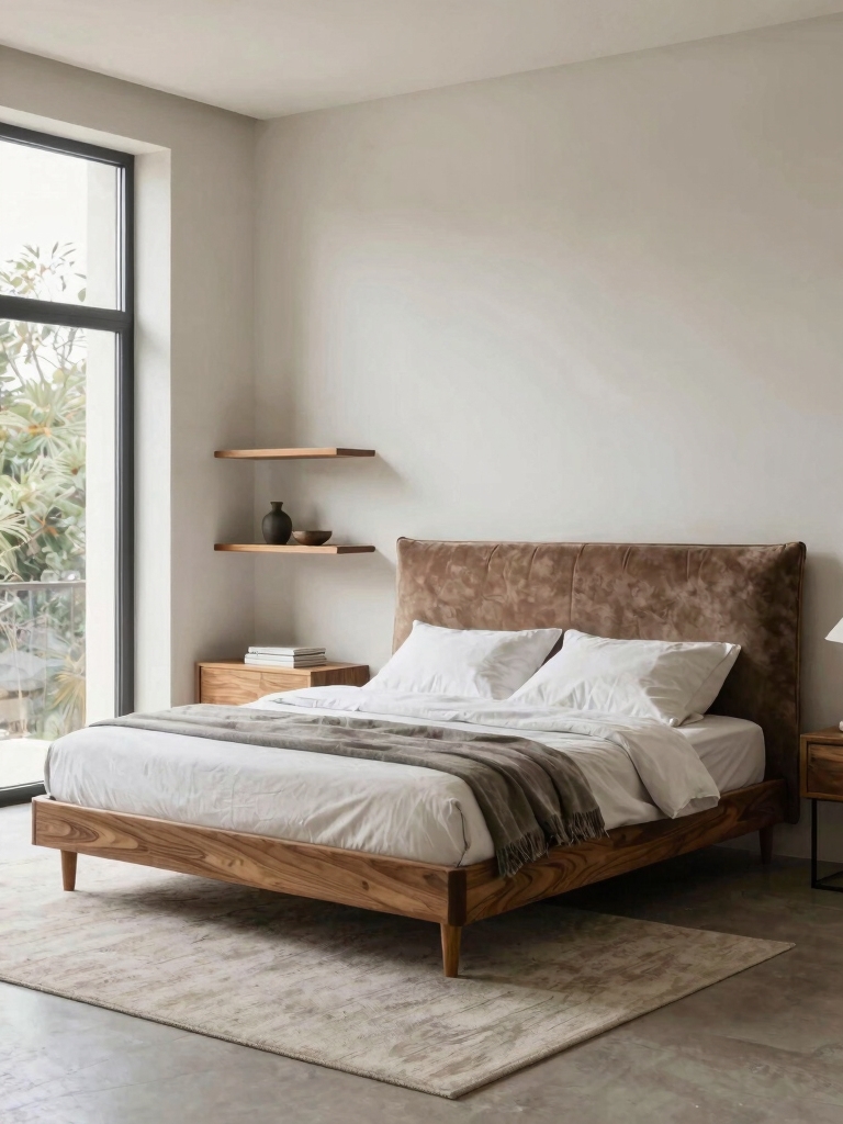
Floating shelves above or beside the bed are a quiet workhorse, since they add display and storage without a single piece of floor furniture. A narrow ledge holds a small stack of books, a framed photo, and a tiny plant, turning dead wall into a styled bedside moment. Done well, they punch far above their size.
Style them with the same restraint as a gallery wall. Vary the heights so the eye moves, leave breathing space between objects, and stick to a few things you love over a crowded, fussy row. A picture ledge also lets you swap art with no new nail holes, so the display changes as your taste does. Keep the styling tight and a small shelf reads polished, not cluttered.
- Hang a slim picture ledge so you can lean and swap art without re-drilling.
- Style in odd numbers with varied heights, and leave space so each piece can be seen.
- Keep the shelf shallow and the objects light above a bed, so nothing bulky or heavy hangs over your head.
Add Texture With Textile Wall Hangings

Hard, bare walls are why some bedrooms feel cold, and the fix I reach for is fabric on the wall. A woven hanging, a macramé piece, or a framed textile adds warmth and texture you can almost feel, softening the room in a way flat art never quite does. It’s also one of the few wall pieces that quietly improves the acoustics of a hard, echoey room while it decorates.
Size it to two-thirds the bed width
Scale is the thing to get right here. A too-small hanging on a big wall looks lost, so size it to roughly two-thirds the width of whatever it sits above, the bed or a console. A neutral textile adds quiet texture, while a bold woven piece brings controlled color without committing to paint.
Hang it as the anchor or as a layer. On its own above the bed it’s a statement; layered with a couple of small frames it adds softness to a gallery. A textile hanging runs about $20 to $60 and warms a wall faster than almost anything, and these paint ideas to refresh a room pair well with it.
“Designer’s note: when a wall feels off but you can’t say why, it’s almost always scale or spacing. Go one size bigger than feels safe on a large wall, and keep gallery gaps tight and even. Most amateur walls fail because the art is too small and too far apart, not the pieces themselves.”
Create Ambient Glow With Wall Lamps
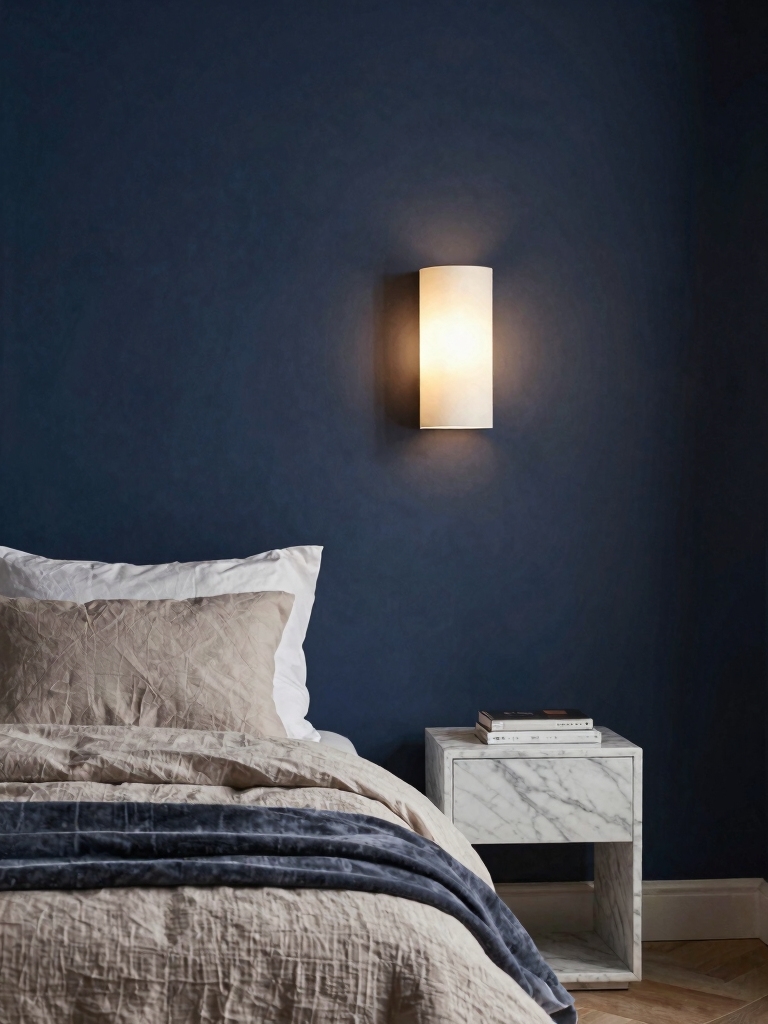
The last move is lighting the walls themselves, which most people skip entirely. Wall-mounted lamps and sconces add a soft, layered glow exactly where you want it and clear the nightstands of bulky lamps at the same time. That combination of better light and clearer surfaces is what makes a bedroom feel designed rather than just furnished.
Reach for the easy versions if you can’t hardwire. Plug-in sconces and battery or rechargeable wall lamps give you the same look with no electrician and no holes beyond a couple of screws, so even renters can do it. Mount them at about eye level when you’re sitting up in bed, roughly a foot or two above the mattress, for the most flattering cast.
Keep the bulbs warm and put them on a dimmer or a smart switch. A warm 2700K glow makes the room feel calm and intimate at night, and being able to dim it turns the wall lights into mood lighting on demand. Wall lamps flanking the bed also read as a designer touch, symmetrical, balanced, and intentional in a way a single lamp on one side never manages, and these lighting ideas for mood cover the rest.
The Measurements That Make Walls Look Pro
Designers hit the same numbers without thinking, and once you know them, your walls jump a level overnight. These are the numbers I use every time. Center your art at 57 to 60 inches from the floor. Hang it 6 to 10 inches above a headboard, close enough that the two feel connected. Keep 2 to 3 inches between frames in a gallery so the cluster holds together.
One more rule ties it all together: size a piece or grouping to about two-thirds the width of the furniture below it. Those four numbers do most of the work. They’re the difference between art that floats awkwardly and art that looks placed on purpose. When a wall feels off, I pull out the tape measure before I ever blame the art, since it’s almost always the height or the scale, not the piece itself, that’s wrong. A two-minute check usually solves it.
Common Wall Decor Mistakes Designers Skip
Most wall decor goes wrong in the same few ways, and once you see them you can’t unsee them. The biggest is hanging everything too high, up near the ceiling where it floats disconnected from the bed and furniture below it. Bringing a too-high piece down to eye level is the single most common fix I make in a room, and people are always shocked how much it pulls the whole wall together.
The other two are scale and clutter. A small piece floating on a big wall looks lost, so go bigger or group several together, and leaving no breathing space turns a collection into noise. The fix is almost always to remove a piece or two and let the rest sit comfortably. Get the height and the scale right and even simple, inexpensive art looks intentional, which is the whole game.
Keep It Flexible So the Walls Can Change
The best wall decor is built to evolve, since your taste will, and the move is choosing methods that let you swap without patching holes. Picture ledges, washi-tape and clips, adhesive hooks, and gallery systems all let you change art on a whim, which keeps the room feeling current instead of frozen. I lean on reversible methods in every room, especially rentals.
Plan a flexible palette too. If the frames, the textile, and the lamps all play within one calm color family, you can rotate the art inside them endlessly and the wall always looks pulled-together. Swap a print, change a season, hang a new photo, and the bones of the design hold. That flexibility is what keeps a styled wall from ever feeling stuck, and a few wall-doubling mirror tricks add light while you’re at it.
Hang It Like a Designer Would
The wall decor secrets that matter are mostly about placement and restraint: anchor the room with one statement wall, hang art at eye level in odd-numbered groups, layer in texture, and light the walls to free your surfaces. Get the proportion and spacing right, and inexpensive art on a budget reads as deliberate and designed.
Start with the focal wall and the right hanging height, since those two fix most of what makes a wall feel off, then layer the texture and light from there. A styled wall isn’t about spending more; it’s about knowing the few rules that make everything you already own look intentional.