Walk into a freshly painted bedroom and you feel it before you can name it: the room smells clean, the walls look crisp, and the whole space seems to exhale. No other change does that much for so little. A weekend, a couple of gallons, and a steady hand, and you wake up to a room that feels new without your having touched the furniture.
The trick to a refresh that lasts is choosing the color by the feeling you want. The swatch that catches your eye in the store rarely tells you that. These ideas walk through the colors that do the most for a bedroom, calm neutrals, warm whites, a moody accent wall, soft blues, and how to use each one so the room feels considered, not just recoated. Pick the mood first, and the color almost chooses itself.
Refresh-by-Color, at a Glance
- Choose paint by the mood you want: calm, bright, dramatic, or serene, then pick the color that delivers it.
- Neutrals and warm whites refresh a room quietly; a moody accent wall refreshes it with drama for one gallon.
- Sample the color on the actual wall and live with it a day before you commit to the gallons.
- Refresh on a budget by painting just an accent wall, the trim, or a headboard for a fraction of a full repaint.
Bold Colors for Refreshing Spaces
Of every change you can make to a bedroom, color is the one that resets the whole room in an afternoon. A fresh, confident color, whether it’s a warm clay, a soft terracotta, or a deep green, gives the space a clear point of view that beige builder walls never had. The refresh isn’t about bold for its own sake. It’s about the room finally having an opinion.
Commit to the color. A timid half-step, a barely-there tint you can’t quite read, leaves a room looking unfinished. A color chosen with conviction makes the whole space feel designed. Pick a shade you truly respond to, put it on the walls properly, and a tired bedroom turns into one with personality for the cost of a couple of gallons.
- Pick a color you react to so the refresh actually changes how the room feels.
- Carry the color across all four walls for a full reset, or one wall for a lighter touch.
- Anchor a bold color with warm neutrals and wood, and pull the palette from these color palette ideas.
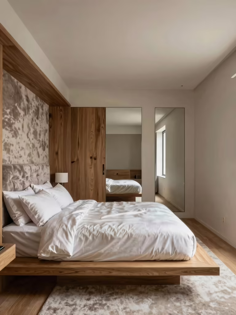
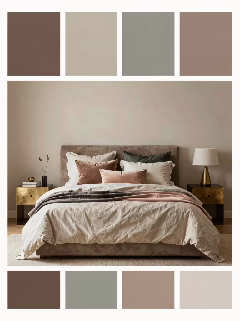
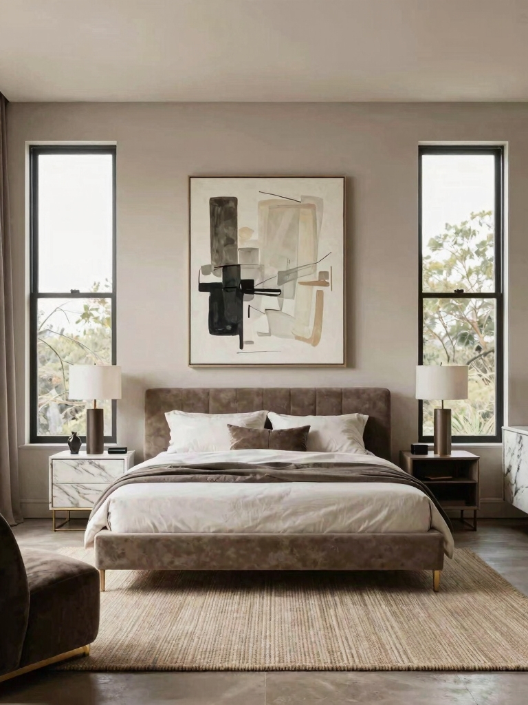
Calm, Cozy Neutral Palettes
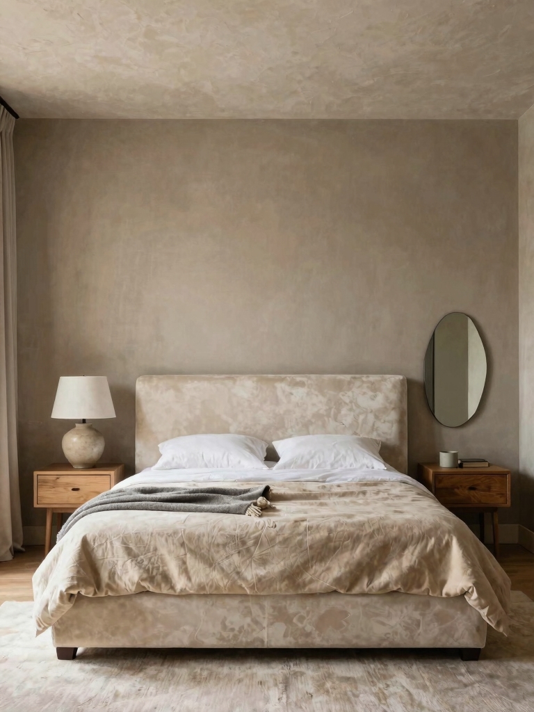
If you want the bedroom to feel like somewhere to decompress, a soft neutral palette is the most reliable refresh there is. Warm beiges, taupes, mushroom, and gentle greiges wrap a room in a quiet, restful calm while keeping your options open, which is exactly what most people want from the room they sleep in. The refresh here is subtle but real: the room goes from blah to serene. That alone is worth a weekend.
Keep neutrals from going flat by layering close tones. A wall a shade or two deeper than the trim, a few warm wood pieces, and natural textures give a neutral room the depth it needs so it looks collected and considered. A layered neutral stays interesting, and it’s the calm backdrop that lets everything else in the room breathe.
- Lean on warm neutrals, greige, taupe, mushroom, for a calm refresh that suits almost any bedroom.
- Layer close tones and natural texture so the neutral reads rich, not flat.
- Let the quiet walls set off your textiles, the way these decor ideas worth borrowing build warmth on top.
ℹ️Good to Know
A gallon of paint covers roughly 350 to 400 square feet in one coat, so a standard bedroom usually needs two gallons for two solid coats. Buy the second gallon up front; running out mid-wall and matching a new can later is how you end up with a faint line you’ll see forever. Most colors need two coats to look even, especially over a darker old color.
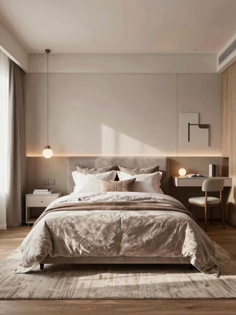
Warm Whites for Cozy Brightness
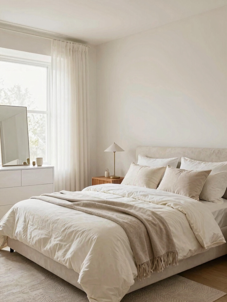
Warm white is the refresh for anyone who wants the room bright and airy without the chill a stark white brings. Whites with a soft yellow, cream, or peach undertone bounce light around and keep the room open. The warmth in them stops the walls going cold and clinical the way a blue-white does. It’s the safe, light refresh that still feels cozy at night. Bright by day, warm by lamplight.
Pair a warm white with texture so the room doesn’t read empty. Linen, wood, a chunky throw, and a single soft accent give an all-white room the depth it needs to feel intentional, and the warm undertone makes it glow softly under lamplight. If a cozy white room is the goal, these cozy white bedroom ideas go deeper on getting it right.
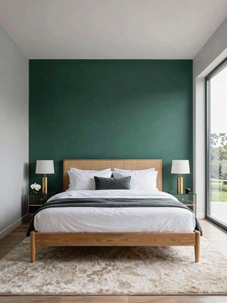
Bold Accent Hues That Add Drama
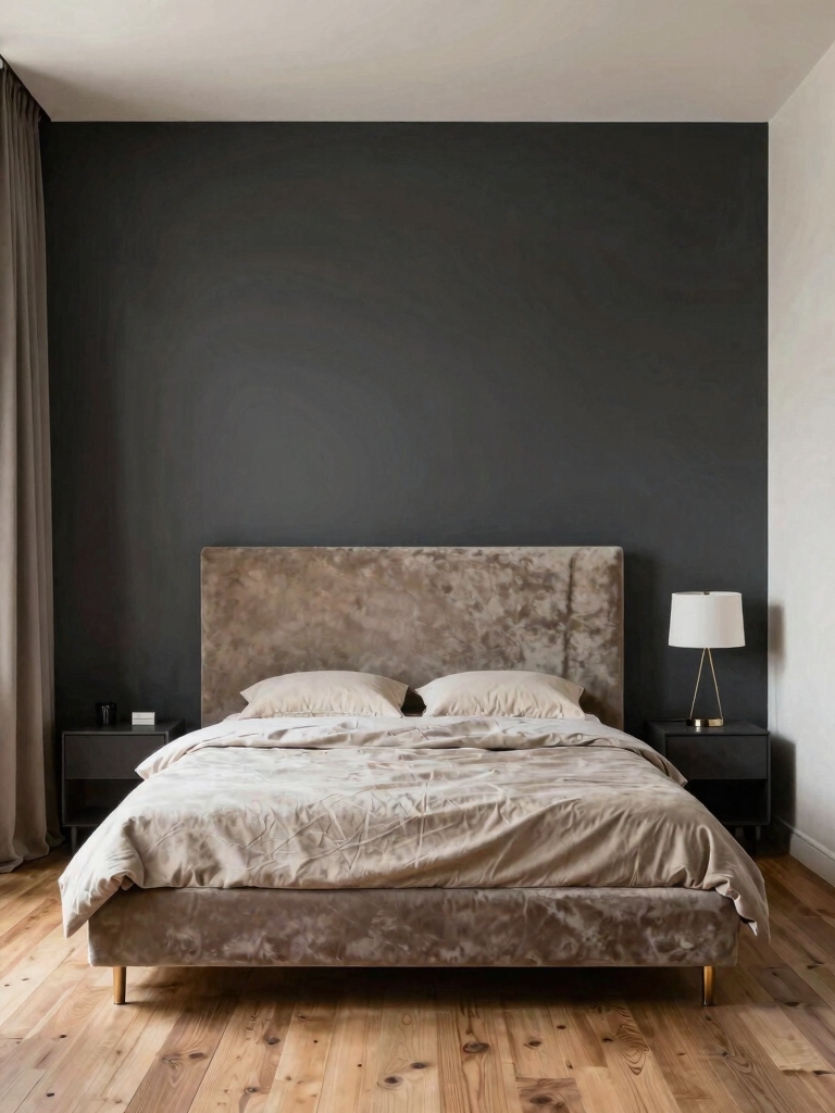
When you want a refresh with real drama on a budget, a single accent wall is the move. Painting just the wall behind the bed in a deep, saturated color, an ink blue, a forest green, a charcoal, or a plum, gives the room a bold focal point and a sense of depth, while the other three walls keep it light and easy. One gallon, one afternoon, and the room reads completely different.
Go properly dark on the feature wall
Choose the accent color to set the room’s mood. Deep blues and greens feel calm and enveloping; charcoals and near-blacks feel modern and dramatic; warm plums and rusts feel cozy and rich. Whatever you pick, go properly dark and saturated, since a half-hearted accent wall in a muddy mid-tone just looks like you ran out of paint.
Balance the dark wall so it feels intentional. Pair it with light bedding, a little warm metal, and good lighting, so the contrast comes across as designed and the dark wall anchors the room rather than closing it in. An accent wall is the highest-drama refresh per dollar there is, and these layout ideas for small rooms help you decide which wall to feature.
📋A weekend refresh, step by step
- ✓Sample the color on the wall and check it morning and night before buying gallons
- ✓Patch holes, sand rough spots, and wipe the walls clean so paint goes on smooth
- ✓Tape the trim and ceiling line, then cut in the edges with a brush
- ✓Roll two coats, letting the first dry fully, and pull the tape while the last coat is still tacky
Serene Blues and Seafoams
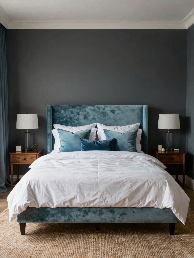
Soft blues and seafoam greens are the color family to reach for when you want the bedroom to feel serene and a little coastal. A misty blue, a pale seafoam, or a gray-green carries a calming, water-like quality that suits a room meant for rest, and it pairs beautifully with white trim, natural wood, and linen. It’s a refresh that feels like a deep breath every time you walk in.
- Choose a muted, grayed blue or seafoam so the color stays calm and restful, a long way from primary or nautical.
- Pair the blue with warm wood and cream to keep a cool color from feeling cold.
- Match the undertone to your light: softer, warmer blues for north-facing rooms that lean cool already.
Where to Start a Paint Refresh
The hardest part of a refresh is usually deciding, so start by naming the feeling you want the room to have, then let that narrow the color fast. Calm points you to neutrals and soft blues; bright points to warm whites; dramatic points to a moody accent wall. Once the mood is set, you’re choosing between three or four shades instead of the whole paint aisle, which is what saves a refresh from stalling out in indecision.
Then make it a contained, finishable project. A standard bedroom takes about two gallons and a weekend, with a gallon running roughly forty to sixty dollars, so it’s a truly affordable reset. Prep the walls, cut in the edges, and roll two coats; a coat dries in an hour or two, so the whole job wraps up by Sunday night.
The refresh I push most is the accent wall, since it gives the biggest change for the least time in the room. The smaller the scope you commit to, the more likely the refresh actually happens, which is why a single accent wall gets done while a whole-house repaint sits on the list for months.
Refresh Without Repainting the Whole Room
A full repaint is just one way to use paint for a refresh. Painting only the trim, the doors, and the window frames a crisp fresh white sharpens a whole room in an afternoon for the cost of a quart. A painted headboard shape on the wall behind the bed fakes a real headboard for the price of a sample pot, and it’s the kind of low-stakes move you can change your mind on later.
Turn paint on the furniture, too. A dated dresser or nightstand in a fresh color or a soft black becomes the room’s best piece for a few dollars of paint and an afternoon, at a fraction of the price of replacing it. These small, targeted paint jobs deliver most of the refresh of a full repaint at a fraction of the time and cost, and they’re the smart move when the walls are fine but the room still feels tired.
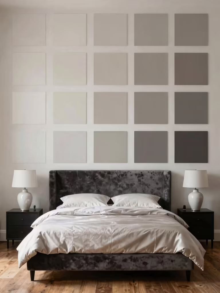
Picking the Right Color for Your Light
The same paint looks like a different color depending on the light a room gets, which is why a shade that wowed you at a friend’s house can disappoint on your wall. North-facing rooms get cool, flat light that pushes colors grayer and bluer, so they want warmer, slightly deeper shades to compensate. South-facing rooms get warm, generous light all day and can carry cooler colors that would look chilly elsewhere.
Work with the light your room already has. East rooms glow warm in the morning and cool by afternoon; west rooms do the reverse, so judge a sample at the time of day you use the room most.
Brushing a swatch on the wall and checking it morning and night is the one habit that saves a refresh, since the chip in the store tells you almost nothing about how the color will live in your actual room. More on testing is in these small-room paint ideas that transform a space.
Bedroom Paint Refresh, Answered
?What is the easiest way to refresh a bedroom with paint?
Paint a single accent wall, usually the one behind the bed, in a deeper color. It takes one gallon and an afternoon, gives the room a bold focal point, and leaves the other walls light. If you’d rather keep it subtle, repaint the trim and doors a crisp white, which sharpens the whole room for the cost of a quart.
?How much paint do I need to refresh a bedroom?
About two gallons for a standard bedroom, enough for two coats on the walls. A gallon covers roughly 350 to 400 square feet per coat and runs about forty to sixty dollars. Buy both gallons at once so the color matches exactly, and add a quart if you’re also doing the trim in a different shade or finish.
?How do I choose a bedroom paint color I will actually like?
Pick by the mood you want, then test the shade on your actual wall. Brush a big swatch and check it in morning and evening light, since the same color shifts a lot with a room’s exposure. North-facing rooms suit warmer shades; sunny rooms can take cooler ones. Living with a sample for a day beats guessing from a chip.
Pick the Mood, Then the Color
A paint refresh delivers more change per dollar than anything else you can do to a bedroom, as long as you choose the color for the feeling you want.
Calm neutrals and warm whites refresh the room quietly; a moody accent wall or a serene blue refreshes it with mood; and a coat of paint on the trim, a headboard shape, or a tired dresser refreshes it without repainting at all. Name the mood, match the color to your light, and a weekend’s work resets the whole room.
So before the next time the bedroom feels tired, reach for paint before you reach for new furniture. Save the color that fits the mood you’re after, test it on the wall this week, and you’ll wake up in a room that feels brand new for the price of a couple of cans.