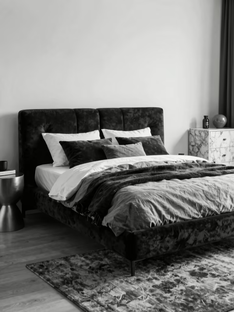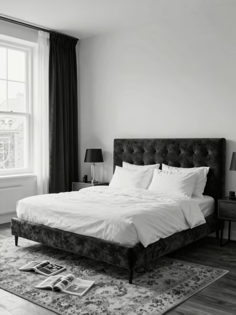

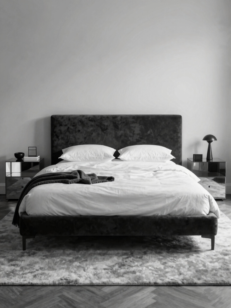
There is a reason the black-and-white bedroom stays in rotation: it photographs like a magazine and lives like a favorite outfit. Stand in one at dusk and you feel the calm of it, crisp white catching the last light, black grounding the corners, everything sharp and settled. That quiet confidence is what keeps people coming back to these black and white bedroom ideas.
Below are 19 of the moves the obsessed swear by, from choosing your version of the palette to the texture and upkeep that keep it looking sharp. None of it is complicated; it just rewards a little restraint and care.
The Two Ways to Do Black and White
| Approach | The vibe | Best for |
|---|---|---|
| Black walls, white accents | Moody, cocooning, dramatic | Bigger or bright rooms |
| White walls, black furniture | Crisp, airy, minimal | Small or low-light rooms |
| Mostly white, black trim | Soft, classic, easy | Anyone nervous to commit |
The Timeless Elegance of Black and White
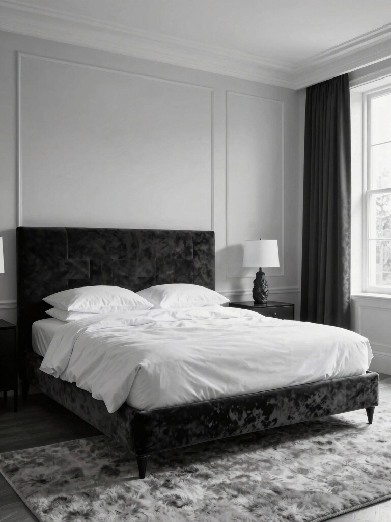
Black and white sticks around because it solves problems other palettes create. It never dates, it flatters any style from modern to classic, and the contrast does the styling for you. People get obsessed because the look is hard to get wrong once the balance is right.
Timeless, and hard to get wrong
The appeal is also practical. A monochrome scheme hides a multitude of mismatched furniture, since black ties disparate pieces together and white keeps the room from feeling heavy. You can build it slowly, one piece at a time, and it still looks cohesive.
The thing I love most about a black-and-white room is how forgiving it is. I have pulled one together for a client from thrifted furniture and a couple of cans of paint, and it looked custom. For a bolder, more graphic take, our a black-and-white statement leans into drama; this one is the everyday version.
The High-Contrast Essentials You Will Use
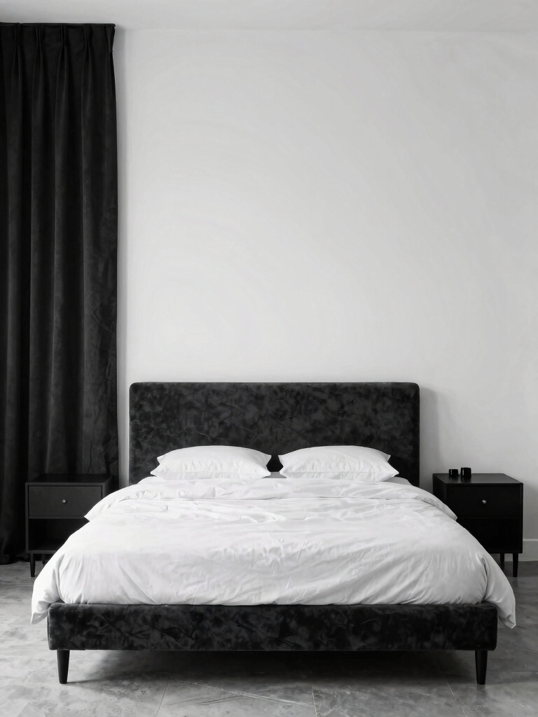
Every black-and-white room leans on the same handful of building blocks, so it helps to know them before you shop. Balance, texture, lighting, and a little restrained pattern are the four that do the work. Get these right and the rest is just personal taste.
Balance, texture, light, restraint
Balance is the big one. Pick a lead. Decide your ratio of black to white and stick to it, since a fifty-fifty split fights itself while a clear lead, usually white, feels calm. Then let texture and light add the depth that two flat colors cannot.
What I check first in any black-and-white room is the ratio and the bulbs, since those two fix most of the rooms that feel off. Once the balance leans one way and the light runs warm, the contrast finally feels intentional.
Heads-Up
The one thing that trips people up is going all cool-toned. Pure white plus true black under cold bulbs reads like a dentist’s office. Warm the whites a touch, add wood or brass, and use warm bulbs, and the same palette turns cozy.
Balance Moody Black With Brightness
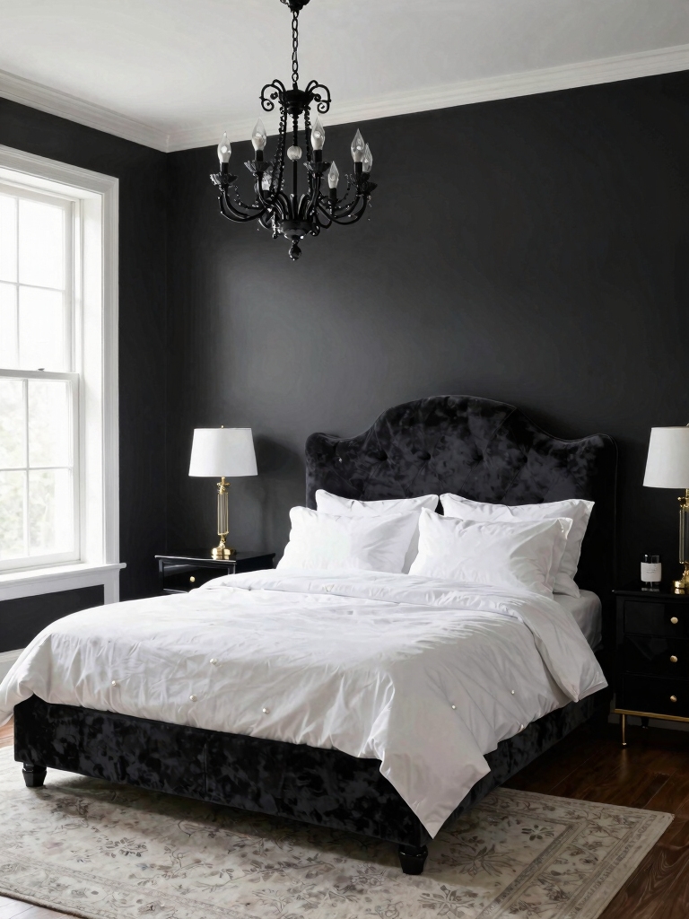
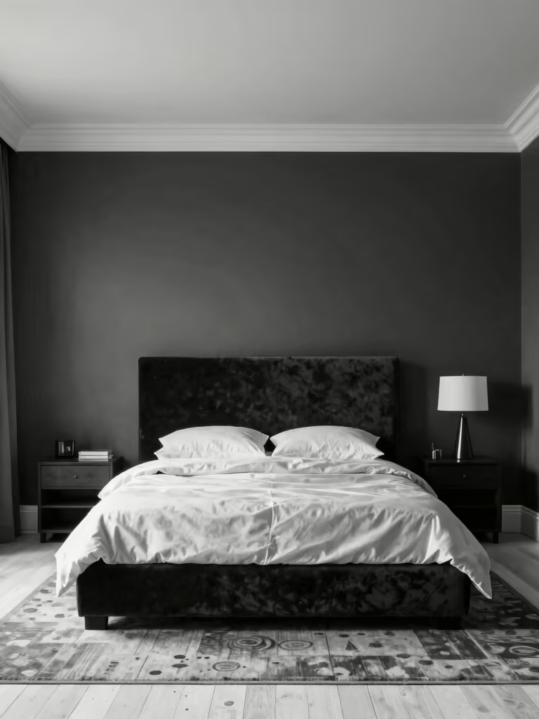
One beloved approach goes dark: an all-black or charcoal wall, usually behind the bed, with crisp white accents bouncing light back. The black wall recedes and cocoons, while the white keeps it from closing in. Light it well. Done right, it feels moody and bright at once.
This version wants more light, so it suits a bigger or sunnier room. Layer white bedding, a pale rug, and warm lamps against the dark wall, and add brass or wood to warm the whole thing. For the deepest version, our a moody, dramatic look goes all in.
- A single black or charcoal wall behind the bed only
- Crisp white bedding and a pale rug to bounce the light
- Brass or wood accents to warm the dark
- Warm lamps so the black reads cozy rather than cave-like
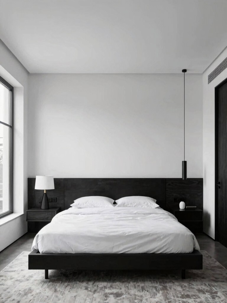
Crisp Minimalism: White Walls, Black Furniture
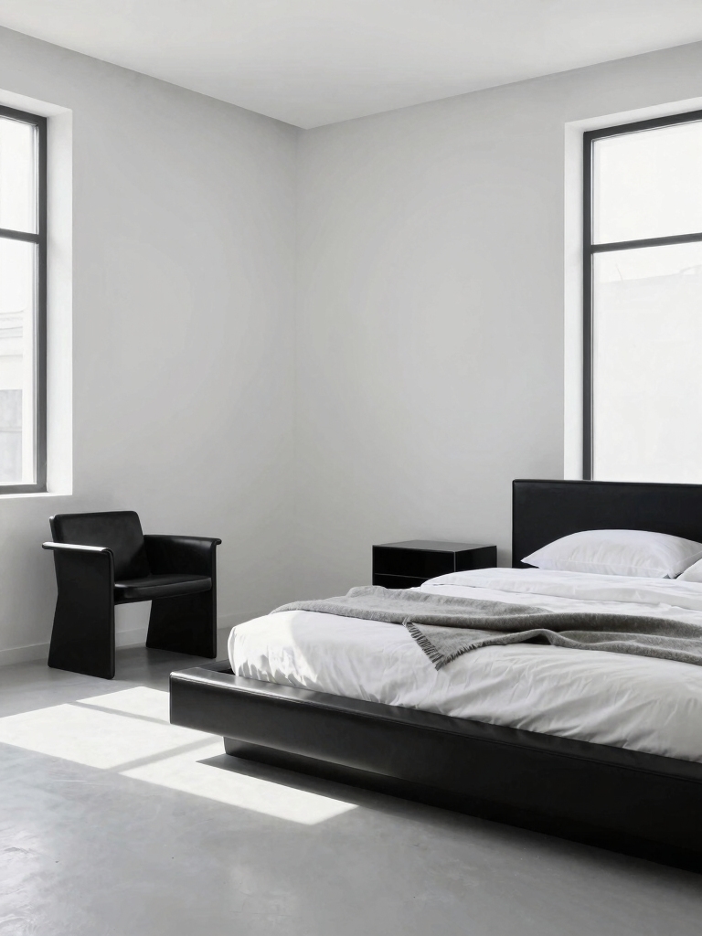
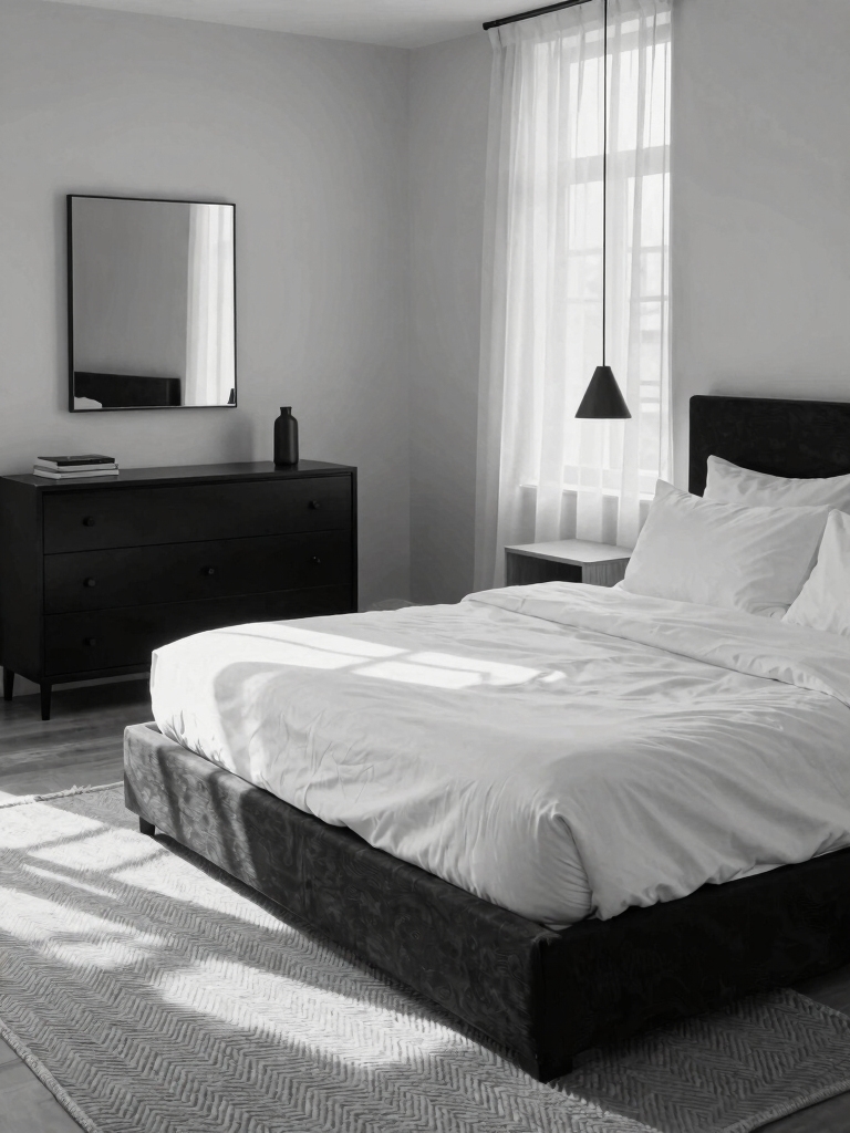
The other classic flips it: white walls with black furniture as the focal points. It is the more forgiving version, and the one most obsessed people start with. Build it in this order:
- Keep the walls white or warm off-white for an airy base
- Anchor the room with black pieces, a bed frame, nightstands, a lamp
- Let cleared surfaces and negative space show off the contrast
- Soften it with light textiles so the black stays light on the eye
- Add a rug to define the zone without overpowering the white
🅰️All-black wall
Moody, cocooning, dramatic. Best in a bigger or brighter room, since it needs light to keep from closing in.
🅱️White walls, black furniture
Crisp, airy, and forgiving. Best in a small or low-light room, and the easier version to start with.
Play With Tactile Contrast
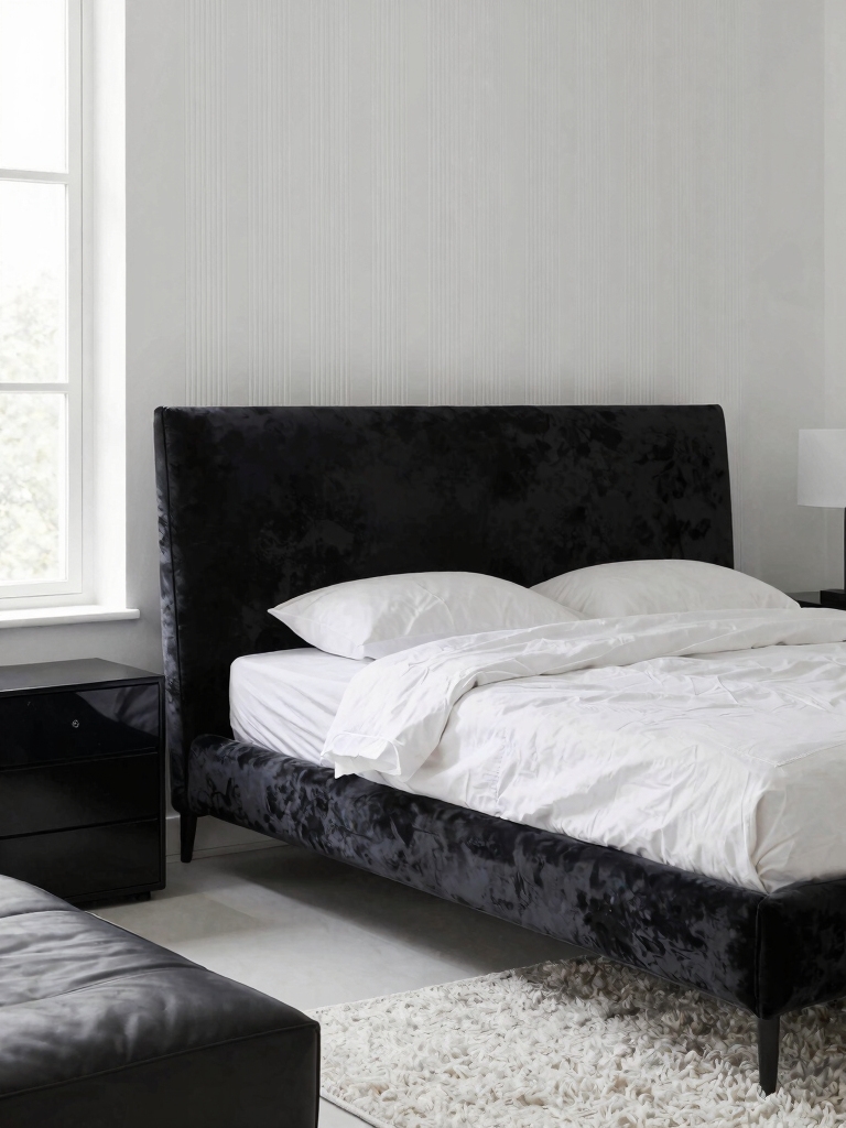
Texture is the secret the obsessed all know: it is what keeps two flat colors from feeling like a chessboard. Contrast in texture matters as much as contrast in tone, so pair velvet against linen, wool against lacquer, matte black against a glossy ceramic, and the room gains depth without a drop of extra color.
- Bouclé or a deep-pile knit for soft warmth against hard black
- Crisp linen and cotton to keep the white from going flat
- A wool or sheepskin layer underfoot for grounding
- One lacquered or glossy piece to catch the light
Keeping Black and White Looking Sharp
The honest downside of black and white is that both extremes show everything. Black collects dust and lint, white shows every scuff and stain, so the look lives or dies on upkeep. Upkeep is the catch. A quick wipe of the black surfaces and a wash of the white textiles on a regular schedule keeps it crisp.
Plan for it from the start. Choose washable covers on the white pieces, a wipeable finish on the black ones, and keep a lint roller in the nightstand. Five minutes of upkeep a week is the difference between a black-and-white room that looks designed and one that looks tired.
Choose Your Version Before You Buy
The biggest mistake the obsessed warn against is mixing both approaches at once. Decide early whether you want the moody black-wall version or the crisp white-walls one, since trying to do both leaves a room that feels half-finished. Let your room’s size and light make the call for you.
Small or dark rooms almost always want the white-led version, which keeps them open. Bigger, brighter rooms can carry the drama of a black wall. Once you have picked, every later purchase gets easier, and for a softer palette altogether our a calm color base is a gentler starting point.
Make the Bed the Focal Point
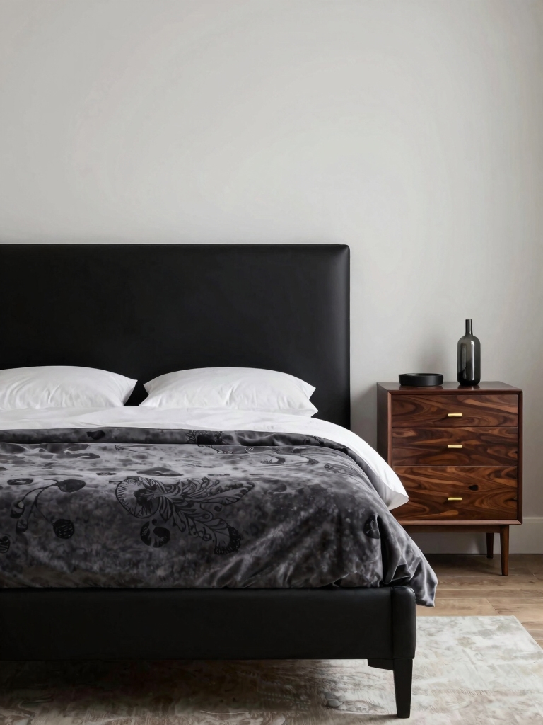
In a black-and-white room the bed is the obvious place to stage the contrast, since it is the biggest surface in the room. A black headboard against white walls, or white bedding against a black wall, makes the bed the clear focal point with almost no effort, and a quality washed-cotton or linen cover, roughly $70-140, upgrades the softness while you are at it.
- A black upholstered or cane headboard against a light wall
- Crisp white bedding with one black accent, a border or lumbar pillow
- Symmetry at the bed, matched lamps and nightstands, for a calm anchor
- One textured throw so the bed reads cozy and soft
Light It Warm to Avoid the Chill
Lighting decides whether a black-and-white room feels chic or clinical, full stop. Cool, bright bulbs make the palette harsh, while warm, low light makes it inviting. Swap to warm-toned bulbs (2700K or lower), put the overhead on a dimmer, and lean on lamps, and the same stark scheme glows.
Layer a few warm sources so the room has depth after dark, a couple of bedside lamps, a floor lamp, maybe a low accent. For where each one belongs, our layered lighting guide helps, and warming the bulbs is a five-minute fix that changes everything.
Add One Accent and Hide the Clutter
Two final touches separate the obsessed from the beginners: one disciplined accent and zero visible clutter. A single accent color or metal makes the monochrome feel personal, and clear surfaces let the contrast stay clean. Both are cheap, and both matter more than another piece of furniture; our hidden storage helps with the second.
- One accent only, brass, greenery, or a single muted color
- Closed storage so the stark palette stays clutter-free
- Clear surfaces, since mess shows louder against black and white
- A tray or basket to corral the daily small stuff
Mix in Metallics for a Little Glam
A touch of metal is what tips black and white from graphic into glam. Brass, gold, or matte bronze warms the cool palette and catches the light the two flat colors cannot. Keep it to one finish and a few small doses, and it reads luxe and intentional.
- Brass or gold on lamp bases, frames, and hardware
- One finish throughout so the metals agree
- Small doses only, since too much shine tips into gaudy
- Matte black hardware instead if you want edge over glam
Use a Statement Rug to Ground It
A rug is the easiest place to bring the contrast down to the floor and warm the room at once. A black-and-white pattern, a striped flatweave, or a high-pile white rug grounds the bed and softens hard floors. Size it up so it runs well under the bed and the room feels anchored.
Let the rug be the pattern if your walls are plain, or keep it quiet if a wall already carries the graphic. One bold element at floor level is plenty. A wool or jute weave handles bare feet and wears well, which matters more in a high-contrast room where every mark shows.
Refresh It With One Seasonal Swap
Black and white is a steady base, which makes it easy to refresh with a single seasonal swap. Change the accent, a warm throw and brass in winter, greenery and crisp linen in summer, and the whole room feels new for the price of a cushion. The monochrome bones never change.
Keep a small box of off-season accents so the swap takes ten minutes. The discipline of one accent at a time is what keeps the room from sliding into clutter, and it gives you a low-stakes way to keep the space feeling current every few months.
Black-and-White Questions the Obsessed Ask
?Should my walls be black or white?
Let the room decide. Small or low-light rooms want white walls with black furniture, which keeps them open and airy. Bigger, brighter rooms can carry a moody black or charcoal wall behind the bed. Pick one approach and commit, since mixing both at once tends to look half-finished.
?How do I keep a black-and-white bedroom from feeling cold?
Warm the light and add texture. Swap to warm 2700K bulbs on a dimmer, layer velvet and linen, and bring in wood or brass. Lean mostly white with black as the accent and warm the whites slightly. Those moves turn a stark scheme cozy without losing the contrast.
?What ratio of black to white should I use?
Pick a clear lead rather than a fifty-fifty split, which tends to fight itself. A rough seventy to ninety percent white with black as the accent reads calm and open and is the easiest to live with. You can always push more black in once the room feels balanced.
?Is black and white hard to maintain?
It shows more than most palettes, since black catches dust and lint and white shows scuffs. Plan for washable white covers, a wipeable finish on black pieces, and a lint roller nearby. About five minutes of upkeep a week keeps the contrast looking crisp rather than tired.
?What accent works best with black and white?
One is plenty. Brass or gold adds warmth and glam, greenery pops fresh, and a single muted tone like sage or blush feels modern. Choose one accent and repeat it a few times so it looks deliberate, and keep the rest of the room strictly black and white.
Why the Obsession Lasts
Black and white stays a favorite because it is bold and easy at the same time: two colors that always work together, a look that hides mismatched pieces, and a scheme that never dates. Pick your version, lean the ratio one way, warm the light, and add texture, and you get a room that looks designed for very little.
So decide which version is yours, the moody black wall or the crisp white base, and start there. Get the balance and the light right first, keep it sharp with a little weekly care, and you will understand exactly why the obsessed never switch.