A bedroom cupboard takes up more wall than almost anything else in the room, so its color quietly sets the whole mood. Painted or finished well, it can fade into a calm backdrop or become the room’s boldest feature. Most people never think to choose; they take whatever the wardrobe came in and live with it. You can do far better.
These bedroom cupboard color ideas walk through the real decision: blend the wardrobe into the room or let it stand out, then pick the shade and finish that pulls it off. We’ll cover matching your wood, calm neutrals, restful blues, cozy terracotta, and dark drama, with hardware and finish tips. The wardrobe stops being furniture you tolerate and starts being a design choice.
Choosing a Cupboard Color
First decide the job: do you want the cupboard to blend into the walls and disappear, or stand out as a feature? Blending makes a room feel calmer and larger; contrast makes the wardrobe a statement.
Then match the shade to your wood, walls, and the mood you want, and finish it right: matte for a soft, modern look, or satin and gloss to bounce light. Coordinate the hardware and the whole piece reads designed rather than default.
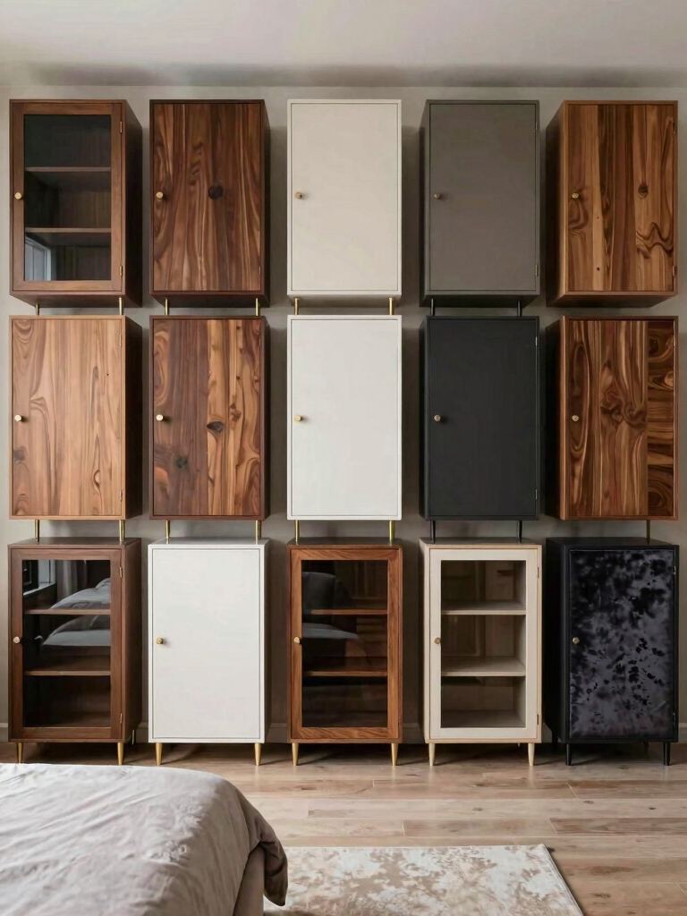
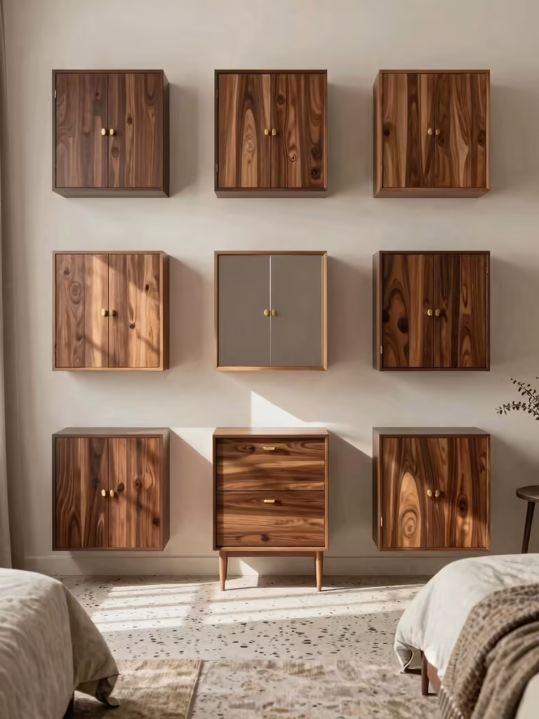
Matching Cupboard Color Harmony
The first choice is whether to blend or contrast. It changes everything that follows. Painting the wardrobe close to your wall color lets it recede, which makes a room feel calmer and more spacious, perfect for a small or busy bedroom. Picking a contrasting shade turns the cupboard into a deliberate feature, which suits a room that wants a focal point.
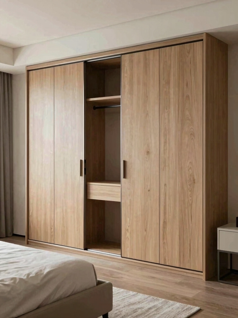
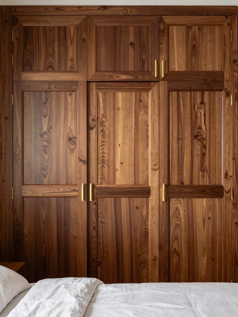
Either way, the goal is harmony with the wood and the room. Read the undertones first: a warm wood floor wants a cupboard color with warmth in it, a cool gray scheme wants cooler tones, so they sit together comfortably. Test a panel before committing, and plan the hardware and nearby furnishings to tie in. My [cozy bedroom color palette guide](cozy-bedroom-color-palette-ideas-changing) helps read undertones.
- Decide the job first: blend to calm and enlarge, or contrast to make a feature.
- Match undertones to your wood and walls so the cupboard harmonizes, not clashes.
- Test a painted panel and plan the hardware before you commit to the whole wardrobe.
Calm, Elegant Bedroom Aesthetics
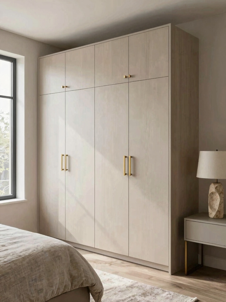
Soft neutrals top the list of cupboard colors for good reason: they bring calm, everyday elegance and go with almost anything. A warm white, greige, mushroom, or soft taupe wardrobe looks polished and timeless, and it blends into a neutral room so the space feels serene and uncluttered. This is the safe, graceful choice. It flatters most bedrooms and almost never dates, which is why designers reach for a soft neutral wardrobe again and again.
- Choose a warm neutral (greige, mushroom, soft taupe) for a calm, timeless wardrobe.
- Keep it close to the wall color so the cupboard recedes and the room feels larger.
- Layer natural textures nearby (linen, wood, rattan) so the neutral never reads flat.
A few cupboard-color terms worth knowing:
📖Blend vs contrast
Painting the wardrobe near the wall color (blend) calms a room; a different shade (contrast) makes it a feature.
📖Undertone
The warm or cool bias hidden in a color; match it to your wood and walls so the cupboard harmonizes.
📖Sheen
How much a finish reflects: matte hides flaws and reads soft, gloss bounces light and shows every smudge.
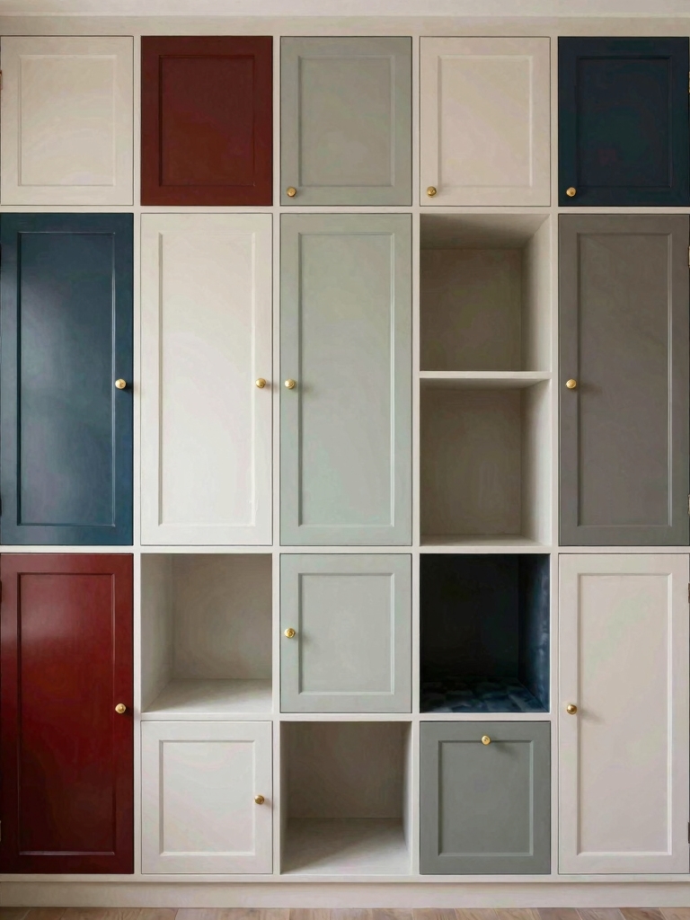
Calming Blue Bedroom Aesthetics
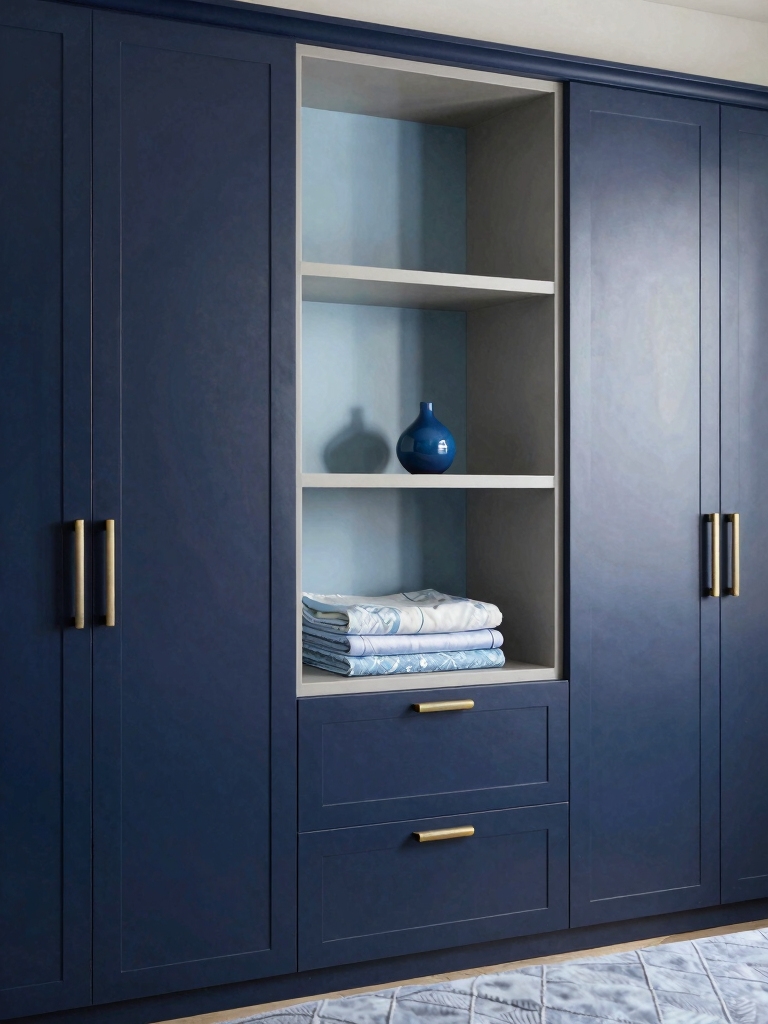
Blue is a quietly brilliant cupboard color. It feels restful and a little unexpected on a wardrobe, which is exactly what a sleep-focused room wants. A soft dusty blue keeps things light and serene, while a deep navy brings grown-up drama minus the heaviness of black. Either way, blue on a cupboard comes across calm and considered, perfect for a room built for sleep.
Pair the blue with warm metals and wood to keep it from going cold. Brass or aged-gold handles warm a navy wardrobe instantly, and a wood floor or nightstand grounds the cool tone. Keep the walls soft so a bold blue cupboard can be the room’s quiet centerpiece. For the palest end of the blue family, see my [baby blue bedroom ideas](baby-blue-bedroom-ideas-sweet).
Cozy Terracotta Bedroom Accents
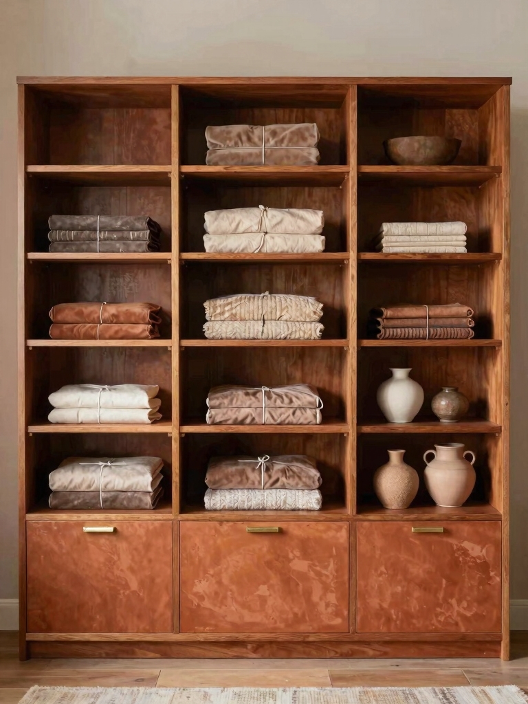
Want warmth instead? Terracotta and other clay tones make a cupboard feel cozy and characterful, the earthy answer to all those cool neutrals. A muted terracotta, rust, or warm ochre wardrobe brings sun-baked warmth to a bedroom, especially against cream walls and natural wood. It’s a softer way to add color than a cool tone, feeling welcoming rather than bold.
Keep the earthy cupboard grounded with the right company. Pair terracotta with cream, warm white, and plenty of natural texture (jute, linen, wood) so it feels like a desert evening rather than a loud statement. Warm brass or bronze hardware completes the cozy look. For more on warm, grounded palettes, see my [aesthetic room color ideas for any bedroom](aesthetic-room-color-ideas-bedroom).
A wardrobe is the biggest piece of color in most bedrooms. Choose its shade on purpose and half the room is decorated before you hang a thing.
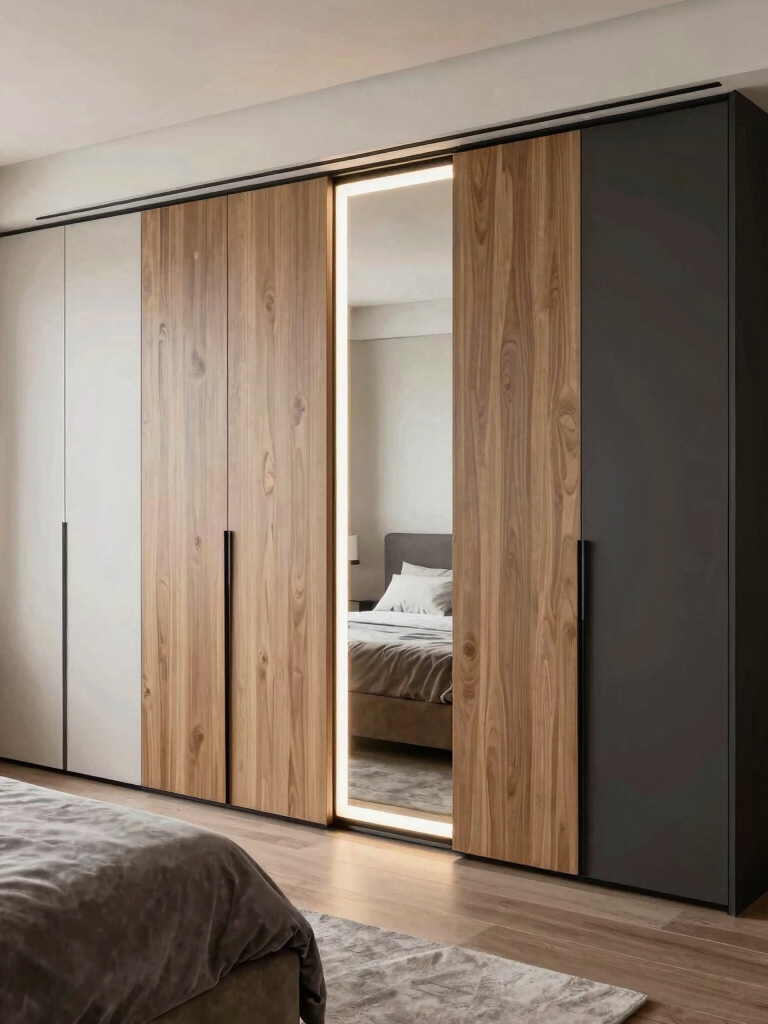
Chic, High-Contrast Bedroom Design
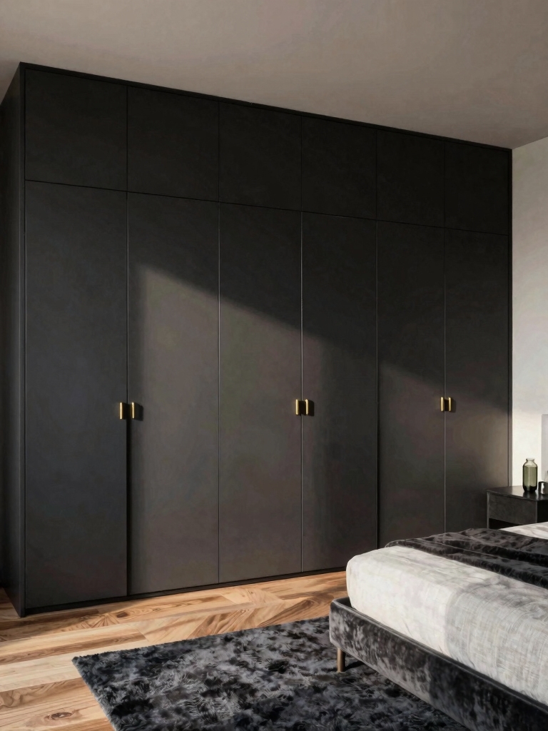
When you want the cupboard to be a statement, go high-contrast and let it own the room. A deep charcoal, forest, or black wardrobe against pale walls looks chic and architectural, turning storage into the bedroom’s boldest design moment. This is the choice for a bold room. It wants drama and can carry a strong focal point without tipping into too much.
Let the Dark Cupboard Lead
Balance the bold cupboard so it feels intentional. Keep the walls and bedding light and calm so the dark wardrobe has room to stand out, and add warm metal hardware so the contrast feels luxe and intentional. A dark cupboard can anchor a whole room the way a feature wall does, with the bonus of holding all your clothes.
Mind the scale and the light before going very dark. A large dark wardrobe can overwhelm a tiny or dim bedroom, so in a small room a deep tone might work better on a single section or the inside of the doors. In a bright, generous room, full dark drama looks striking. For lighting a bold piece well, see my [bedroom lighting ideas for mood](bedroom-lighting-ideas-mood).
Finishes That Make or Break the Look
The finish matters as much as the color. The same shade reads completely different in matte versus gloss, so the sheen is half the decision. Matte and eggshell feel soft, modern, and forgiving of fingerprints, which suits a calm or moody wardrobe. They absorb light, so the color stays deep and quiet, ideal for neutrals and darks.
Glossier finishes do the opposite, bouncing light to brighten a room and add a sleek, lacquered look. A satin or semi-gloss cupboard throws daylight back, which can lift a dim bedroom, though it shows every smudge and imperfection, so the surface has to be smooth. Gloss suits a polished, contemporary room and high-touch doors that wipe clean.
Match the finish to the room and the wear. A busy household leans toward a wipeable satin; a serene, grown-up room leans matte. Whatever you choose, prime properly if you’re painting over laminate or old wood, since a cupboard takes daily handling and a cheap finish chips fast. The right finish is what separates a custom-looking wardrobe from a DIY one.
Hardware and the Inner-Door Surprise
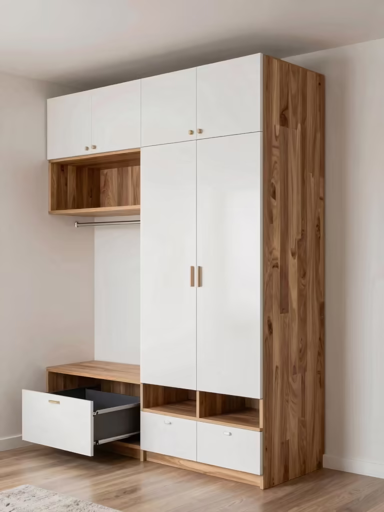
Hardware is the jewelry of a cupboard. The right handles tie the color into the whole room and quietly signal quality. Match your metals to the rest of the bedroom (brass with warm schemes, black or nickel with cooler ones) and the wardrobe instantly looks designed. Swapping dated handles for a fresh finish is one of the cheapest upgrades there is, often under $30 for a small wardrobe.
For a playful, low-risk pop of color, paint the inside of the doors. A bright or bold shade on the interior gives you a little jolt of personality every time you open the cupboard, while the outside stays calm and goes with the room. It’s a designer trick that costs a sample pot and surprises in the best way.
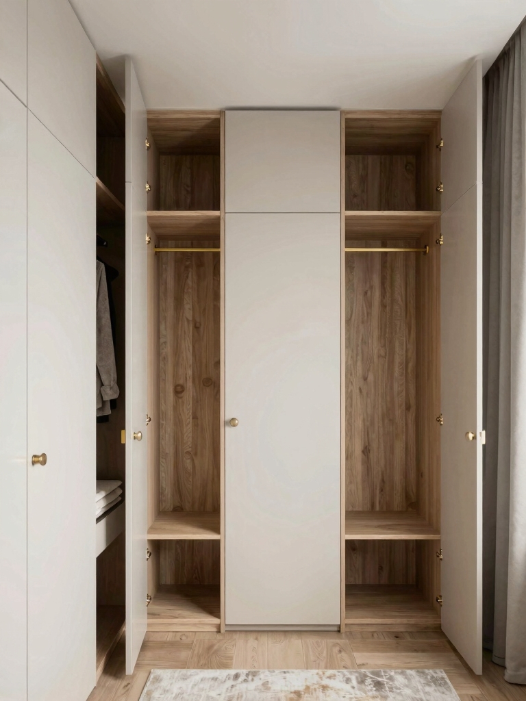
Think about the doors themselves as part of the color story. Beadboard or fluted door fronts add texture that a flat color alone can’t, and replacing solid doors with cane or fluted glass softens a big wardrobe. These small structural touches, paired with the right color and hardware, are what turn a plain cupboard into a piece that seems built for the room.
Budget Ways to Restyle a Cupboard
You don’t need a new wardrobe to change its color, just paint and a plan. A quart or two of cabinet-grade paint transforms an old or builder-basic cupboard for well under fifty dollars, and the right primer lets you cover laminate or dated wood that you thought you were stuck with. It’s the highest-impact bedroom upgrade most people never consider.
Stack a few cheap touches for a custom look. Swapping the handles for a fresh metal, adding slim molding to flat doors, or lining the interior with a fun paper or paint all read high-end for pocket change. Each small move compounds, so a tired wardrobe ends up looking like a designed, built-in piece.
Spend the little you do spend where it shows and lasts. Good paint and quality hardware are worth it on a piece you open every day, while the decorative flourishes can stay thrifty. Done right, a weekend and a small budget turn the biggest, dullest item in the room into its most stylish.
Which Cupboard Color Suits You
The right cupboard color comes down to your room and how much drama you want. If the space is small, busy, or you crave calm, blend the wardrobe into the walls in a soft neutral so it quietly disappears. If the room is roomy and a little plain, a contrasting cupboard in blue, terracotta, or a deep dark gives it the focal point it’s missing.
Factor in your wood, your light, and your patience for upkeep. Warm woods love warm cupboard colors, dim rooms benefit from lighter or glossier finishes, and busy households want wipeable surfaces and forgiving mid-tones.
Match the color to all three (the room, the wood, and your real life) and the wardrobe ends up both stylish and easy to live with. For coordinating the storage inside, see my [bedroom cupboard storage ideas](bedroom-cupboard-storage-ideas-work).
A Wardrobe Worth Choosing a Color For
Your bedroom cupboard is too big a surface to leave to chance. Decide whether you want it to disappear or stand out, match the shade to your wood and the mood you’re after, pick the finish that suits your room and your life, and coordinate the hardware. Do that and the wardrobe shifts from background furniture into one of the most stylish decisions in the room.
Look at your cupboard as a blank canvas this week, decide blend or feature, and the biggest piece in the room becomes the easiest place to add real style.