Blue in the bedroom isn’t just color—it’s a calming, budget-smart secret weapon I love sharing. From airy light blues to deep navy foundations, blues cue rest, coziness, and a sense of curated sanctuary. I mix textures, matte woods, and soft fabrics, add metallic accents, and swap pillow covers or rugs to refresh—no wrecking balls of cash. If you keep exploring, you’ll reveal more blue-blueprints to tailor a serene sanctuary you’ll actually want to sleep in.
Why Blues Promote Rest in the Bedroom
Blue tones soothe the mind and cue our bodies to wind down, so blues in the bedroom aren’t just pretty—they’re practical.
I notice how cooler blues calm nerves, lowering heart rate, while deeper hues ground me for sleep.
I’ll guide you through gentle contrasts and textures that feel intentional, not fussy, so your rest becomes a curated, cozy ritual.
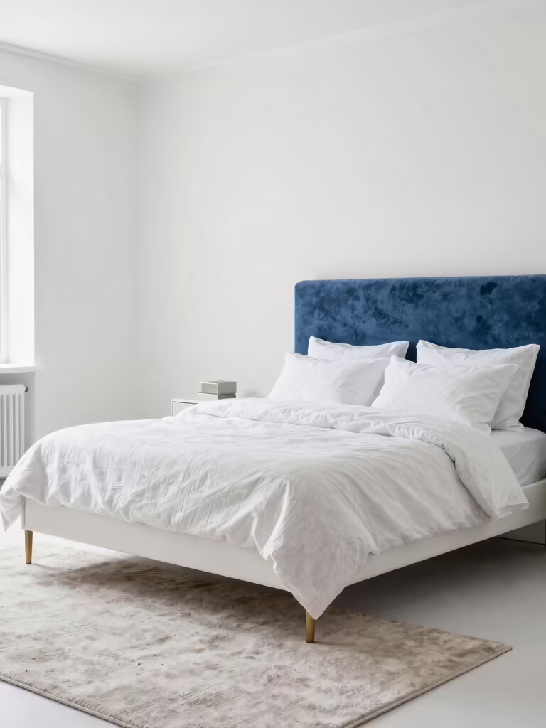
Choose Blues: Light, Medium, or Deep Tones for Your Space
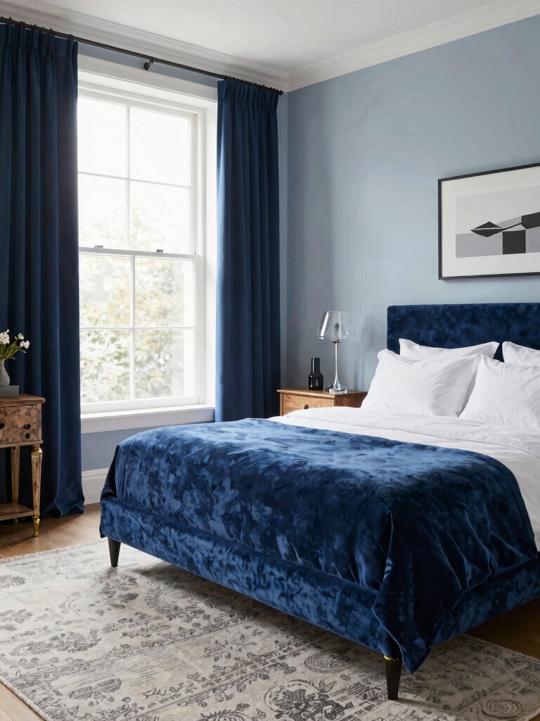
After feeling the calming pull of blues in the bedroom, it’s time to pick your vibe: light, medium, or deep tones.
I’ll guide you quick: light feels airy and fresh, medium balances serenity with personality, deep adds drama and coziness.
Consider natural light, room size, and furniture. Test swatches, trust your eye, and build layers for a cohesive, calming sanctuary.
For those who adore the color, exploring dreamy blue bedroom inspirations can spark ideas that fit every style.
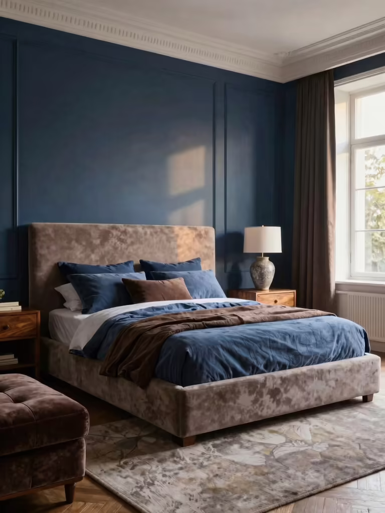
Midnight Navy as a Bold Foundation: When It Works
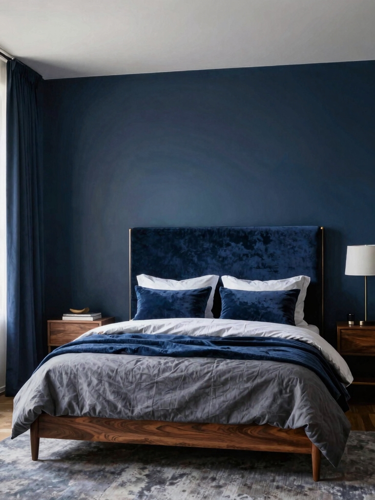
Midnight Navy lays a sturdy, bold foundation without shouting.
I’ll show you how its night-quiet depth can anchor both bold accents and soft textures for balance.
Let’s explore when this hue works—from contrast-friendly pairs to cozy, calming corners.
This versatile shade can transform your bedroom on any budget while maintaining a sophisticated look.
Bold Foundation Benefits
Bold foundation isn’t just a backdrop; it anchors the room, giving Midnight Navy a reliable stage to shine.
I’m sharing how this deep base boosts mood, depth, and cohesion without shouting. It lengthens lines, enhances natural light, and makes accents pop with precision.
You’ll feel calmer, more collected, and curious about how small details echo bold confidence.
Night-But-Soft Balance
I mix saturated walls with warm textures and soft lighting, letting the deep hue anchor the room while plush textiles soften the mood.
You’ll notice contrast, cohesion, and comfort—a curated, approachable vibe that keeps everything livable, not stiff.
Nighttime serenity, colorfully practical.
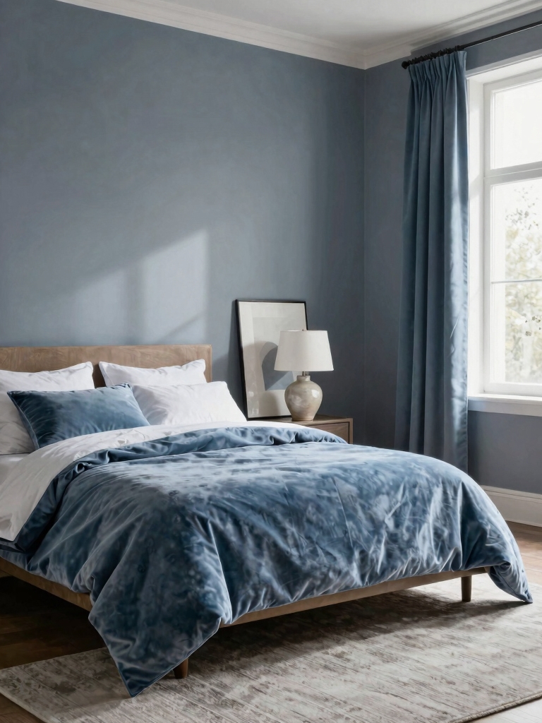
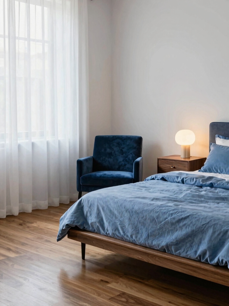
Soothing Sky Blues for Calm Mornings
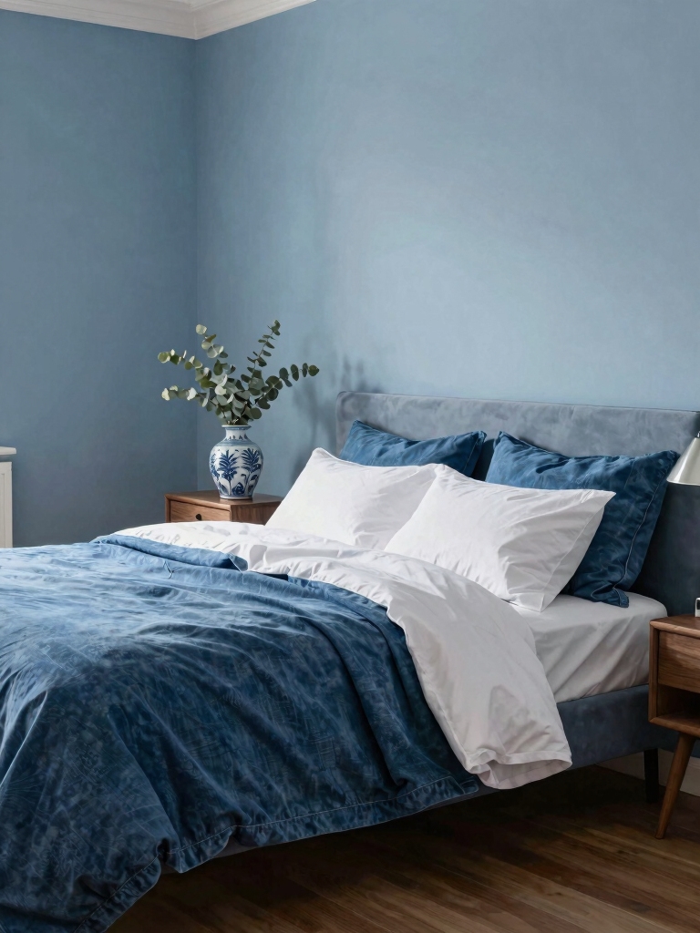
When you wake up to a sky-blue room, mornings feel gentler, almost like the light itself is taking a slow, deep breath.
I’m sharing soothing sky blues that calm minds and spark gentle routines. I pick airy pigments, soft textiles, and minimal palettes so clutter disappears.
You’ll feel refreshed, focused, hopeful—ready to greet the day with a quiet, curious smile.
These serene blue bedroom aesthetics create a relaxing retreat that enhances your overall well-being through calm energy.
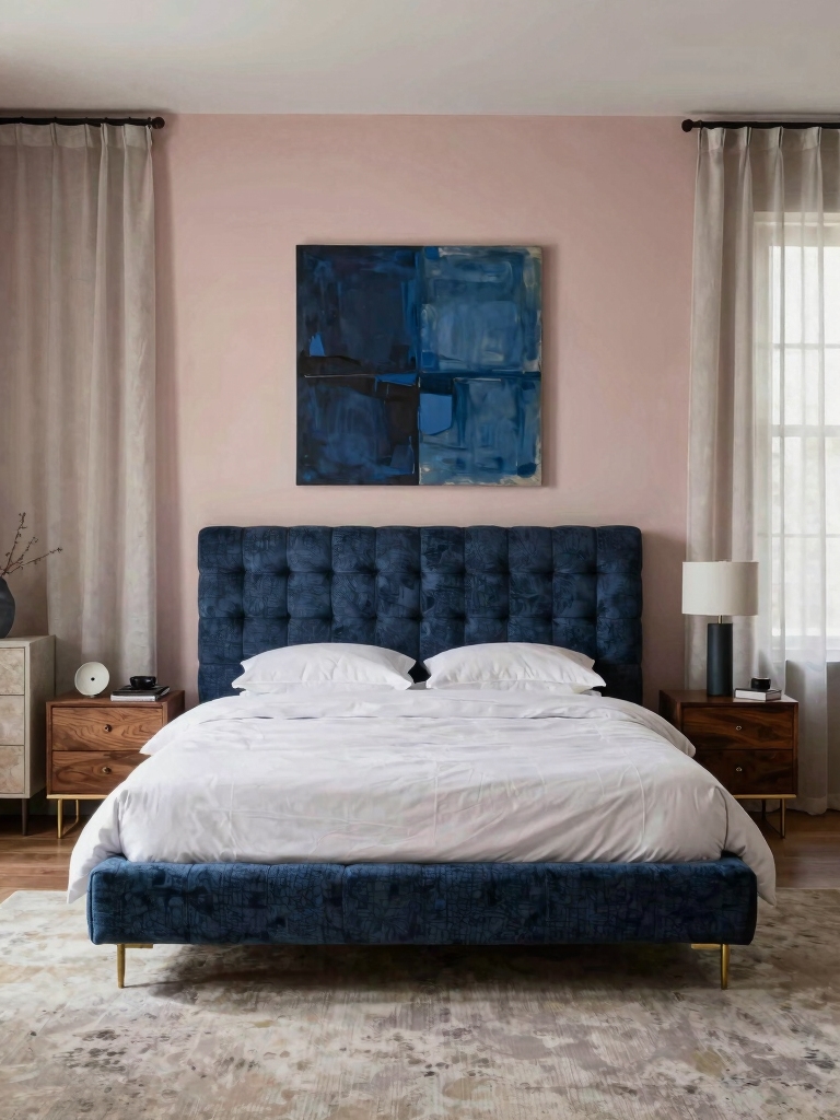
Teal and Indigo Twists for Depth in Blue Schemes
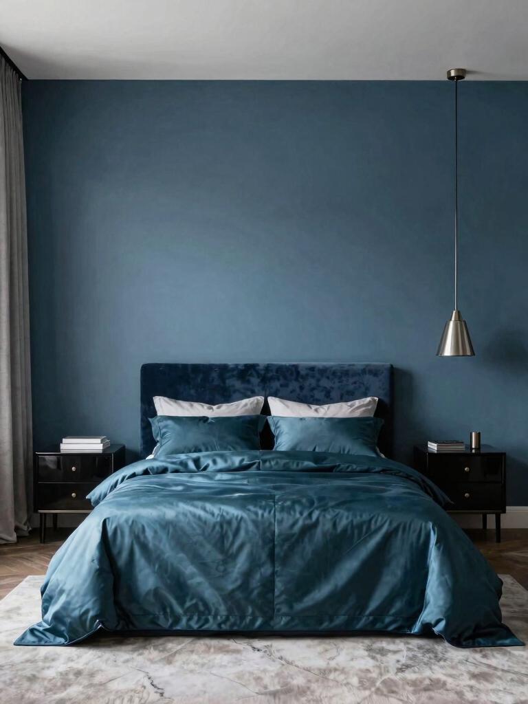
I’ll show you how Teal balances depth without overpowering the room, using its cool glow as the backbone.
Indigo accents pop just enough to anchor the palette and keep the eye moving, so a single statement feels intentional.
With blue cohesion in mind, we thread the teal and indigo through textures and finishes for a layered yet seamless look.
For more inspiration, explore stunning blue and white bedroom designs to see how these hues work harmoniously together.
Teal Balance for Depth
Teal can be the quiet hero that adds depth without shouting, especially when indigo threads weave through the blue.
I balance hues like a careful curator, letting teal ground dreams while indigo accents whisper. You’ll notice richer mood with thoughtful contrasts, texture, and proportion that stay cozy, never loud.
- Pair teal with midnight accents for depth
- Layer textures to deepen color perception
- Use restrained patterns to keep calm
- Add subtle metallic highlights
- Test swatches in natural light before committing
Indigo Accents, Blue Cohesion
Indigo accents sneak into blue rooms like a velvet whisper, tying teal and blue into one cohesive tapestry.
I love how these hues reinforce depth without shouting. I pair indigo with lighter blues for contrast, then sprinkle teal in textiles and art for lively rhythm.
The result feels curated yet welcoming, deliberate, and effortlessly fresh. Your space breathes, cohesive and intriguing.
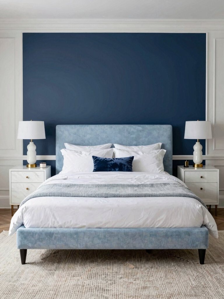
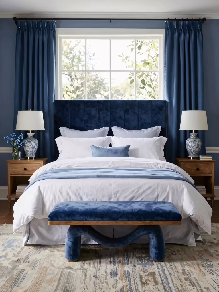
Layer Blues With Neutrals for Balance
Layering blues with neutrals creates a balanced, easy-on-the-eyes mood in a bedroom, and it starts with a simple rule: keep the neutrals grounding the blues without soaking up all the personality.
I’ll guide you:
- Balance bold with soft
- Pick a dominant blue hue
- Use warm beiges or whites
- Introduce natural textures
- End with a cohesive accent palette
Incorporating elements of the dreamy blue aesthetic trend can elevate the calming effect and add a modern touch to your space.
Texture to Warm Blues: Fabrics and Surfaces to Add Comfort
Soft textures are the easiest way to turn cool blues into cozy retreat vibes.
I explore fabrics and surfaces that amp warmth without shouting. Think velvet cushions, brushed linen, and cotton tchotchkes; pair with matte woods and woven rugs.
I avoid glare finishes, embracing tactile layers that invite you to linger.
The goal: calm, inviting, quietly luxurious blues.
Incorporating green room inspiration can also enhance the sense of tranquility and freshness in a blue bedroom.
Subtle Accent Walls: When to Whisper vs. Shout
Subtle accent walls can be your blue bedroom’s best-kept secret: they whisper, not shout, and still anchor the space.
I guide you to choose wisely, balancing hue, texture, and lighting. Whisper walls feel calm; shout walls demand drama. Ready, set, curate.
- Pick a muted shade with 1-2% contrast
- Use matte or satin finishes
- Mirror nearby lighting sources
- Consider vertical or horizontal framing
- Pair with calmer textiles and art
Incorporating blue bedroom ideas aesthetic can elevate your subtle accent wall from simple to stunning.
Smart Blue Room Storage and Closet Layouts
Smart blue rooms crave clever storage that feels like design, not clutter—so we’ll map out closet layouts that maximize space without stealing the calm.
I tailor shelves to your daily rituals, add cubbies for sourced treasures, and tuck hanging zones into soft-blue corners.
Minimal hardware, maximal impact: drawers align with doors, and every inch earns a quiet, curated win.
Incorporating a cozy blue comforter can enhance the bedroom’s warmth and tie the storage design seamlessly into the overall aesthetic.
Maximize Natural Light to Elevate Blues
Natural light is my secret weapon for blue rooms, and I’ll show you practical ways to flood your space without bleaching the mood.
I’m sharing concise tactics that stay chic, not dim. Here’s how to glow:
- Embrace sheer curtains for soft diffusion
- Reposition mirrors to multiply rays
- Opt light-wall paint for bounce-back
- Trim clutter to reveal window access
- Choose glass or open-sill accents
Incorporating sky blue inspiration can enhance the calming effect of natural light in your bedroom.
Lighting for Blues: Warm vs. Cool Interplay
Warm and cool light aren’t enemies in a blue room; they’re teammates you can orchestrate.
I mix sources to bend mood: warm lamps soften navy midnight and cool LEDs sharpen icy accents.
Balance matters—don’t overdo one side. Use dimmers, swappable bulbs, and color-filtered lamps to tailor vibes for reading, relaxing, or dreaming.
Subtle contrast keeps blues lively, never clinical.
Inspired by vibrant blue wall bedroom ideas, incorporating varied lighting enhances the room’s dynamic and appeal.
Furniture Choices That Complement Blue Palettes
I’m choosing furniture that plays nicely with blues, leaning into complementary wood tones to keep the room grounded.
I’ll mix textures across finishes—matte, satin, and a hint of grain—to add depth without shouting.
Let’s chat about how these choices cue the eye toward the blue, with a curated, approachable vibe.
Complementary Wood Tones
Choosing the right wood tones is like picking the bass line for a blue vibe—you want something that supports without shouting.
I mix warm oak, soft maple, and walnut to ground a palette, keeping contrast tasteful, not dramatic.
Here are options:
- Warm oak
- Soft maple
- Walnut accents
- Teak touches
- Painted contrast trims
Texture Across Finishes
I’m all about pairing matte blues with glossy whites to balance calm and spark. Mix velvety fabrics with lacquered woods, then tuck in textured metals for contrast.
I love how a satin cabinet echoing a sea breeze brightens space, while a chalky desk adds grounded charm.
Finish thoughtfully, live stylishly.
Pattern Play in Blues: Stripes, Florals, Damasks
Pattern play in blues is all about mixing stripes, florals, and damasks without shouting over the bed.
I mix scale and pattern like a DJ, keeping harmony with calm blues, then drop surprising accents. You’ll feel bold without loud chaos.
- Stripes play nice with florals when sizes differ
- Layer a damask rug for grounded elegance
- Use subtle blues as a glue
- Alternate patterns across textiles
- Keep negative space intentional
Metallic Touches: Brass, Copper, Chrome Accents
Metallic touches elevate a blue bedroom without shouting.
I sprinkle brass, copper, and chrome as small, intentional accents—think lamps, picture frames, and drawer pulls. They add warmth, reflect light, and playful contrast without overwhelming the mood.
I balance cool blue with a dash of gleam, keeping lines clean and curated. Subtle, shiny cues elevate the room with confidence.
Budget-Friendly Makeovers: Paint, Swap, Refresh
I’m keeping the blue vibe intact while I paint, swap, and refresh on a budget.
Let’s talk paint tactics that stretch a buck and swap ideas that refresh the room without wrecking the wallet.
Ready to start small, stay intentional, and see big changes?
Paint Tactics On Budget
If you’re aiming for a quick room transformation on a budget, painting is your secret weapon and a surprisingly satisfying DIY—swap out the mood, not the furniture.
I’ll keep it crisp:
- choose bold accent walls for impact
- test swatches in natural light
- pair matte walls with glossy trims
- use painter’s tape for clean lines
- refresh with a single contrasting ceiling color
Refresh By Swap Ideas
Swap your space, not your budget: quick, budget-friendly refresh ideas that hinge on a swap or two—paint, accents, and a few smart swaps in decor you already own.
I’m sharing simple, playful tweaks: rotate a rug, swap pillow covers, and repaint a single wall for mood.
Curated, practical, and surprisingly transformative—your blue bedroom will feel brand-new without breaking the bank.
DIY Projects to Personalize a Blue Bedroom
When you want a blue bedroom that feels uniquely you, DIY projects are the fastest path to personalize it without breaking the bank.
I guide you with simple, clever tweaks that reflect your taste, not trends, so you feel at home the moment you step in.
- Painted accent wall with a soft gradient
- DIY fabric drawers for a pop of texture
- Handwritten wall quotes
- Upcycled frame gallery
- Mini botanical shelves for calm color pops
Preview Blues Before You Commit: Testing Your Palette
Curious where your blues land before you commit? I test palettes like a detective with swatches, lighting, and mood boards.
I live with samples on a wall, note how they feel at morning brightness and after dusk. I pick three contenders, compare vibes, and cut the clutter.
Then I commit only when the color speaks clearly to the room’s soul.
Conclusion
I know blue can feel bold or chilly, but I’ve learned to lean in anyway. If you’re worried you’ll tire of it, test swatches in your lighting and keep the rest simple—white textiles, warm wood, a brass quote hook—and you’ll see the mood soften into serenity. It’s not about chasing trends, it’s about making a sleep haven you actually love waking up to. Trust the palette, and your room will tell you what it wants to be.