
Stand in a bedroom at dusk and you feel the color before you read it: a warm clay wall glowing under a lamp, or a cool gray that suddenly turns chilly once the sun drops. Color is the loudest quiet decision in a room. It sets the mood every single morning and night, long after you’ve stopped noticing it consciously.
These aesthetic room color ideas for a bedroom run from the softest neutrals to deep jewel tones, each with the pairings and undertones that make it work. I’ve grouped them by feeling so you can match a palette to how you want the room to feel, then test it cheaply before you commit a whole wall.
Picking a Bedroom Color, Fast
- Start from the feeling you want (calm, cozy, moody) and let that narrow the palette before you browse swatches.
- Build every scheme as one dominant tone, one neutral anchor, and one or two accents; that structure holds together every time.
- Test paint with a $6 to $9 sample at night, since bedroom color lives or dies under lamplight.
- Lean warm and a little muted for restful sleep; save the boldest tones for one accent wall or textiles.
Build a Cohesive Color Palette Framework
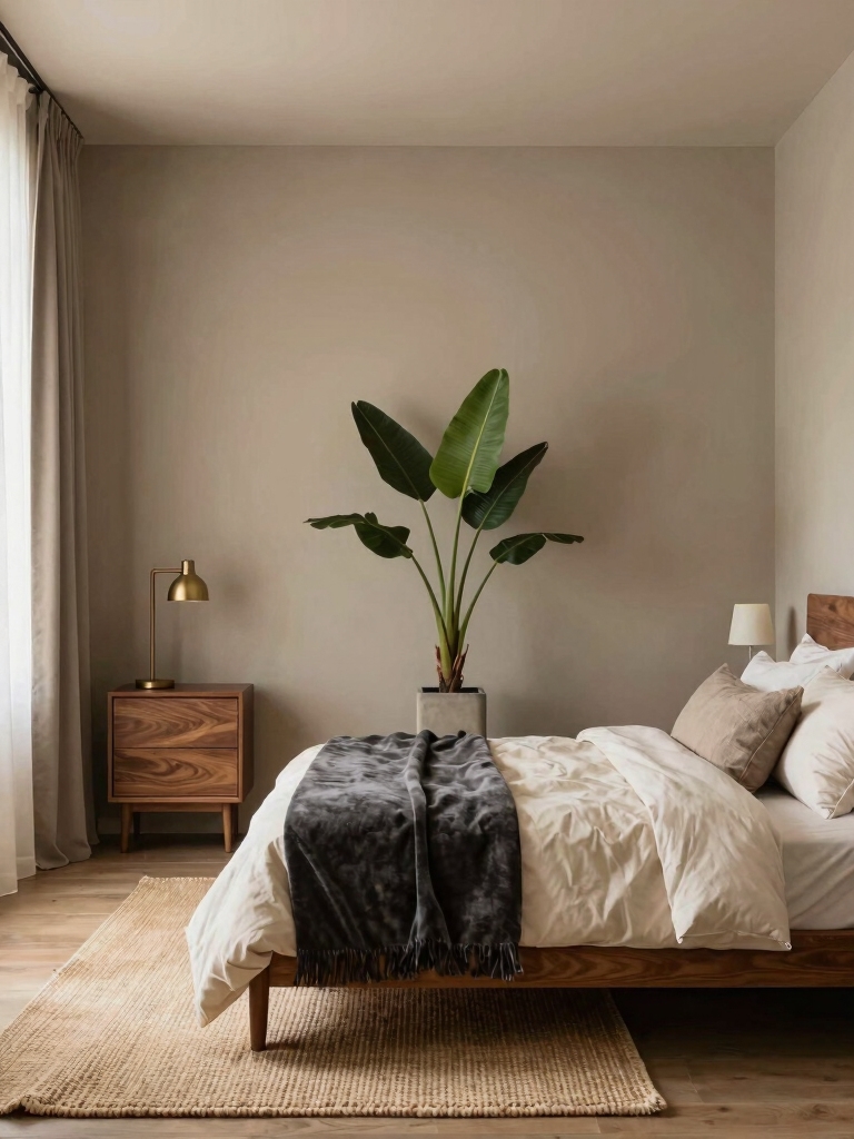
Before any specific color, learn the structure that makes every palette below work. The formula designers lean on is simple: one dominant tone for most of the room, one neutral to anchor it, and one or two accents for life. Roughly a 60-30-10 split keeps the eye calm and the room from feeling busy.
Pick the dominant tone from the mood you want, then choose a neutral that shares its undertone, warm with warm, cool with cool, so nothing clashes. Repeat each color at least twice around the room and the space looks composed. The eye relaxes.
Test your shortlist with a $6 to $9 sample pot at night, since lamplight changes everything. For deeper pairings, my [cozy bedroom color palette guide](cozy-bedroom-color-palette-ideas-changing) breaks down combinations that hold up in low light.
Soft, Calming Neutral Palettes
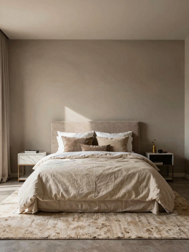
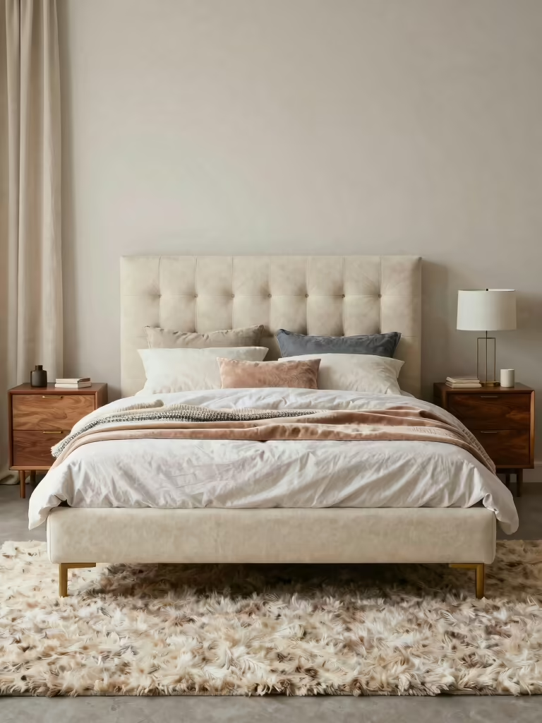
Neutrals are the easiest place to start. They anchor most restful bedrooms because they forgive almost everything you layer on top, from a bold throw to a clashing book stack on the nightstand. The trick is warmth: a neutral with a little cream or clay in it feels soothing, while a stark cool one can tip toward cold. Here are the neutral families I reach for most.
- Creamy whites and oatmeal: soft, sunny, and forgiving; they glow under warm bulbs and pair with any wood.
- Warm greige: the gray-beige hybrid that flatters both cool and warm accents, ideal if you can’t decide.
- Soft taupe and mushroom: a half-step deeper for a cocooning feel that still stays light.
Match a palette to the mood you’re after:
🎯Want calm and restful?
Soft warm neutrals or dusky blue; muted, warm, and easy to live with night after night.
🎯Want cozy and grounded?
Cream with terracotta or a warm brown; earthy tones that glow under lamplight.
🎯Want moody and dramatic?
Charcoal with brass, or plum with blush; deep tones balanced by warm metals and soft texture.
Balanced Jewel-Tone Decor
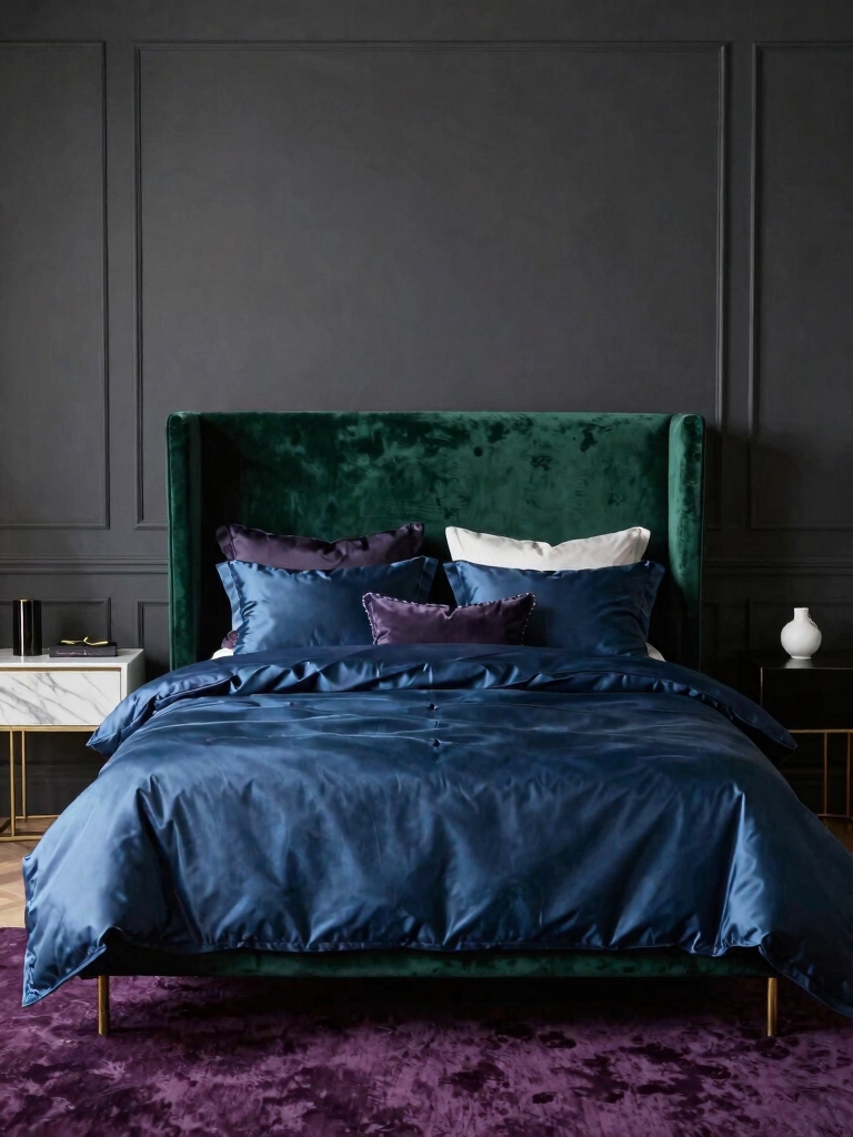
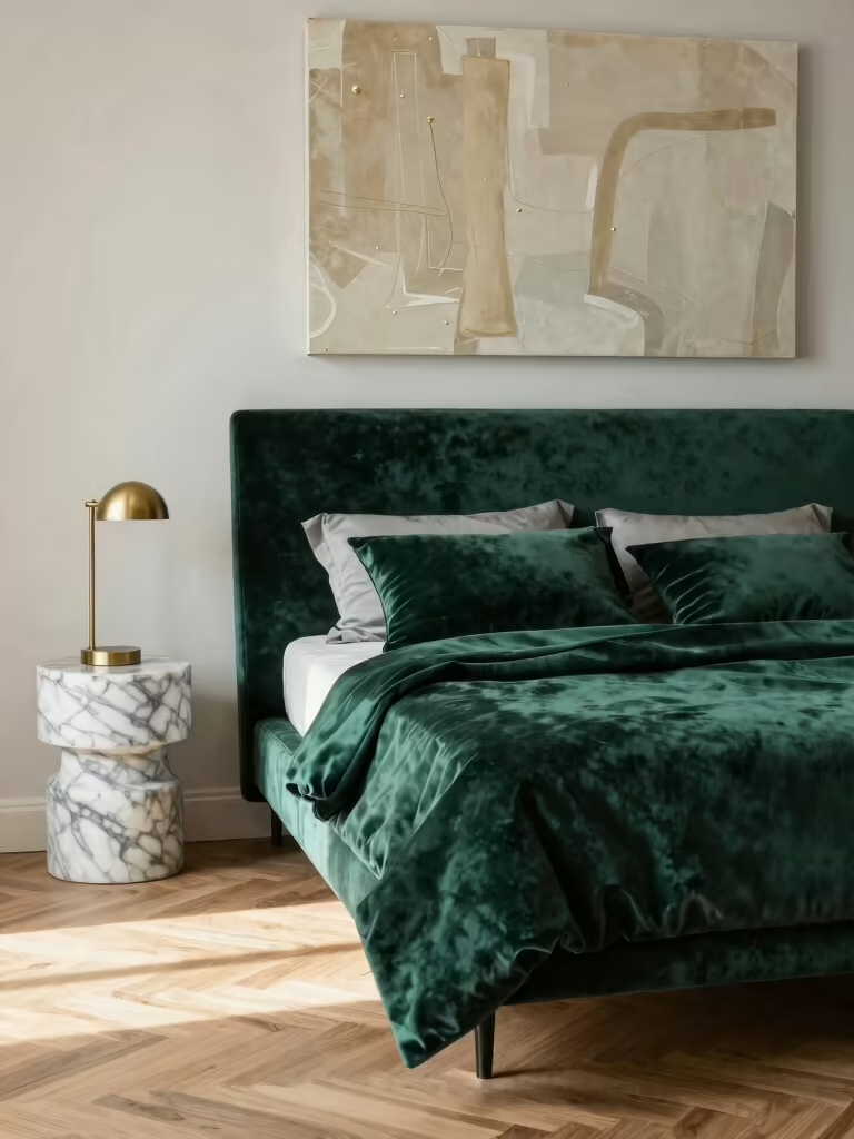
Jewel tones (emerald, sapphire, ruby, amethyst) bring drama and depth, and they’re easier to live with than people expect once you balance them. The key is pairing a saturated color with calm neutrals and matte textures so it grounds the room instead of taking it over. A single deep wall behind the bed often does more than drenching the whole room.
How to Keep Deep Colors From Closing In
Let daylight be your guide. Deep colors drink up light, so a jewel tone sings in a bright room and broods in a dim one; in a darker bedroom, keep the saturated color to textiles and one accent. Balance it with brass, wood, or cream so the eye gets somewhere to rest.
If you’re nervous, start small: a velvet emerald pillow, a sapphire throw, a single amethyst lampshade. Live with the accent for a week before you commit to a wall. That low-stakes test is how most people find the courage to go bolder.
Creamy Warmth With Terracotta
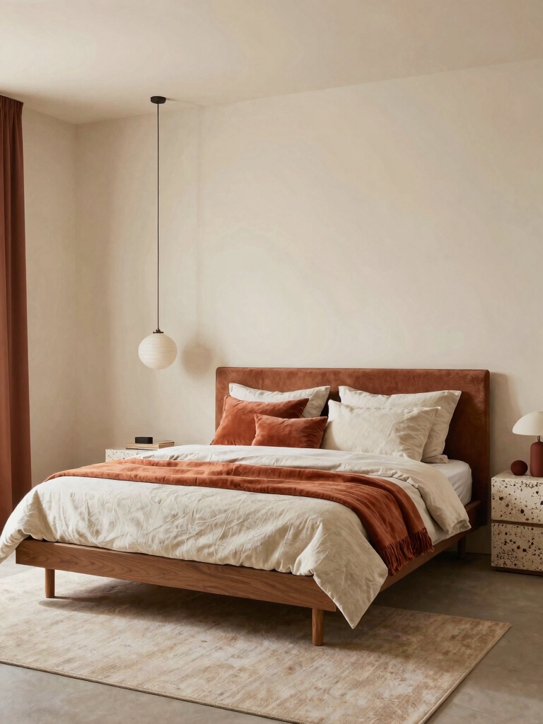
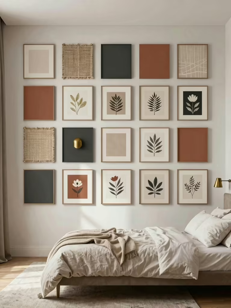
Cream and terracotta is the palette I recommend most to people who want a warm, grounded room that still feels light and airy through the day. Soft cream walls set a calm, sunny base, while terracotta brings that sun-baked, earthy warmth in small doses. Together they feel like late-afternoon light. That glow is exactly the mood most bedrooms want, warm and unhurried and easy to wind down inside of after a long day.
Keep the terracotta as the accent and let cream carry the room. A clay lampshade, a rust throw, a pot or two, and the warmth looks intentional. Layer in natural textures (linen, jute, wood) to deepen the earthiness, and the palette comes together for almost nothing. For a warmer, deeper cousin of this scheme, see my [brown bedroom ideas that stay timeless](brown-bedroom-ideas-cozy-timeless).
- Use cream on the walls and let terracotta show up in textiles and ceramics.
- Add wood tones and jute to play up the earthy, sun-warmed feel.
- Keep metals warm here (brass or aged bronze) so nothing fights the palette.
“To read a paint chip’s true undertone, lay it next to a sheet of plain white paper. Against true white, a ‘warm’ beige suddenly shows its pink or yellow and a ‘cool’ gray reveals its blue or green. That ten-second trick stops you from pairing two tones that quietly fight once they’re on the wall.”
Soothing Dusky Blue for Serenity
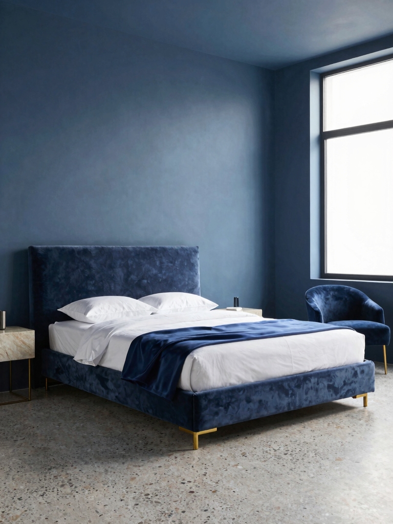
Dusky, grayed-down blues give a bedroom a spa-like calm that brighter blues can’t, because the muted tone feels restful and soft. Think slate, denim, and soft teal: colors that soften as the light fades and stay gentle under lamplight. They suit north-facing rooms beautifully.
Pair dusky blue with warm whites and natural wood to keep it from going chilly, and add a brass or soft-gold accent for a little glow. It works on all four walls in a calm room, or on a single accent wall paired with crisp linens. For the palest, airiest end of the cool spectrum, my [white bedroom ideas that still feel cozy](bedroom-ideas-in-white-that-actually-feel-cozy) cover how to keep it warm.
- Choose a grayed, muted blue over a bright one for a restful, spa-like feel.
- Warm it with wood, cream, and brass for an inviting glow.
- Great for a north-facing room, where cool light makes the blue feel even softer.
Muted Blush, Sage, and Other Soft Color Pairs
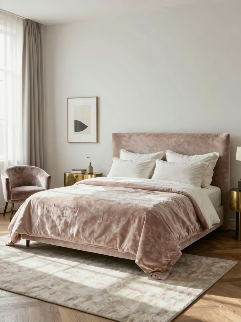
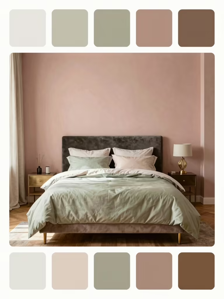
Beyond the headline palettes, a few soft pairings deserve a spot on any shortlist. Muted blush with warm taupe gives a gentle, grown-up warmth that stays soft and quiet, and it flatters nearly every skin tone in morning light. Keep the blush dusty rather than candy-bright and anchor it with taupe textiles so it looks grown-up.
Sage green with a touch of mustard is the retro-modern pairing I keep coming back to. Sage brings earthy calm, mustard adds a little vintage warmth, and brass or warm wood ties them together. It feels fresh and a little timeless, and it grows with you season after season.
Pale yellow with soft gray makes a sunny, lighthearted scheme for a room that needs a lift, especially one short on natural light. Let the yellow stay soft and buttery, use gray to ground it, and the room feels cheerful and calm at once.
Moody and Dramatic: Charcoal, Plum, and Black Accents
For people who want a bedroom that feels like a cocoon, the moody end of the spectrum delivers. Deep charcoal walls with brass and wood highlights feel grounded and a little luxe, since the warm metals keep the dark from feeling heavy. Matte finishes help here, soaking up light so the room feels soft rather than stark.
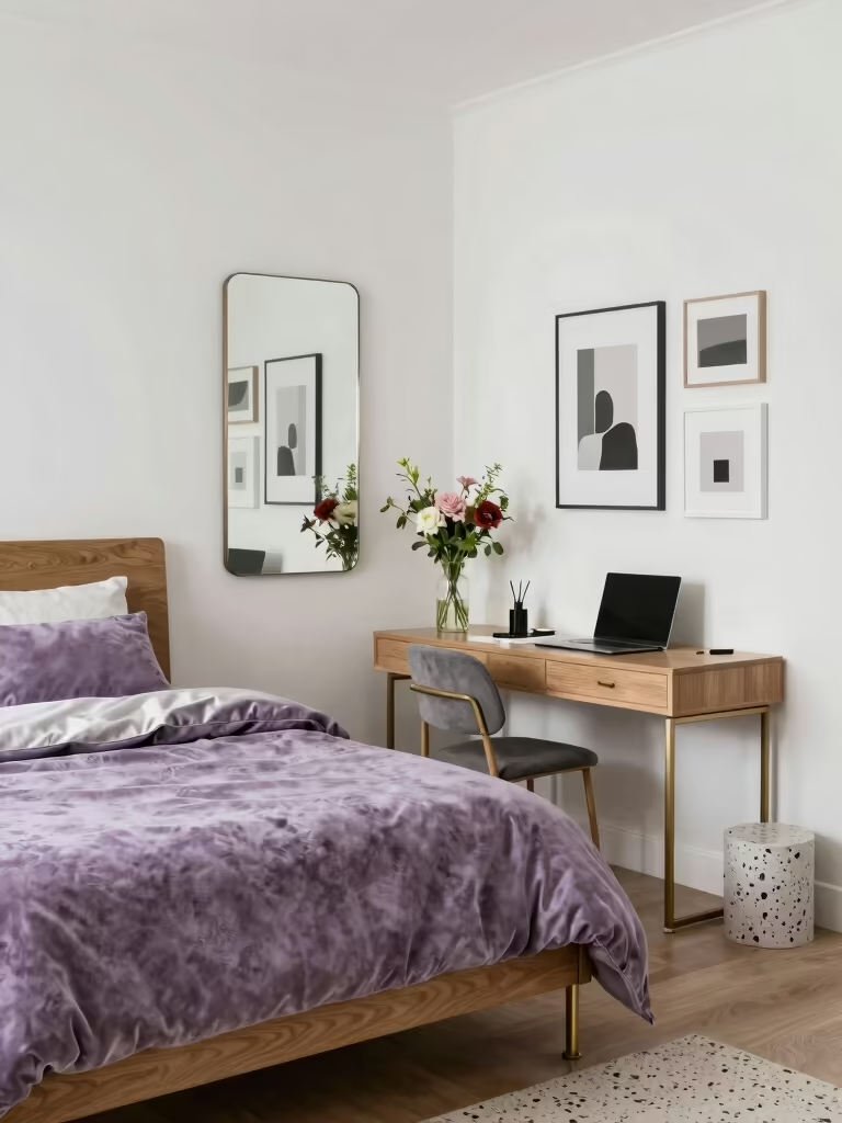
Rich plum with soft pink undertones is the moody palette that stays approachable. The plum brings depth, the blush keeps it from feeling severe, and a touch of pale gold lifts the whole thing. Pile on cozy textures so the intensity reads warm instead of cold.
If a fully dark room feels like too much, use black as an accent instead. A charcoal bed frame, black sconces, or thin black trim against pale walls gives you drama and definition while the rest of the room stays light. It’s the easiest way to make a light room feel modern and intentional.
How Lighting and Textiles Refine Any Palette
No bedroom color works in a vacuum; light and fabric finish the job. Warm 2700K bulbs make almost any palette feel cozier, while cool bulbs can turn a lovely warm scheme flat and clinical, so match your bulbs to your colors. Put the main light on a $15 to $25 dimmer and you can tune the whole palette from morning-bright to evening-soft. My [bedroom lighting ideas for mood](bedroom-lighting-ideas-mood) go deeper on this.
Textiles are where a flat color scheme gains depth. Layer a few weights and finishes (a matte linen curtain, a satin pillow, a chunky knit throw) and even a single-color room feels rich. Cool textiles can calm a bold wall; warm ones can rescue a scheme that drifted chilly. These small, swappable pieces let you refine a palette long after the paint has dried. Fabric is the cheapest edit you have.
Matching the Palette to Your Room
The right color for your bedroom depends as much on the room as on your taste. North-facing rooms get cool light, so warm palettes (cream, terracotta, blush) keep them from feeling chilly, while bright south-facing rooms can carry cooler dusky blues and even deep jewel tones with ease.
Notice which way your windows face before you fall for a swatch. Light changes everything. The same gray can read soft and dovelike in a sunny room and turn cold and grim in a north-facing one.
Room size matters too. Small or dim bedrooms feel larger in light, warm neutrals, while a generous, well-lit room can handle a moody charcoal or plum without closing in. Whatever you choose, test it on the actual wall at the actual hour you use the room, because a color that charms you at noon in the store can turn on you at 9 p.m. at home.
Pick the Feeling, Then the Color
The best bedroom color is the one that matches how you want the room to feel and the light it actually gets. Start from the mood, build with one dominant tone, a neutral, and an accent, and test it cheaply before you commit. That structure works whether you lean creamy and calm or deep and dramatic.
So which feeling do you want to wake up to: soft and serene, warm and grounded, or moody and tucked away?